Charting tools are the visual and functional core of most trading platforms. They translate raw market data into an organized display that helps a trader monitor instruments, manage orders, and record what occurs during a session. A well-constructed charting workspace supports routine decisions such as whether an order has filled, how far price is from a stop, what the current session range looks like, and whether alerts have fired. This overview examines what charting tools are, how they work in practice, why they exist in markets, and how they appear in real-world trading workflows. The discussion focuses squarely on tools and platform mechanics. It does not address trading strategies or technical analysis.
What Charting Tools Are
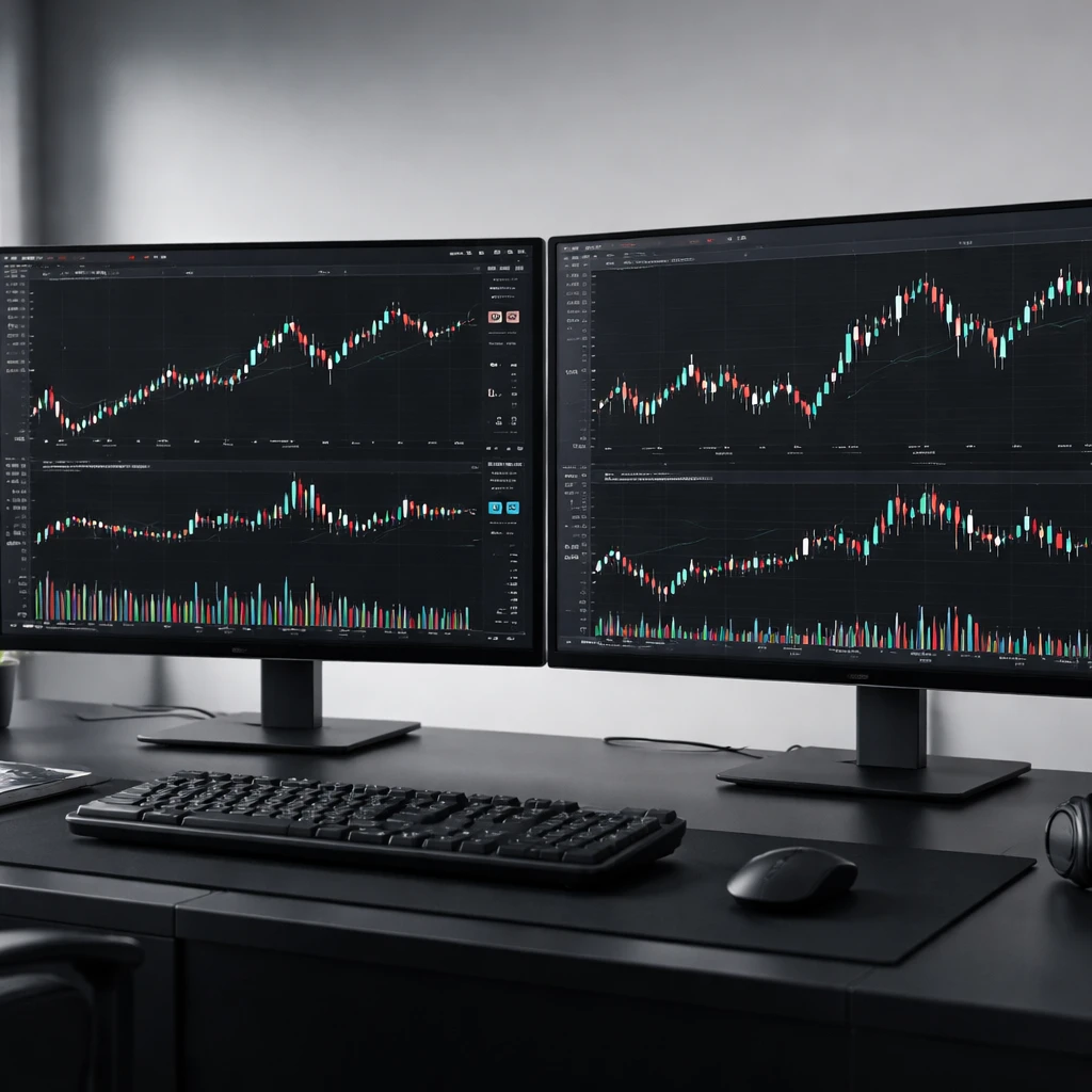
In a trading platform, charting tools are the set of features that render market data on a timeline and allow a user to observe, mark up, alert, and interact with that data. At minimum, a chart displays prices across time using line, bar, or candlestick plots. Most platforms add volume, session separators, drawing instruments, alerts, templates, and chart-based order management.
The chart is not only a display. It is a hub that connects data feeds, broker routing, user preferences, and recordkeeping. A single chart often holds the following elements:
- Data inputs: trades, quotes, volume, and corporate actions delivered from one or more data vendors.
- Time aggregation: the logic that groups ticks into bars such as 1-minute, hourly, or daily.
- Visual layers: price plots, volume panels, session shading, and user drawings.
- Interaction tools: cursors, measuring rulers, tooltips, and order lines that can be dragged.
- Automation hooks: alerts tied to prices or drawings, export functions, and scripting interfaces for custom visual elements.
Why Charting Tools Exist
Markets produce a continuous stream of prints and quotes. Raw tape is too dense to monitor directly for most users, so platforms compress and summarize it into time-based or event-based bars. Charts exist to reduce complexity, standardize observation, and link visual context to execution. They are also a lingua franca for communication. When two professionals discuss the behavior of an instrument at a particular time, they frequently refer to a charted view. In addition, charting tools make post-trade analysis and compliance simpler because they preserve a record of what the user saw at the time decisions were made.
Core Data Foundations
Data Sources and Integrity
Chart accuracy begins with the feed. Platforms may use consolidated feeds for equities, direct feeds for specific venues, or proprietary vendor composites. For futures, data typically comes from the exchange. For foreign exchange and crypto, there is no single consolidated tape, so charts depend on the chosen liquidity provider or exchange. Differences in vendors can produce small discrepancies in highs, lows, or volume, which in turn affect how a chart looks and which alerts trigger.
Key considerations for data integrity include:
- Latency and streaming: real-time versus delayed data, and whether the feed streams tick-by-tick or in updates batched per interval.
- Historical backfill: how far back the platform can load and whether historical data matches the real-time stream format.
- Corporate actions: split- and dividend-adjusted prices for equities and ETFs, selectable per user preference.
- Trading halts and anomalies: gaps or spurious spikes caused by halts, bad ticks, or vendor outages. Many platforms include filters or repair rules.
Time Aggregation and Bar Construction
Charting tools aggregate raw trades into bars based on a chosen interval. Standard intervals are seconds, minutes, hours, days, and weeks. Some platforms support event-driven bars such as tick count, volume bars, or range bars. These are not strategies. They are different ways of partitioning the stream of trades into visual units. The choice affects performance and legibility. Shorter intervals can reveal fine-grained fluctuations but consume more computing resources. Longer intervals smooth noise and reduce resource load.
Users should be aware of session boundaries when constructing bars. A daily bar for an equity may cover the regular session only, while another chart might include extended hours. Futures trade nearly around the clock, yet platforms commonly assign a primary session to aid comparison across days. Session templates, described below, determine how bars open and close.
Sessions and Time Zones
Charts are time-dependent objects, so session rules and time zones matter. Platforms usually offer a library of sessions such as equity regular hours, extended hours, futures main session, and custom templates. A session defines when bars are allowed to build and when they should pause. A trader who wants to monitor premarket activity might enable an extended-hours template that shades those periods and displays their volume. Another user may prefer to exclude those trades to focus on regular liquidity. Time zone selection affects timestamps, alert schedules, and session alignment. Some platforms anchor to exchange time, others allow local time settings. Consistency across the workspace reduces confusion.
Chart Types and Visual Layers
Price Plots
The standard price plots are line charts, bar charts, and candlesticks. Line charts connect closes or a chosen price field. Bar and candlestick plots display open, high, low, and close. A platform may also provide specialized constructions such as Heikin-Ashi or range-based bars. These are visual formats for the same underlying trades, not strategies in themselves. The chosen plot impacts readability and how much detail is visible.
Volume and Additional Panels
Volume is often placed in a subpanel under price, with each bar showing the number of shares or contracts traded in that interval. Some tools add session volume profiles or time statistics. Users can select what to show and how to scale it. For instruments without centralized volume such as certain FX pairs, platforms may display tick count or omit the panel entirely depending on the data source.
Adjustments and Continuous Contracts
Equity charts may be split- and dividend-adjusted. A reverse split can change the visible history dramatically if adjustment is toggled off. Futures add another layer. Since each contract expires, many platforms offer a continuous contract that stitches multiple expiries into one series. Stitching can be done by simple concatenation, by ratio adjustment, or by back-adjustment that aligns price levels across rolls. The choice changes levels on historical bars, which affects order lines, alerts, and measurements anchored to prior history. Tools should make the adjustment method visible and configurable.
Workspace, Layouts, and Ergonomics
Multi-Chart Layouts
Most active users operate multiple charts simultaneously. A platform may allow tiled windows, tabbed charts, and saved layouts. Linking mechanisms synchronize instruments or timeframes across panes. For example, clicking a symbol in a watchlist can update all linked charts. A synchronized crosshair highlights the same timestamp across panels, which aids visual comparison without manual alignment.
Templates and Styles
Templates capture plot types, colors, grids, and panels, then apply them to new charts. Styles improve readability. High-contrast themes assist users in bright rooms, while muted palettes reduce eye strain in dark environments. Font size, axis labeling, and spacing are simple but important. Poor typography can hide information or lead to misreading a scale. Color-blind safe palettes are increasingly available and reduce ambiguity between rising and falling bars.
Hotkeys, Mouse Actions, and Navigation
Efficient charting depends on fast navigation. Hotkeys for zoom, scroll, bar-spacing, and object deletion reduce friction. Mouse modifiers for drawing, snapping to open-high-low-close, and magnetic alignment help place clean annotations. A well-tuned scroll speed and zoom behavior make intraday monitoring easier without constant re-centering.
Drawing and Annotation
Drawing tools support observation, planning, and documentation. Typical instruments include trend lines, channels, horizontal and vertical lines, rectangles, arrows, and text notes. Many platforms allow drawings to snap to highs and lows, display coordinates, and extend into the future. Precision matters when an order is positioned relative to a prior bar or when a user wishes to replicate a setup for recordkeeping. Annotation is not inherently a signaling method. It is a workflow support that clarifies what the user is seeing.
Measurements are a related function. Rulers show the distance between two points in price units and time bars. Some tools display percentage changes and the monetary value per contract or per share, based on a configured multiplier. This information becomes practical during order placement when confirming that a potential stop level would represent an acceptable monetary exposure.
Alerts and Monitoring
Alerts convert visual conditions into notifications. The simplest is a line alert that fires when price crosses a specified level. More sophisticated alerts attach to drawings such as channels or rectangles, so a trigger occurs if price touches or exits a zone. Alerts can trigger once or multiple times and can be set to expire. Delivery channels include on-screen popups, sounds, emails, or mobile push notifications. An alert log provides timestamps and status. Reliable alerting requires accurate session handling. An alert configured for regular hours may intentionally mute outside of that window.
Chart-Based Order Entry and Trade Management
Many platforms allow orders to be entered and managed directly on the chart. This reduces context switching and connects visual reference to execution controls. Common features include:
- Click-to-place orders: placing a limit or stop by clicking on the price axis or within the chart region, generating a visible order line.
- Drag-and-drop modification: adjusting a limit, stop, or bracket order by dragging the line to a new level, with the platform recalculating quantities and risk displays.
- Bracket and OCO integration: pairing a stop with a target so when one fills, the other is canceled automatically.
- Position visualization: a line at the average fill price, with real-time unrealized profit or loss shown in currency or ticks.
- Order status overlays: pending, partially filled, filled, and canceled indicators attached to the order lines with timestamps in the order log.
These features do not decide what to trade. They streamline execution once a decision is made elsewhere. Good chart trading design also minimizes accidental actions. Confirmations, order locks, and undo controls are safety features that reduce operational risk.
Performance, Reliability, and Infrastructure
Rendering and Resource Use
Charts are graphics-intensive. Platforms rely on hardware acceleration when available and balance frame rate against CPU and memory use. Heavy workspaces with many instruments and panels can stall if the platform attempts to redraw too frequently or caches too little history locally. Common mitigations include limiting the number of bars loaded, capping the update rate, or using a multi-threaded architecture. Users benefit from understanding how to profile resource use and prune unnecessary layers when the workspace becomes sluggish.
Reconnections and Data Gaps
Network interruptions are common. A robust charting tool manages disconnections gracefully, queues orders locally when appropriate, and reconciles history on reconnect. After a gap, the platform should backfill missing bars to align the visual record with exchange data. Audit logs that record connection state, symbol subscriptions, and restored history are helpful for diagnosing discrepancies between what was displayed and what occurred.
Clock Synchronization
Because alerts and order timestamps hinge on accurate time, platforms typically sync clocks to network time sources or exchange references. Mismatched local time can shift session boundaries and create confusion when comparing a screenshot to an execution report. Clear time status indicators reduce this risk.
Data Management and Export
Modern platforms treat the chart as an information asset. Useful capabilities include:
- Screenshot and annotation export: capturing the current view with drawings and order lines for journals or reports.
- Bar data export: downloading open-high-low-close-volume with timestamps for further analysis in spreadsheets or statistical packages.
- Layout backup: saving chart templates, alerts, and drawings to the cloud or to a local file for disaster recovery.
- Permission and privacy controls: redacting account numbers or balances from chart overlays before sharing images.
Special Considerations by Asset Class
Although charting principles are general, asset-specific details matter:
- Equities and ETFs: corporate action adjustments, exchange holidays, and extended-hours liquidity that may be thin compared with regular sessions.
- Futures: contract roll schedules, exchange-defined sessions, and tick size that affects scaling and measurement.
- Foreign exchange: decentralized liquidity with vendor-specific pricing and weekend gaps shaped by provider policy.
- Crypto assets: 24-hour trading and exchange-specific volume, with maintenance windows that can create irregular candles.
- Options: charts showing the option series as well as reference panels for implied volatility or Greeks, if the platform supports them.
How Charting Tools Work in Practice
Consider a routine session for a user who monitors two equities and one futures contract. Before the open, the user loads a workspace with three charts tiled horizontally. Each chart has a session template that includes premarket activity for equities and the main session for futures. The user checks whether the platform has backfilled the prior day and whether corporate action adjustments match the broker statements.
The user sets two price alerts. One alert sits above the previous day’s range in an equity, configured to trigger only during regular hours. Another alert marks a futures level that, if reached, merits attention. The watchlist is linked to the charts so selecting a different symbol updates all panes. The crosshair is synchronized, making it easy to compare time-aligned behavior across the three charts.
The open approaches. On the equity chart, the user creates a bracket order by clicking on the price region to place a limit entry. The platform displays a pending order line, with estimated risk and quantity based on the default settings. The user drags the stop line to a level that contains the desired risk and confirms the order with a dialog. During the session, the user adjusts the stop by dragging the line, and the platform logs the modification with a timestamp. The futures alert fires, producing a sound and an on-screen notice; the user dismisses it after reviewing the chart. No strategy logic is encoded here. The chart is a control panel for observing prices and managing orders.
At midday, the platform loses network connectivity for a minute. The charts show a reconnect banner, then backfill the missing bars from the server. The user compares the rebuilt chart to the order log and sees that a modification request sent during the outage was queued and then processed on reconnection. Later, the user takes a screenshot of the equity chart showing the day’s fills, adds a text note, and saves it to a journal folder along with the audit log.
Real-World Example of Context and Execution
Imagine an equity that announced a stock split overnight. An adjusted chart shows historical bars scaled to reflect the new share count. An unadjusted chart shows the post-split open as a sharp gap. If a user wants to manage an open order based on prior relative levels, the adjusted view is more practical for order placement. The charting tool should make it obvious which mode is active and allow a quick toggle.
In the same session, the user wants to monitor premarket prints before deciding whether to place a limit order on the open. With extended hours enabled, new candles populate before the bell, with lighter volume. The user sets a one-time alert at a premarket high to receive a notification if regular-session price approaches that level. When the session starts, the user enters the order directly on the chart. The order line displays estimated execution cost and links to a stop using an OCO rule. As the day progresses, the chart helps the user track distance to the stop in both ticks and currency, while the volume panel provides context about liquidity without implying any strategy signal.
Common Pitfalls and How Tools Address Them
- Session mismatches: an alert or order appears to trigger unexpectedly because the chart was set to extended hours while the user assumed regular hours. Clear session labels and templates mitigate this.
- Adjusted versus unadjusted history: equity levels differ across charts because one is dividend-adjusted and the other is not. Visible toggles and status badges reduce confusion.
- Symbol mapping issues: the wrong contract month or an outdated symbol roots a chart in stale data. Platforms use symbol search with metadata such as expiration dates and tick sizes to guide selection.
- Time zone inconsistencies: screenshots taken in local time do not match a broker’s exchange-time statements. Platforms that display both time zones or enforce exchange time help avoid misalignment.
- Bad ticks and spikes: occasional erroneous prints distort a bar and trigger alerts. Many tools offer filters or let users hide or correct specific trades, with changes logged.
- Overloaded workspaces: too many panels or frequent updates slow rendering. Resource controls, bar limits, and performance profiling help maintain responsiveness.
Platform Selection Considerations
While specific vendors are outside scope, the following criteria are commonly evaluated when choosing charting tools inside a platform:
- Data coverage and quality: supported exchanges, depth, historical span, and alignment between real-time and backfill.
- Session handling: configurable templates, clear labeling, and extended-hours controls.
- Chart trading: order entry from chart, drag-to-modify, bracket and OCO support, and visible risk metrics.
- Alerting system: line and drawing-based alerts, reliability, delivery channels, and logs.
- Layout management: multi-chart synchronization, templates, and backup of settings to prevent loss.
- Performance: smooth rendering with many symbols, stable reconnection behavior, and efficient memory use.
- Export and journaling: screenshots, data export, and annotation retention for compliance and review.
- Accessibility: color-blind themes, scalable fonts, keyboard navigation, and clear contrast.
- Security and privacy: control over what overlays reveal account information, plus encryption of saved layouts and credentials where applicable.
Linking Charts With Broader Tooling
Even though this article does not discuss strategies, it is useful to understand how charts connect to other platform components. Scanners or alerts can feed candidate symbols into a watchlist that is linked to the chart layout. News panels can display scheduled corporate actions or economic events alongside the chart timeline. A depth-of-market or time-and-sales window can be docked with the chart for additional context. These integrations do not prescribe any decision. They provide different slices of the same market activity.
Practical Workflow Tips
- Keep a stable baseline layout: store a clean template with standard sessions and panels, and clone it for experiments so the core workspace remains consistent.
- Label drawings and alerts: add short notes to clarify purpose. Weeks later, annotations without labels are hard to interpret.
- Audit your time settings: verify time zone and session templates after platform updates or daylight saving shifts.
- Validate data after events: after stock splits, symbol changes, or futures rolls, confirm that the chart reflects expected adjustments.
- Back up layout files: keep cloud or offline copies of templates and drawings to protect against hardware failure.
Ethical and Operational Considerations
Charts often include overlays that show account size, position quantity, or order identifiers. When sharing screenshots for education or compliance, ensure that sensitive information is redacted. If a chart is used in a collaborative environment, document who can create or modify alerts and orders. Clear roles and permissions prevent unintended changes and maintain an accurate audit trail.
Looking Ahead
Charting tools continue to evolve. Expect better multi-device synchronization, more granular control over alert conditions, higher-fidelity data visualization, and improved accessibility features. The core purpose remains stable. A chart is a structured lens on market data that connects observation to execution and to the record of what happened.
Key Takeaways
- Charting tools convert raw market data into structured visual timelines and connect directly to execution and alerts.
- Data quality, session rules, and adjustment settings materially shape what appears on a chart and how orders are managed.
- Drawing, annotation, and measurement features support clarity, communication, and auditability without implying strategy.
- Chart-based order entry with bracket and OCO controls streamlines trade management and reduces operational friction.
- Reliable performance, reconnection behavior, and export capabilities make charts practical for real-world workflows across asset classes.