Volatility is the statistical description of how widely and how unpredictably prices move over time. In technical analysis it is a foundational concept because it shapes the context within which any price pattern, indicator, or market signal is interpreted. Volatility does not speak to direction. It describes dispersion and instability. A highly volatile market can rise, fall, or move sideways while producing large and frequent price swings.
Defining Volatility
At its core, volatility measures the variability of returns. In practice, chart readers often think in two complementary ways:
- Realized volatility. The variability that actually occurred in past prices. It is usually estimated from historical data, such as the standard deviation of daily returns over a rolling window or the average size of price ranges.
- Implied volatility. The forward-looking volatility embedded in option prices. It reflects the market’s consensus about the magnitude of future price moves, regardless of direction.
Both concepts refer to how far price might drift from its recent average path, but they are constructed differently and can diverge for long periods. Technical analysis primarily observes realized volatility on the chart, while also acknowledging that implied volatility, when available, provides a complementary view of expectations.
How Volatility Appears on Charts
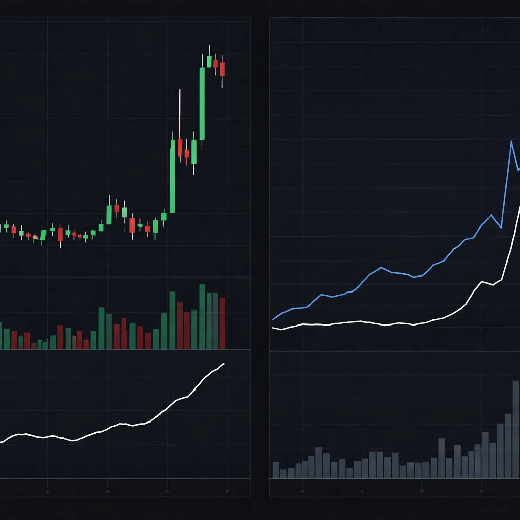
Volatility is visible even before it is measured. Several visual cues indicate whether the market is calm or agitated:
- Candlestick size. When candle bodies and shadows expand, realized volatility has likely increased. Narrow candles often cluster during quiet periods.
- Gaps and whipsaws. Frequent gaps between sessions and abrupt reversals within sessions are signs of unstable price discovery.
- Range dynamics. A market that moves from tight consolidation to wide daily ranges is transitioning into a high-volatility regime.
- Band width and channels. Indicators that adapt to price dispersion, such as rolling standard deviation bands, visually widen during turbulent periods and narrow when volatility contracts.
- Separate volatility panes. Sub-panels that display Average True Range or rolling standard deviation provide a clean, quantitative readout of volatility through time.
Although these cues are straightforward, context matters. A one-dollar move in a 20-dollar stock is large. The same move in a 400-dollar stock is small. Effective chart reading treats volatility in both absolute and relative terms.
Why Traders Pay Attention to Volatility
Volatility conditions influence how price interacts with reference levels, how quickly thresholds may be reached, and how much noise surrounds any signal:
- Risk characterization. High volatility increases the range of plausible price paths over a given horizon. This makes thresholds more likely to be touched and increases the dispersion around forecasts of future price.
- Execution and slippage. Large, rapid swings often coincide with wider spreads and deeper liquidity holes, which can increase execution variance and cost.
- Signal reliability. Patterns and indicators that look stable in low-volatility regimes can behave erratically when volatility expands. Conversely, very quiet regimes can mask latent risk that emerges when conditions shift.
- Event interpretation. Economic releases, earnings, policy announcements, and geopolitical headlines often trigger regime changes. Volatility provides a common language for describing these transitions.
In short, volatility organizes the chart reader’s understanding of uncertainty. It frames what counts as a large move, what qualifies as noise, and how stable the market’s microstructure appears to be.
Measuring Realized Volatility on Price Charts
There are several practical ways to quantify realized volatility. Each method captures different aspects of price behavior, and each carries assumptions and limitations.
Return-Based Standard Deviation
A standard approach estimates the standard deviation of log returns over a rolling window. If rt is the log return for period t, the rolling sample standard deviation over the last N observations provides a measure of dispersion. Chartists often display this as a sub-panel or translate it into price bands around a moving average. A larger standard deviation indicates more dispersed returns, which correspond to wider price swings.
Key considerations:
- Window length. Short windows respond quickly to changes but are noisy. Long windows are stable but can lag regime shifts.
- Sampling frequency. Volatility depends on the observation interval. Intraday series typically show different characteristics from daily or weekly data.
- Scaling across horizons. In many contexts, volatility scales approximately with the square root of time. This approximation breaks down at very short horizons due to microstructure noise.
Range-Based Measures and True Range
Range-based estimators use information from the high and low of each period. They are attractive because range captures intra-period variability that returns may miss.
- True Range. For each bar, True Range equals the maximum of the following three quantities: current high minus current low, absolute value of current high minus previous close, and absolute value of current low minus previous close. This accounts for gaps between sessions.
- Average True Range (ATR). ATR smooths True Range over a user-selected window. The ATR line on a sub-panel rises when daily ranges expand and falls when ranges compress.
- High-low estimators. Parkinson and related estimators use the high-low range to infer volatility under certain assumptions about the price process. They can be efficient in calm markets but are sensitive to jumps and drift.
Range-based techniques align closely with what the eye perceives on candlestick charts. The magnitude of highs and lows, and how they change through time, directly maps to the intuition of quiet versus turbulent markets.
Directional Neutrality
Correct interpretation requires recognizing that volatility is directionally neutral. A rapid multi-day advance with large candles and a rapid multi-day decline with large candles can produce similar volatility readings. Volatility measures scale, not bias. They do not tell you whether the next move will be up or down.
Volume, Liquidity, and Volatility
Volume is the count of shares or contracts traded. Liquidity describes the ability to transact size with minimal price impact. Volatility often correlates with both, but the relationships are nuanced.
- High volume and high volatility. News shocks and crowded position adjustments can produce simultaneous surges in volume and volatility. Price moves far because many participants are changing their valuations quickly.
- High volume and low volatility. In orderly markets with deep liquidity, large volume can clear at stable prices, producing narrow ranges despite heavy trading.
- Low volume and high volatility. Thin markets can gap on small orders, especially outside regular trading hours.
- Liquidity regime shifts. During stress, spreads often widen and depth thins, which allows prices to travel farther with fewer trades. On charts, this appears as wider candles even without unusual volume.
Chart readers watch the joint behavior of volatility and volume. Spikes in volatility with confirming volume expansion tell a different story from spikes in volatility on light volume. Neither configuration is inherently bullish or bearish, but each has distinct implications for stability and execution conditions.
Implied Volatility and the Options Lens
When options are listed on an asset, implied volatility offers a forward-looking reference for expected price variability. Implied volatility is the value that, when plugged into an option pricing model, reproduces the observed option price. It is usually quoted on an annualized basis.
Several aspects matter for chart interpretation:
- Level. A higher implied volatility indicates that the options market is pricing a wider distribution of potential future outcomes.
- Term structure. Near-term implied volatility can differ markedly from longer-dated implied volatility, especially around scheduled events such as earnings or economic releases.
- Skew and smile. Implied volatility often varies by strike. Equities, for example, frequently exhibit higher implied volatility for downside strikes, a pattern associated with crash sensitivity.
Implied and realized volatility are related but distinct. Their spread incorporates risk premia, supply and demand for options, and the market’s aversion to tail outcomes. On a chart, realized volatility may appear calm even while implied volatility lifts ahead of an event. The divergence signals that the market expects larger moves than the recent history alone would suggest.
Volatility Regimes and Clustering
Volatility tends to cluster. Calm days often follow calm days, and turbulent days often follow turbulent days. This persistence creates identifiable regimes that can last weeks, months, or longer. The transition between regimes typically appears as a compression phase with falling volatility, followed by a burst of range expansion.
Common characteristics include:
- Compression. Narrow candles and decreasing ATR or rolling standard deviation. Bands and channels narrow. Volume often fades.
- Expansion. Wide candles, frequent gaps, and rising ATR or rolling standard deviation. Bands widen quickly. Volume frequently increases, though not always.
- Asymmetry. In some markets, especially equity indices, volatility has historically been higher during declines than during advances. This leverage effect is a descriptive tendency, not a rule.
Recognizing regimes helps with interpretation. A price move that appears large inside a low-volatility regime might be ordinary inside a high-volatility regime. The same absolute move has different meaning depending on recent dispersion.
Practical, Chart-Based Contexts and Examples
Example 1: Earnings Season in an Individual Stock
Suppose a large-cap stock trades quietly in the two weeks before an earnings announcement. Daily candles narrow and the ATR trends downward. Implied volatility quoted on near-term options rises as the date approaches. On the chart, traders see tight consolidation and subdued realized volatility, while the options market signals the potential for a larger move.
After the report, the stock gaps and prints a wide-range candle on heavy volume. The ATR rises sharply and the rolling standard deviation increases. This sequence illustrates how realized volatility can lag expectations and then catch up abruptly once new information is absorbed. The gap and the large candle represent a regime transition from compression to expansion.
Example 2: Central Bank Decision in a Currency Pair
Consider a major currency pair heading into a policy decision. Intraday realized volatility declines during the pre-event lull, visible as smaller one-minute and five-minute bars and a falling intraday ATR. Immediately after the statement, realized volatility spikes. Candles lengthen, shadows extend, and prices oscillate around the new information. Depth on the order book thins briefly, spreads widen, and price travels farther per trade. Volume surges, then decays as the market digests the message and conditions normalize.
This example highlights how volatility is path dependent around events. It also shows the interplay between volatility and liquidity. On the chart, the volatility jump is unmistakable even if the final direction after the dust settles is unclear.
Example 3: Commodity Futures Around a Supply Report
A grain futures contract often exhibits seasonality in both volume and volatility. In the weeks before a major crop report, realized volatility can contract while implied volatility drifts upward. On report day, open interest may shift, intraday ranges expand, and the settlement session records a large true range that lifts the ATR. The chart displays a swift transition from narrow to wide ranges. This visible alteration in price dispersion signals a new information set and a fresh volatility regime.
Absolute and Relative Perspectives
Volatility can be framed in absolute currency terms or in relative, scaled terms. Both are useful.
- Absolute volatility. A daily ATR of 2 dollars in a 50-dollar stock is different from 2 dollars in a 400-dollar stock. Absolute figures help with practical questions about movement per day or per week.
- Relative volatility. Scaling by price, often using percentage returns or dividing ATR by price, allows meaningful comparison across assets and across time as price levels change.
Charts that include both perspectives help avoid misinterpretation. A price that drifts higher over months can mechanically inflate absolute ranges even if percentage volatility remains stable.
Timeframe and Aggregation
Volatility depends on the timeframe observed. An asset may look erratic on a one-minute chart and placid on a daily chart. Aggregation smooths noise and alters the apparent distribution of returns. Three practical consequences follow:
- Noise versus signal. Very short horizons capture microstructure effects, including order flow imbalance and price impact, that can exaggerate perceived turbulence.
- Intraday patterns. Many markets exhibit a U-shaped intraday volatility profile, with higher activity near the open and close and a lull mid-session.
- Overnight behavior. Gaps between sessions contribute to realized volatility even if intraday ranges are quiet.
When reading charts, the chosen timeframe should match the question being asked about price behavior. A mismatch can lead to conflicting impressions of stability or risk.
Data Construction and Calculation Details
Sound measurement begins with clean data. A few practical points are worth noting:
- Adjusted price series. For equities, use data adjusted for dividends and splits when computing returns and standard deviation. Unadjusted series can distort volatility at corporate action dates.
- Gaps and outliers. Extraordinary moves, such as limit-up or limit-down days, can dominate rolling statistics. Some analysts use robust estimators or examine both raw and winsorized results to understand sensitivity.
- Choice of return metric. Log returns are additive across time and are commonly used for volatility estimation. Arithmetic returns can also be used with care, especially for small changes where the difference is minimal.
- Smoothing method. ATR and similar indicators often use exponential smoothing. The choice affects responsiveness. More smoothing reduces noise but also delays detection of regime shifts.
- Scaling. If volatility is measured per day, approximate annualization typically multiplies by the square root of 252 for equities. This convention is a simplification and may not hold in all contexts.
Interpreting Volatility with Price Levels
Support and resistance zones, supply and demand pockets, and round numbers interact with volatility. The same distance to a level can be trivial or meaningful depending on current dispersion. For example, a price that sits 0.5 percent below a noted level may be almost certain to touch it within a day during a high-volatility regime but not during a low-volatility regime. The interpretation relies on understanding the typical range for the period in question.
This context does not forecast direction. It frames the likelihood of a price path intersecting nearby thresholds in a given time window, based on recent movement characteristics. Chart readers often compare the distance to a reference level with a measure of typical daily range to calibrate expectations about path sensitivity.
Common Pitfalls When Reading Volatility
Several errors can creep into analysis if volatility is interpreted without context:
- Conflating volatility and trend. Volatility measures dispersion, not directional bias. Rising volatility during an advance is not inherently supportive or unsupportive of the trend.
- Ignoring regime shifts. Using a long lookback window can obscure a recent transition. Conversely, a very short window can label every fluctuation as a regime change.
- Single-metric dependence. Relying on only one estimator can miss important features. Range-based and return-based measures often complement each other.
- Timeframe mismatch. Drawing conclusions from a five-minute chart and applying them to weekly behavior can be misleading.
- Volume-blind interpretation. Reading volatility without reference to volume and liquidity can miss structural drivers of price movement.
Volatility and Market Microstructure
Behind the chart, trades meet quotes in a limit order book or through a dealer network. Microstructure affects observed volatility:
- Order imbalance. A temporary asymmetry between buy and sell interest can move prices quickly, widening ranges even absent new information.
- Spread dynamics. In stress, spreads tend to widen, which can amplify measured ranges, especially on lower timeframes.
- Algorithmic activity. Intraday volatility often reflects the interaction of liquidity-seeking and market-making algorithms, which respond to volatility itself, volume surges, and changing depth.
These features are more pronounced during openings, closings, and news windows, which helps explain recurring patterns in intraday volatility profiles.
Putting It Together on the Chart
A disciplined chart read incorporates volatility as a first-class input. The process often includes the following elements:
- Observe the raw price action for candle size, gaps, and whipsaws.
- Consult a volatility pane, such as ATR or rolling standard deviation, to quantify dispersion and identify transitions.
- Compare absolute and relative volatility to understand the scale of movement in practical and percentage terms.
- Cross-reference volume and, when available, implied volatility to gain insight into participation and expectations.
- Assess how far price sits from relevant levels in units of typical range, rather than only in absolute price increments.
This framework does not prescribe trades. It improves interpretation of the tape, clarifying whether recent behavior is unusually calm, unusually turbulent, or near the market’s own baseline for the current regime.
Historical Perspective and Stability
Volatility is cyclical. Extended quiet periods can breed sensitivity to shocks, while extended turbulence can normalize large moves and reduce their informational content. Over long histories, many markets show episodes of elevated volatility during financial stress, policy uncertainty, or structural change, followed by reversion toward typical levels.
For a chart reader, the key is not to assume that volatility will remain at current levels. The path of volatility is itself volatile. Recognizing clustering, acknowledging the possibility of abrupt transitions, and measuring dispersion with robust tools helps maintain an accurate read on market conditions.
Key Takeaways
- Volatility is the magnitude and variability of price changes, not a statement about direction.
- It is visible on charts through candle size, ranges, gaps, and the behavior of indicators such as ATR or rolling standard deviation.
- Volume and liquidity conditions shape how volatility manifests, with different implications for stability and execution.
- Realized and implied volatility are related but distinct, and their divergence conveys information about expectations versus history.
- Effective interpretation treats volatility in absolute and relative terms, considers timeframe, and recognizes regime shifts and clustering.