Volume and volatility are two of the most observable dimensions of market activity. Volume captures how much is trading. Volatility captures how much price is moving. Considered together on the same chart, they form a useful lens for reading market behavior without taking a view on direction. The relationship is not mechanical and it is not a trading signal by itself. It is a contextual framework that helps explain whether price changes are occurring with broad participation, under thin liquidity, or in the midst of a changing information environment.
Defining the Components
What volume measures
Volume is the count of units traded over a period. In equities it is shares. In futures it is contracts. In exchange-traded crypto it is coins or contract equivalents. Many charting platforms display a volume histogram under the price panel. The histogram shows a separate bar for each period, often color-coded by whether the close is above or below the prior close. Some analysts also overlay a moving average of volume to gauge relative participation.
Volume can be aggregated in different ways. For markets with multiple venues, consolidated volume integrates prints from several sources. Over-the-counter markets may rely on proxies such as tick volume, which counts price changes rather than actual traded units. These distinctions matter when comparing volume across assets or when evaluating whether a change is truly broad based.
What volatility measures
Volatility is the degree of variation in price over time. In technical analysis, realized volatility is often approximated by measures that do not require a full statistical model. Typical tools include:
- True Range and Average True Range (ATR), which reflect the period’s high-low range and gaps.
- Bollinger Band width, which tracks the dispersion of recent prices around a moving average.
- Rolling standard deviation of returns, usually on closing prices.
Volatility is directionless. A period with sharp advances and declines can register the same volatility as a period with sharp declines only. The chart expression of volatility is the size of candles or bars, the presence of gaps, and the frequency of large intraperiod swings.
The Concept: Volume and Volatility Together
Volume and volatility together refers to interpreting price changes through the joint behavior of participation and range. The combination helps address basic diagnostic questions. Is a price move occurring with widespread involvement or in a thin, easily moved market. Is the market digesting new information or simply oscillating within a well-understood range. Are liquidity providers comfortable absorbing flow or are they widening their quotes and retreating from risk.
There is a well-documented tendency for volume and volatility to rise together during periods of elevated information flow. The effect is not constant and varies by asset class and regime. It reflects several mechanisms: heterogeneous beliefs, the need to rebalance positions when prices move, and changes in liquidity supply when risk becomes harder to manage. The practical value of the concept lies in recognizing which configuration is on the chart now, rather than attempting to forecast the next configuration.
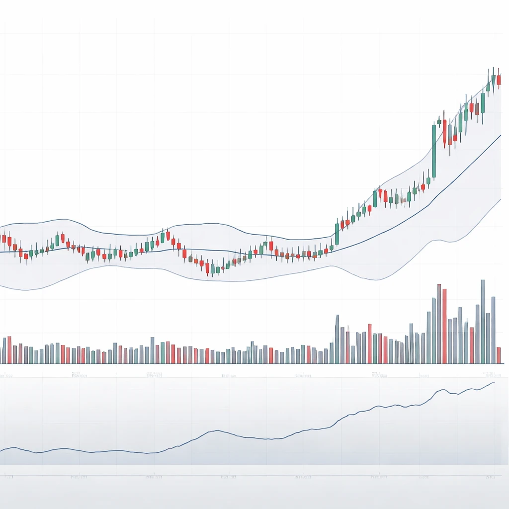
How the Relationship Appears on Charts
Most chart layouts place price candles in the main panel and a volume histogram immediately below. Volatility indicators can be overlaid on price or placed in a separate panel. Three visual cues are common:
- Range expansion: candles with larger bodies and wicks, frequent gaps, and extended daily ranges. ATR typically rises in tandem.
- Band expansion: Bollinger Bands or Keltner Channels that widen after a period of contraction. The bands visually capture dispersion.
- Volume bursts: histogram bars that exceed a recent average or percentile threshold. Many platforms display a 20-session average volume line for reference.
When a wide-range candle aligns with a volume bar that is substantially above average, analysts often infer that a broad set of participants traded during the move and that liquidity conditions adapted to a higher-uncertainty environment. Conversely, narrow-range candles with subdued, steady volume suggest a balanced market where buyers and sellers transact within tight expectations.
Why Analysts Pay Attention
Reading volume and volatility together provides:
- Participation context: whether price change reflects broad involvement or isolated prints.
- Liquidity insight: whether market depth is likely concentrated or thin. Thin depth can amplify moves without unusually high volume.
- Information regime cues: whether the market is in a discovery phase with shifting beliefs, or in a valuation range with shared expectations.
- Risk and uncertainty cues: rising volatility often coincides with wider spreads and more cautious liquidity provision. That affects how easily large orders can be executed.
None of these observations prescribe action. They structure interpretation. The same configuration can occur in uptrends, downtrends, and sideways markets, and it can precede continuation or reversal. The utility is in understanding market state, not in predicting the next bar.
Common Configurations and Their Interpretation
High volume with high volatility
This configuration often appears around macroeconomic releases, earnings announcements, regulatory news, or surprise events. On the chart you see a large candle, sometimes with a gap at the open, and a volume bar that ranks among the highest of the recent sample. ATR or band width jumps. The market is conducting price discovery. Many participants are updating beliefs and transferring risk. Liquidity providers may widen quotes to manage inventory risk, which contributes to the larger ranges.
In such periods, direction can swing intraday as the order book rebalances. Wicks above and below the candle body reflect tests of prices that were briefly rejected. The key insight is not whether price will continue in the direction of the close, but that uncertainty is elevated and that the trading day likely involved a large share of active participants.
High volume with low volatility
Heavy participation with small ranges is a different signal. It suggests that significant transaction flow is being absorbed within a well-known price region. On a chart this appears as a cluster of relatively small candles, with closes near each other, while the volume histogram is consistently above its recent average. The reading is that liquidity is deep at prevailing prices and that the market is comfortable matching buyers and sellers without much concession.
Practitioners sometimes describe this as balance with absorption. The balance descriptor is about price behavior, not about directional prediction. The informational content is that the market can process large orders without forcing range expansion, at least for the moment.
Low volume with high volatility
Sharp moves in the absence of meaningful volume are common in thin hours or in instruments with limited depth. Examples include overnight sessions for certain futures, holidays, or assets with fragmented liquidity. Candles can be large, but the volume histogram is unimpressive relative to its own history. This configuration can occur when small orders push through a shallow book or when quotes are wide. The move says more about the ease of moving price than about broad agreement among participants.
Low volume with low volatility
This combination is typical of quiet consolidations. Price trades in a narrow band and participation is muted. ATR drifts lower and band width compresses. Such phases can persist for days or weeks in established markets. They indicate a lack of urgent information and a temporary balance of expectations. The interpretation is descriptive rather than predictive. Compression does not necessarily imply imminent expansion on a fixed timetable.
Measurement Choices That Improve Context
Relative volume
Absolute volume varies by instrument and over time. A common practice is to compare current volume with a rolling average, such as a 20-session mean, or with a percentile rank computed over the prior quarter. Intraday, it can be useful to compare volume to time-of-day profiles, since many markets naturally trade more at the open and the close. Relative measures mitigate false impressions that arise from secular growth in volume or calendar effects like month-end rebalancing.
Volatility normalization
For price series that trend upward or downward, using volatility measures that scale by price can help. ATR divided by price, Bollinger Band width divided by price, or a rolling standard deviation of returns rather than levels provides a cleaner comparison across time. Some analysts chart a z-score of ATR or band width to identify periods that are unusual relative to the recent regime. The point is not to create a threshold that triggers action, but to frame the current state within its own history.
Multiple horizons
Volume-volatility states look different across timeframes. A low-volatility week might consist of several high-volatility intraday sessions that net out to little weekly change. Analysts often align the timeframe of the volume statistic with that of the volatility measure to avoid cross-horizon confusion. For example, pair daily volume against daily ATR, or 5-minute volume against 5-minute true range.
Practical Chart-Based Context
Example 1: Earnings week in a large-cap stock
Imagine a daily candlestick chart of a widely held company across a 30-session window. For the 10 sessions before earnings, price oscillates within a modest range. Bollinger Bands are close together and ATR drifts downward. Volume is slightly below its 20-day average. This is a low volume with low volatility phase that indicates a balanced market awaiting information.
On the earnings day, the stock gaps at the open and prints a wide-range candle with a close near the upper half of its intraday range. Volume is the largest in six months. ATR and band width spike. This is high volume with high volatility. The market processes new information, and the candle’s upper wick indicates that buyers tested higher levels that were partially rejected before the close. The analysis here is about breadth and uncertainty: many participants traded, and liquidity conditions adjusted to absorb that flow.
In the subsequent three sessions, price ranges remain larger than the pre-earnings regime, but daily volume steps down to just above average. Bands remain wide but begin to contract. This shows a typical volatility decay after an information event. The decaying volatility with still-elevated volume suggests continued participation as positions are rebalanced, even as uncertainty starts to normalize. None of this sequence dictates a directional outcome. It does organize the narrative of how the market absorbed new data over time.
Example 2: Macro data release in an equity index future
Consider a 5-minute chart around a scheduled macro release. For the 30 minutes before the print, candles are small and volume is modest. Spreads are tight and depth is stable. Immediately after the release, the next two candles span several times the pre-event range. Volume surges to several multiples of the prior 5-minute bars. ATR computed on intraday intervals jumps. The market auctions rapidly through prices as orders are repriced and liquidity providers widen quotes to manage risk. Within fifteen minutes, range size declines, though it remains above the pre-release baseline, and volume normalizes toward average. The joint evolution of volume and volatility reveals a classic discovery-then-stabilization pattern around a known catalyst.
Economic and Microstructure Intuition
Several mechanisms support the observed relationships:
- Information arrival: When beliefs update across many investors, both the desire to trade and the dispersion of fair values rise. That produces volume and volatility together.
- Inventory and risk management: Dealers and market makers adjust quotes when volatility rises. Wider spreads and smaller displayed size translate into larger realized ranges for a given flow.
- Heterogeneous reactions: Different strategies and mandates interpret the same news differently. Their interactions increase turnover and price variability.
- Liquidity withdrawal: In stress, passive liquidity can retreat. Modest orders move price farther, which looks like high volatility on low or moderate volume.
These mechanisms are descriptive, not prescriptive. They are most useful for explaining chart behavior and for gauging whether the current state is an outlier relative to the market’s own history.
Cross-Asset and Data Nuances
Equities
Listed equities generally have reliable consolidated volume during regular trading hours. After-hours and premarket trading can show low volume with high volatility because displayed depth is thin and many participants are inactive. Corporate actions such as splits and changes in shares outstanding alter the scale of volume and should be accounted for when comparing across long periods.
Futures
Futures volume concentrates in the front contract and rolls to the next delivery month on a schedule. During roll periods, activity splits across contracts and consolidated charts may show reduced volume for a few sessions. Overnight sessions exhibit different liquidity conditions from regular market hours, which affects the volume-volatility mix. Continuous contracts constructed by back-adjustment can distort the visual relationship unless the underlying series is understood.
Foreign exchange
Spot FX is decentralized, so there is no single exchange volume. Many platforms use tick volume as a proxy, which correlates reasonably with actual volume but is not the same. Interpreting volume with volatility in FX requires awareness of this limitation and of session-specific liquidity differences between Asia, Europe, and North America.
Cryptoassets
Crypto markets trade across many venues with varied data quality. Reported volume can include wash trades or non-economic activity on some exchanges. Using reputable exchange data or volume from regulated derivatives can improve interpretability. Volatility regimes can shift quickly around network events and policy news.
Risks of Misinterpretation
Several common pitfalls arise when reading volume and volatility together:
- Calendar and mechanical flows: Rebalancing, index inclusions, expirations, and option-related hedging can elevate volume without a corresponding change in information content. A high-volume day might not imply a new regime.
- Print anomalies: Off-exchange or late-reported prints can distort a single bar’s volume. Always contextualize with more than one period.
- Scale illusions: An upward-trending price series can show rising ATR in absolute terms even if scaled volatility is constant. Normalizing by price avoids false conclusions.
- Overreliance on one indicator: ATR and band width capture different aspects of dispersion. A holistic view that includes candle structure, gaps, and intraday profiles is more robust.
Combining Complementary Indicators
Analysts sometimes add tools that relate price to volume without treating them as trading signals. Examples include:
- On-Balance Volume (OBV) and Volume-Price Trend (VPT), which cumulate volume with the sign of returns to summarize whether participation has recently aligned with rising or falling closes.
- Volume-weighted average price (VWAP), which provides a participation-weighted reference level within a session. Large deviations from VWAP during high volatility can indicate that risk is changing hands away from the bulk of that day’s flow.
- Relative volume intraday profiles, which compare current flow to typical patterns by time of day. They help distinguish genuinely unusual participation from normal opening and closing surges.
These additions do not change the foundational reading. They enrich the description of whether a price path reflects broad, sustained engagement or transient moves in an illiquid tape.
Timeframe Effects and Volatility Clustering
Volatility is known to cluster. High-volatility days tend to be followed by more high-volatility days, and low-volatility days by more low-volatility days. Volume also displays persistence, reflecting calendar patterns, earnings seasons, and macro cycles. On charts, clustering appears as runs of wide candles and elevated volume bars, followed by gradual decay. Recognizing clustering prevents overreacting to a single bar. It also guides measurement choices, such as using rolling windows long enough to capture typical cycle lengths without washing out shorter dynamics.
From Description to Interpretation
Interpreting volume and volatility together is about diagnosing the state of the market’s auction. When both are high, the market is working to incorporate new information and transfer risk among a wide set of participants. When both are low, the market is in balance and risk transfer is minimal. When they diverge, the state of liquidity becomes central. High volatility with low volume points to shallow depth or fragmented participation. High volume with low volatility points to deep liquidity at prevailing prices and absorption of flow.
Context is essential. The same configuration has different implications in a trending environment versus a broad range. A wide candle on high volume after a prolonged quiet period conveys different information than the same candle in the middle of a choppy sequence. The analyst’s task is to place the visual evidence into the instrument’s own history, the calendar, and the microstructure constraints of how it trades.
Illustrative Reading Checklist
When reviewing a chart for the joint behavior of volume and volatility, a structured checklist can help standardize the assessment without implying a course of action:
- Identify the current volatility regime using ATR or band width relative to a rolling baseline.
- Assess current volume relative to its own history and, if intraday, to time-of-day norms.
- Note candle structure: size of bodies and wicks, presence of gaps, and clustering of wide bars.
- Look for catalysts on the calendar that might explain shifts in the regime.
- Consider market-specific data features such as contract rolls, exchange schedules, or fragmented liquidity.
Limitations and What the Concept Does Not Do
Volume and volatility together does not reveal the intentions of individual traders, nor does it decompose buys from sells in aggregate data. It does not predict turning points with reliability. It does not distinguish between informed trading and mechanical hedging without additional context. The concept is a reading tool. It complements other forms of analysis, including fundamental research and order book data where available.
Key Takeaways
- Volume and volatility together offers a descriptive framework for interpreting whether price change is broadly supported and how uncertainty is evolving.
- On charts, look for the alignment of range expansion, band width or ATR changes, and relative volume to identify regime shifts in participation and dispersion.
- High-high, high-low, low-high, and low-low configurations have distinct microstructure interpretations tied to liquidity and information flow.
- Normalization by price and by time-of-day, plus attention to calendar effects and data quirks, improves reliability of the reading.
- The concept organizes market behavior into context without implying strategies or recommendations, and it should be used alongside other analytical tools.