Volatility is a central concept in technical analysis because it describes how widely and how quickly prices move. Risk is the possibility of unfavorable outcomes relative to an objective, which may involve the potential for loss, instability of returns, or failure to achieve a target. In market practice, volatility is often used as a proxy for certain dimensions of risk because it is observable and can be measured directly from price data. This article outlines how volatility and risk appear on charts, how volume provides context, and why the interaction between price range and traded activity helps interpret market behavior.
Defining Volatility and Risk
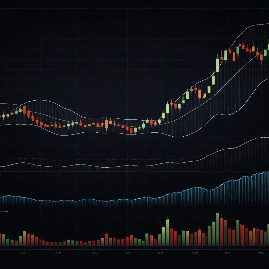
Volatility is the magnitude of price fluctuations over a specified period. Statistically, it is often represented by the standard deviation of returns or by range-based estimates. On charts, it manifests as the width of candlesticks, the size of intraday swings, and the distance between bands or channels that scale with recent price variability.
Risk is broader. It includes the chance of adverse price moves, uncertainty about the distribution of outcomes, and exposure to sudden or extreme events. Technical analysis does not assign preferences or recommend actions, but it does provide a language for describing risk visually. Sharp gaps, unusually large candles, or sustained increases in trading range point to conditions where outcomes are less predictable and where realized price paths can deviate materially from recent norms.
Volatility is not the same as risk, although they are related. A market can be volatile without trending, which increases uncertainty about short-horizon outcomes even if long-horizon direction is unclear. Conversely, a market can trend steadily with low day-to-day variance, yet risk can be high if the trend eventually reverses sharply or if liquidity conditions deteriorate. Technical charts make these distinctions tangible by revealing both the amplitude of price moves and the structure of the path.
How Volatility Appears on Charts
On a candlestick chart, higher volatility appears as taller candles and longer wicks. The intraday high and low separate more markedly, and price gaps become more frequent. Consolidations tend to show the opposite. Candles are shorter, ranges cluster tightly, and price advances or declines occur in smaller increments.
Several indicators translate these visual cues into measures that can be compared across time:
- Average True Range (ATR). ATR averages the true range of recent bars, where true range accounts for gaps between sessions by taking the maximum of the current high minus low, absolute high minus previous close, or absolute low minus previous close. A rising ATR indicates that typical price movement per bar is increasing.
- Bollinger Bands. These are set a defined number of standard deviations above and below a moving average. Band width expands during volatility increases and contracts during quiet periods. The degree of expansion provides a sense of how unusual current variability is relative to the recent past.
- Historical Volatility. Computed as the standard deviation of log returns over a lookback window, then annualized. While less common as a chart overlay, it is often plotted in a subpanel to summarize the dispersion of returns.
- Range-Based Estimates. Formulas such as Parkinson or Garman–Klass use daily highs and lows, with or without open and close, to estimate volatility with attention to intraday extremes. When displayed in subpanels, they complement close-to-close volatility measures.
Price structure also encodes volatility. Narrow trading ranges that persist across several bars suggest a compression regime. Sudden expansions in range, especially when accompanied by gaps and long wicks, often mark transitions to a higher variability regime. These regime shifts are important context for any interpretation of price action.
Risk on Price Charts
Charts display several dimensions of risk that relate to volatility yet are not identical to it:
- Gap Risk. Overnight or event-driven gaps reflect discontinuities in the price path. Even if ATR is moderate, repeated gaps indicate unstable liquidity or rapid repricing of information.
- Drawdown Potential. Persistent directional moves with minimal retracement illustrate path dependency. Low short-term volatility can coexist with high drawdown risk if the sequence of returns is one-sided.
- Tail Risk and Outliers. Occasional bars that dwarf recent ranges indicate fat-tailed behavior. Charts make these outliers visible in a way statistics can obscure when averages dominate.
- Liquidity Risk. Sparse volume, especially around key price levels, can coincide with sudden jumps between traded prices. Candles with wide spreads relative to volume may indicate thin market depth.
By distinguishing these elements on the chart, technical analysis helps articulate which aspect of risk is present. Volatility may be high because information is arriving rapidly, because liquidity is uneven, or because market participants are repricing correlations across assets. The chart often shows the combined effect.
Why Traders Pay Attention to Volatility
Volatility affects the reliability of patterns, the potential size of price swings over a given horizon, and the interpretation of signals derived from historical prices. High volatility widens the plausible range of near-term outcomes, which increases uncertainty and complicates inference from short samples. Low volatility narrows the range of outcomes, but it can also mask latent risks if the underlying drivers are building toward a structural change.
Volatility also influences transaction costs indirectly. Fast markets can produce slippage relative to quoted prices, and spreads may widen when market makers protect against inventory risk. While charts do not display the order book, the interplay between rapidly changing prices and volume bars conveys when these frictions are likely to be larger.
The Role of Volume in Interpreting Volatility
Volume measures the number of shares, contracts, or units traded during a period. When large ranges occur on high volume, the market is accepting the new price level through substantial participation. When ranges expand on light volume, the move may reflect thin liquidity or short-term dislocations. Both cases show higher volatility, but the interpretation of the underlying cause differs.
On the chart, volume appears as a histogram beneath price. Volume spikes aligned with wide candles indicate heavy activity during price discovery. A sequence of rising volumes across several bars combined with expanding ranges points to a sustained adjustment process. Conversely, shrinking ranges with falling volume often describe consolidation, although the interpretation depends on context and broader market conditions.
Volume-based overlays, such as a moving average of volume or volume profile along the price axis, can show where participation has historically concentrated. Low-volume price zones can be crossed quickly during revaluation. High-volume zones, sometimes called areas of acceptance, can slow price movement as orders find matches. Volatility tends to be higher in low-volume zones and lower near high-volume nodes, though this pattern is not universal.
Volatility Regimes and Clustering
Market volatility is not constant. It often clusters in time, with quiet periods followed by active bursts. This empirical regularity matters for chart interpretation. A low-volatility regime is likely to continue until a catalyst triggers a change. Similarly, an elevated volatility regime can persist as new information arrives and is assimilated.
Regime transitions are often visible as a shift from narrow, overlapping candles to wider, directional bars, or as a jump in ATR and band width accompanied by distinctive volume behavior. The persistence of these regimes affects expectations about the next bar’s range relative to the last few bars, without implying any view on direction.
Timeframe Dependence
Volatility depends on the time unit of measurement. Intraday bars can exhibit sharp moves that net to modest changes on a daily chart. As the sampling interval increases, some microstructure noise cancels out, and volatility scales in a way that often approximates the square root of time for diffusive moves. In practice, realized scaling can deviate from this rule, particularly during news events, gaps, or in markets that trade around the clock.
When comparing volatility across symbols or timeframes, percentage measures can be more informative than absolute point ranges. A 2 dollar move means something different in a 20 dollar stock than in a 200 dollar stock. Indicators like ATR can be expressed as a percentage of price to normalize across instruments.
Practical Chart Context: Examples
Example 1: Equity Index during a Macro Announcement
Consider a daily chart of a broad equity index around a major policy announcement. In the days leading up to the event, candles appear narrow and overlapping, and Bollinger Band width contracts. Volume drifts below its 20-day average as participants avoid taking large positions. On the event day, the index opens with a gap relative to the prior close, trades across a wide intraday range, and closes far from the open. ATR, computed on a 14-day lookback, begins to rise. Volume spikes well above the recent median.
The chart shows a clear shift from a low-volatility regime to a high-volatility regime aligned with a surge in participation. The interpretation is that new information forced a rapid repricing, with more uncertainty around short-term outcomes reflected in larger daily ranges.
Example 2: Single Stock around Earnings
On a daily chart of a large-cap stock, the week before earnings often shows a slow drift and narrowing of ranges as traders await guidance. Bollinger Bands pinch, and ATR ticks down. The earnings day features an opening gap and outsized candle on exceptional volume. Over the next several sessions, ranges remain elevated but begin to compress as the new information is absorbed and disagreement among participants declines. Band width expands initially, then gradually reverts toward the pre-event level.
The relevant point is not a trading instruction. It is that the volatility pattern and its volume signature help diagnose whether the market is still in discovery mode or has reached a provisional consensus.
Example 3: A 24-Hour Market during Low-Liquidity Hours
On an intraday chart of a continuously traded market, such as a major cryptocurrency pair, volatility often fluctuates with regional trading sessions. During certain hours, depth can be thinner and large orders can move price across several ticks more easily. The chart shows occasional long wicks and sporadic wide bars without corresponding volume spikes, followed by calmer periods when major centers open and depth rebuilds. ATR on shorter intraday windows reflects these cycles clearly.
In this setting, volatility is partly a function of liquidity conditions rather than new fundamental information. Distinguishing these drivers helps interpret whether a given wide-range bar indicates a lasting shift in valuation or a temporary imbalance.
Linking Volatility to Different Facets of Risk
From a technical perspective, volatility informs several risk-related questions. None of these imply a trading decision, but each shapes how a chart is read:
- Uncertainty of Near-Term Outcomes. A rising ATR or expanding bands indicate that the next bar’s high-low range is likely to be larger than in the recent past. The dispersion of outcomes increases, which affects how confidently one can interpret short sequences.
- Path Risk. A series of large directional bars without overlap shows path dependency. Even if the overall volatility is not extreme by historical standards, the path can still produce large intermediate drawdowns or run-ups.
- Gap and Event Risk. Markets that gap frequently carry discontinuity risk. Charts that show repeated gaps around specific calendar events indicate that overnight exposure can be materially different from intraday exposure.
- Liquidity and Execution Risk. Rapid price changes on thin volume reflect fragility. The same absolute move on heavy volume suggests broader participation and potentially more stable acceptance at new levels.
- Correlation Risk. During stress, cross-asset correlations can rise, and volatility can increase simultaneously across related instruments. While correlation is not directly visible on a single chart, synchronized volatility spikes across several charts often accompany systemic phases.
Indicators and Measures Used in Practice
Average True Range
ATR is a robust way to summarize how much price moves per bar, including gaps. It is computed by averaging the true range values across a lookback window, commonly 14 periods, though the choice depends on context. ATR does not indicate direction. A rising ATR during a decline means price is moving more each period, not that it will keep declining. On the chart, ATR is typically displayed in a subpanel and compared to its own history.
Bollinger Bands and Band Width
Bands set at, for example, two standard deviations above and below a moving average will expand as volatility rises and contract as it falls. Band width, defined as the upper band minus lower band relative to the moving average, is a convenient dimensionless measure. A visual pinch in bands often marks compression, while pronounced expansion signals an active volatility phase. The chart makes these transitions easy to spot without complex calculations.
Historical Volatility
Historical volatility takes a series of returns, computes their standard deviation, and scales the result by the square root of time to annualize. This measure is sensitive to the chosen window. Short windows react quickly to new information, while longer windows smooth noise at the cost of lag. On charts, historical volatility is often plotted as a line beneath price.
Volatility Indices
In equity markets, indices that track the implied volatility of options on broad benchmarks, such as the S&P 500, summarize the market price of expected variability. Although technical analysis focuses on realized price behavior, these indices provide useful context. Rising implied volatility typically coincides with wider ranges in the underlying index, but mismatches can occur when option markets and spot markets respond to different pressures.
Volume Patterns that Modify Interpretation
Volume gives texture to volatility. Several patterns occur frequently on charts:
- High-Volume Wide-Range Bars. These bars indicate intense participation during price discovery. If a sequence of them appears, the market is processing substantial information, and realized volatility will usually remain elevated until the process slows.
- Low-Volume Wide-Range Bars. These can signal thin liquidity rather than a broad change in valuation. The move may be easier to reverse if depth returns, although outcomes remain uncertain and can vary by instrument.
- Volume Droughts. Periods with consistently low volume often coincide with narrow ranges and band contractions. The chart shows reduced disagreement, but the apparent calm can break abruptly if new information arrives.
- Volume Climax. A single day or bar with exceptional volume and range can mark an inflection in participation. Whether it coincides with continuation or reversal is not determined by volume alone, but the spike reflects a transition in market activity.
Contextual Factors that Influence Volatility
Several external and structural elements shape volatility and risk as seen on charts:
- Event Calendars. Earnings releases, policy decisions, and economic data frequently coincide with volatility spikes. Pre-event compression and post-event expansion are common patterns.
- Market Hours and Session Overlap. Opening and closing auctions, as well as overlaps of regional sessions, often exhibit higher volatility and volume.
- Liquidity Cycles. End-of-quarter rebalancing, index additions or deletions, and holidays influence depth and participation, which in turn affect realized ranges.
- Product Microstructure. Futures with regular roll schedules, options with expiration cycles, or assets with varying tick sizes can show distinct volatility behaviors around those structural features.
Common Pitfalls in Reading Volatility and Risk
Several misinterpretations arise when volatility and risk are conflated or when indicators are applied without context:
- Equating Volatility with Direction. Volatility measures dispersion, not trend. Wide ranges can occur in both advancing and declining markets.
- Ignoring Regime Dependence. An indicator level meaningful in a quiet regime may be ordinary in an active one. Comparing values only to their own recent history improves interpretation.
- Using Absolute Instead of Relative Measures. Point ranges are hard to compare across instruments and price levels. Percentage or normalized measures are generally more informative.
- Overreacting to Single Outliers. A lone wide-range bar can be noise. Persistent changes in ATR, band width, and volume profiles indicate more durable shifts.
- Neglecting Liquidity Conditions. The same price move can carry different implications depending on depth, spreads, and participation, which are partially visible through volume behavior.
Bringing It Together on the Chart
To interpret volatility and risk coherently, read price range, the shape of candles, and the behavior of volume as a set. Compression phases are characterized by narrow ranges, overlapping candles, contracting bands, and often below-average volume. Expansion phases show the opposite. Transitions between these phases often align with catalysts that are visible on the calendar or with market microstructure dynamics such as session opens or closes.
Subpanels containing ATR or historical volatility help quantify what the eye sees. Band-based overlays visualize dispersion around a moving average. Volume bars and, if available, volume profile provide information about where trading concentrated. Together, these elements turn a chart into a map of variability and participation, which is the practical foundation for discussing risk in a technical framework.
Limitations of Chart-Based Volatility Measures
Chart-based measures are backward looking. They summarize what has happened over a chosen window and cannot, by themselves, forecast future volatility. The choice of parameters and lookback periods influences what is seen. Short windows react quickly but can whipsaw with noise. Long windows are stable but slow to recognize regime change.
Moreover, volatility is only one dimension of risk. Charts cannot fully convey risks that arise from leverage, financing terms, counterparty arrangements, or operational constraints. They also do not capture the opportunity cost of alternative allocations. Technical analysis is most informative when it is used as a descriptive lens alongside other sources of information.
Reading Volatility in Multi-Asset Context
Volatility frequently moves together across related markets. Equity volatility often rises with credit spreads, currency volatility can spike when interest rate uncertainty climbs, and commodity volatility can surge around supply shocks. When several charts display simultaneous expansions in range and volume, it suggests a broad risk environment rather than an idiosyncratic event. Recognizing this context helps explain why a single instrument’s volatility may have increased even in the absence of news specific to that instrument.
Percentage vs Point Volatility
For instruments with large price differences, comparing point ranges can be misleading. A 5 point move in a low-priced instrument is not comparable to a 5 point move in a high-priced one. Normalizing by price converts ranges into percentage terms. Many charting platforms allow ATR to be expressed as a percentage of price, or for bands to be interpreted relative to the moving average. This improves cross-sectional comparisons and historical analysis within the same instrument as its price level changes over time.
Putting Volume and Volatility into Historical Perspective
Historical context matters. What counts as high volatility in a quiet year may be low in a crisis year. Charts that overlay long-term ATR percentiles or band width percentiles can anchor the current reading within a broader distribution. Similarly, volume can be contextualized with moving averages or percentile ranks to distinguish routine fluctuations from exceptional bursts.
Practical Reading Checklist
The following checklist summarizes a practical, chart-based reading of volatility and risk without implying any action:
- Is ATR rising or falling relative to its recent range, and how rapidly
- Are Bollinger Bands or other dispersion bands expanding or contracting
- Do candles show long wicks, gaps, or sequencing of wide-range bars
- How does current volume compare to its moving average or historical distribution
- Are wide ranges occurring in low-volume price zones or near high-volume nodes
- Are events, session opens, or structural features coinciding with regime shifts
Key Takeaways
- Volatility measures the magnitude of price fluctuations, while risk is a wider concept that includes uncertainty, drawdowns, gaps, and liquidity constraints.
- Charts reveal volatility through candle size, gaps, and indicator behavior, and they express risk through path features such as persistence of directional moves and outliers.
- Volume provides essential context, distinguishing broad participation in price discovery from moves that occur in thin liquidity.
- Volatility clusters in regimes. Transitions between compression and expansion are visible through changes in ATR, band width, and volume patterns.
- Chart-based measures are descriptive and parameter dependent. They help interpret market behavior but do not forecast outcomes or prescribe actions.