Volatility is one of the market’s fundamental states. A high volatility environment is not defined by direction, but by the magnitude and speed of price changes. In technical analysis, this environment is visible in wide ranges, rapid swings, frequent gaps, and a collective behavior of indicators that signals unusually large dispersion in returns. Understanding what constitutes a high volatility environment, and how it shows up in both price and volume, improves a chart reader’s interpretation of market behavior without prescribing any particular course of action.
Defining a High Volatility Environment
A high volatility environment is a regime in which the dispersion of returns increases materially relative to a prior baseline. The baseline is usually defined statistically, for example using rolling standard deviation, average true range, or other range-based volatility estimators. In practice, analysts often characterize a regime shift when realized volatility rises to a high percentile of its own recent distribution. For instance, a market whose 20-day realized volatility jumps from its median to the 90th percentile has likely entered a high volatility state.
Two points help anchor the definition:
- Relative, not absolute. Volatility is evaluated against recent history or a comparable regime. A 2 percent daily range may be routine in one asset but unusual in another.
- State, not direction. High volatility does not imply rising or falling prices. It describes the width of the distribution of returns and the frequency of outsized moves in either direction.
Technical analysis treats volatility as a property that clusters. Periods of high volatility tend to follow other high volatility periods more often than would be expected by chance. This clustering gives the concept practical relevance for interpreting chart patterns and indicator behavior.
Volatility in Technical Terms
Several measures appear routinely on charts and dashboards. Each offers a different window into the same phenomenon.
- True Range and Average True Range (ATR). True range captures the largest of three distances for a bar: high minus low, high minus previous close, or previous close minus low. ATR aggregates true range over a rolling window, often 14 periods, to show typical bar size. Rising ATR is one of the clearest signatures of a high volatility environment on any timeframe.
- Historical or realized volatility. Computed from past returns, often annualized standard deviation. It can be shown directly on a secondary panel or implicitly through bands and channels.
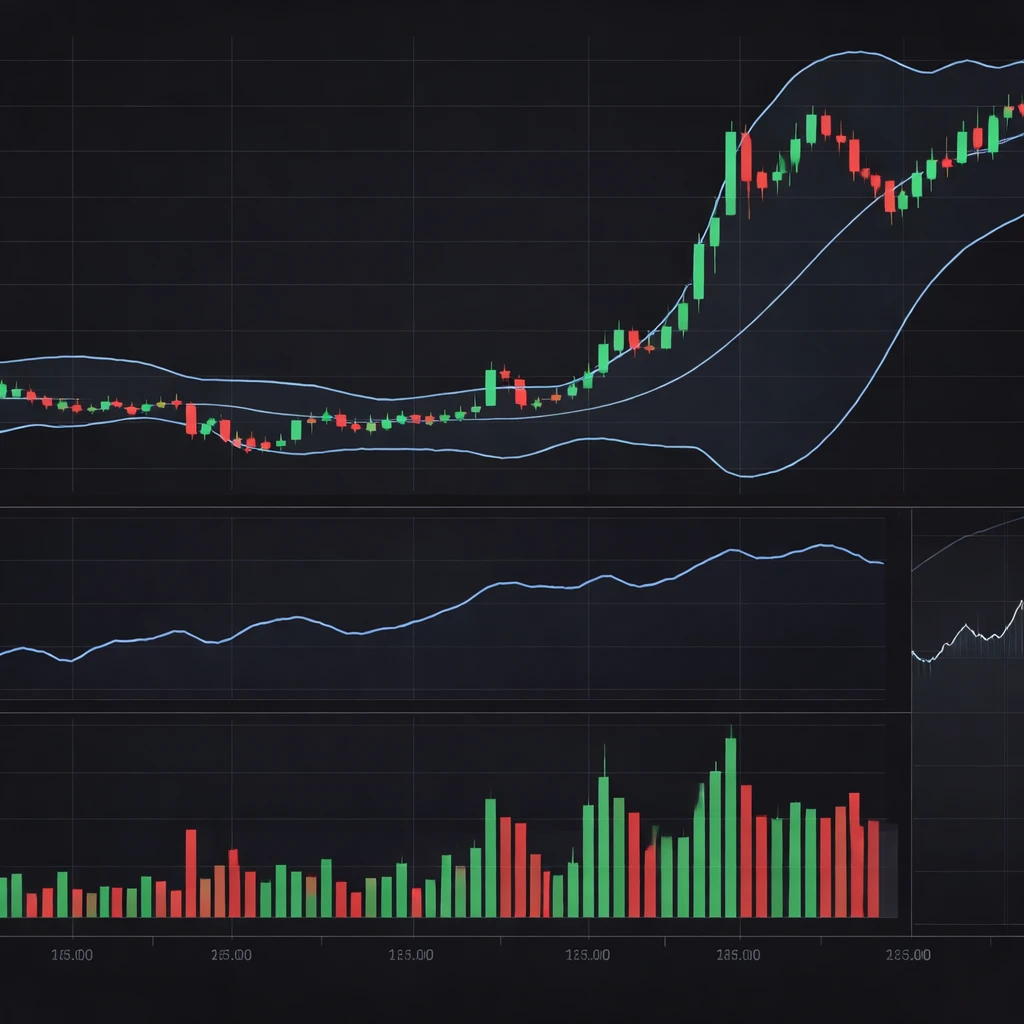
- Band or channel width. Bollinger Band width and Keltner Channel distance scale with volatility. A rapid expansion in band width typically marks a transition into high volatility.
- Implied volatility for options. In index and equity markets, proxies such as the VIX or individual equity implied volatility rise when option prices embed larger expected moves. Although implied volatility is not the same as realized volatility, spikes in implied measures often accompany or slightly lead realized volatility upswings.
While the exact choice of metric varies, these indicators aim to answer the same question: how unusual are current ranges and returns compared with recent behavior in the same instrument.
How High Volatility Appears on Charts
High volatility is visible to the naked eye even before calculating indicators. Several visual cues tend to appear together:
- Longer candles or bars. The distance between high and low expands. In candlesticks, bodies may be large, and wicks often lengthen as intrabar reversals increase.
- Frequent gaps. Overnight or session-to-session dislocations become more common, especially around news or macro events.
- Greater bar overlap. Successive bars may overlap strongly as price surges and snaps back within the same session. This overlap increases intraday noise and short-term whipsaw on lower timeframes.
- Accelerating swings. Price moves traverse prior support or resistance zones quickly, reflecting faster price discovery and wider uncertainty bands.
Overlaying indicators reinforces the picture. ATR rises sharply. Bollinger Bands expand and may bulge outward as price traverses multiple standard deviations in a short span. Keltner Channels widen. On multi-asset dashboards, implied volatility indices jump. In many charts the average divergence between price and a moving average increases, and deviations from a volume-weighted average price become larger and more persistent within the session.
Timeframe Considerations
High volatility is scale dependent. A multi-day sideways drift can conceal intense turbulence on a one-minute chart, while a daily chart can shift into a high volatility regime even if 5-minute bars appear orderly. Analysts therefore reference volatility at the decision timeframe and also observe a higher timeframe to understand whether the lower timeframe turbulence is part of a broader regime shift.
The Role of Volume in High Volatility Environments
Volume and volatility are closely related. In many markets the absolute value of returns correlates positively with trading volume. This relationship reflects several mechanisms that are visible on charts:
- Volume spikes on large moves. Wide-range bars often coincide with volume surges as more participants update positions and new information is incorporated into prices.
- Redistribution across prices. Volume accumulates at multiple distinct price levels within the same session, creating a more fragmented volume profile. Gaps between high-volume nodes can widen, a sign that liquidity is thinner between levels where trading concentrates.
- Execution frictions. Although not always shown directly on charts, bid-ask spreads tend to widen during high volatility, and depth at the best quotes thins. Some charting platforms approximate this through metrics such as volume at price, tick imbalance, or footprint-style displays, which often show uneven trade clustering.
- Event-linked participation. Scheduled announcements such as earnings or macro releases temporarily elevate both volume and volatility around the event window. On intraday charts the clustering is visible in tightly bounded time slices.
There are notable exceptions. In less liquid instruments, volatility can rise without a proportionate increase in reported volume, particularly when price gaps occur on limited participation. Interpreting such cases requires caution, since volatility driven by a lack of liquidity differs from volatility driven by active two-sided trade.
Why Technical Analysts Pay Attention
High volatility changes the informational content of price moves and the reliability of many familiar signals.
- Faster price discovery. Prices incorporate information quickly. Breaks of prior ranges occur more often and travel further. What appears as a routine breakout in a low volatility regime can become a multi-standard-deviation extension in a high volatility regime.
- Indicator behavior shifts. Oscillators can remain pinned near extremes. Moving averages may lag visibly, and crossovers can occur more frequently due to noisy fluctuations. Band-based signals expand and can hold price near the band edges for longer.
- Support and resistance dynamics. Levels may be overrun more readily. Retests often occur sooner and with larger overshoots, which complicates the interpretation of level-based reactions.
- Execution conditions. Slippage and spread costs typically increase. On charts this cannot be seen directly unless using high-resolution tick data, but the footprints show up as price skipping levels and printing wider spreads between transaction clusters.
- Risk quantification. Many position and margin frameworks scale with volatility. Even when not applied mechanically, larger ranges imply greater uncertainty about near-term path and terminal outcomes, which changes how analysts interpret the significance of a single bar or a single day.
Practical Chart-Based Contexts and Examples
Several recurring contexts tend to produce high volatility environments. The aim here is descriptive, not prescriptive, focused on what appears on charts.
Macroeconomic or Policy Announcements
On intraday charts of major currency pairs, a central bank decision window often displays compressed activity followed by a burst of range expansion. Typical signatures include a sudden widening of a one-minute ATR, multiple consecutive long candles, and a rapid increase in relative volume compared with the prior hour. Bands widen quickly and remain wide for a period, while price can overshoot and then retest earlier levels as the market assimilates the new information.
Earnings Releases in Equities
Individual stocks commonly show a gap at the next open after an earnings release. The daily chart reveals a large gap relative to the 20-day average true range, followed by a session where intraday ranges are two to three times the recent average. Volume on the earnings day typically ranks among the highest percentile for the quarter. Bollinger Band width expands sharply, and the distance from price to a 20-day moving average increases. The subsequent sessions often retain elevated ATR even if price settles into a narrower directional move, indicating that the volatility regime has shifted at least temporarily.
Systemic Stress Episodes
During broad market stress, such as the early stages of a financial crisis or a global shock, index charts show simultaneous surges in realized and implied volatility. The daily ATR climbs, the VIX or other implied measures spike, and gaps appear more frequently across sectors. Volume expands across the board. On many days intraday charts feature multiple two-sided swings that each exceed the prior week’s average daily range. This clustering is a hallmark of a high volatility environment and can persist for weeks.
Hypothetical Walkthrough: Daily Index Chart
Consider a broad equity index on a daily chart. For the prior two months, the 14-day ATR hovered around 1 percent of price, and Bollinger Band width remained tight. Over four sessions, the index posts back-to-back large candles with a combined move of 6 percent, and the 14-day ATR climbs to 2.2 percent of price, which is the 90th percentile of the past year. Band width doubles. Volume prints the three highest days of the quarter. On the subsequent week, daily ranges remain elevated, though closes alternate between gains and losses. The technical interpretation is that the market has entered a high volatility state, evidenced by sustained ATR expansion, greater band width, and persistent high volume, regardless of net direction.
Hypothetical Walkthrough: Intraday Futures Chart
On a 5-minute chart of a liquid futures contract around a monthly employment report, pre-release candles are narrow with low relative volume. Upon release, the next five bars expand to three times the pre-release range, and the 20-period 5-minute ATR spikes. Volume per bar triples. Price overshoots the prior day’s high, then snaps back to test the opening range. Over the next hour, Bollinger Bands remain wide, and deviations from a session VWAP are larger than the prior week’s average. The chart communicates an unmistakable high volatility environment tied to a scheduled information event.
Indicator Views That Highlight High Volatility
Analysts often combine a few simple tools to make high volatility states more transparent on the chart:
- ATR panel with percent-of-price scaling. Expressing ATR as a percent of closing price normalizes the measure across levels, which is useful for long trending series where absolute ranges rise over time due to price level effects.
- Bollinger Band width percentile. Plotting band width along with a rolling percentile helps differentiate routine expansions from regime-level expansions.
- Relative volume (RVOL). Comparing current volume to the median volume for the same session window, such as the last 20 days at 10:30 a.m., highlights whether participation is unusual alongside range expansion.
- Implied versus realized comparison. For options-linked assets, a panel showing implied volatility against realized volatility can indicate whether options markets are embedding more or less movement than has recently occurred on the tape.
These additions do not dictate decisions. They clarify context so that the chart reader can avoid attributing ordinary significance to moves that are statistically uncommon, or misreading unusual volatility as a directional signal.
Interpreting Price Structure Under High Volatility
Several structural features of price action change meaningfully when volatility is high:
- Trend persistence versus mean reversion may both intensify. Price can travel further without pausing, and snap-back moves can also become sharper. The dispersion of outcomes widens on both tails, which complicates inference from a single bar break or a routine pattern.
- False breaks and overshoots proliferate. A level that holds in low volatility can be exceeded by a larger margin before price responds. Visual patterns that rely on tight boundaries may lose reliability, at least temporarily.
- Time aggregation matters more. A five-minute overshoot that looks dramatic may compress into an ordinary wick on the hourly chart. Without multi-timeframe context, the analyst risks overinterpreting noise.
The key interpretive point is to recalibrate expectations for how far price can move within a bar or a day when volatility is high. A move that would have been very unusual last month may be routine today if the regime has shifted.
Measurement Choices and Practical Nuances
Defining a high volatility environment involves choices that influence conclusions:
- Lookback windows. Short lookbacks react quickly but can confuse temporary noise with a regime shift. Longer windows smooth noise but respond slowly to rapid transitions.
- Linear versus logarithmic scales. On long price histories, absolute ranges tend to increase with price level. A log scale supports more consistent visual judgment. Complementing the chart with percent-of-price ATR guards against scale illusions.
- Range-based versus return-based measures. ATR emphasizes intrabar extremes, which is useful when gaps or large wicks dominate. Standard deviation of closes captures close-to-close variability, which can be smaller than intraday ranges in gap-heavy environments.
- Sampling frequency. Switching between daily and intraday data can change conclusions about when the regime began. Reporting conventions, such as session boundaries, also matter for futures and global assets.
Common Pitfalls in Reading High Volatility
- Equating volatility with trend. Large ranges can occur in sideways markets and in strong trends. Volatility is the width of the distribution, not its mean.
- Overreliance on a single metric. ATR, band width, and realized volatility can diverge in the short run. Using only one can miss relevant context, such as gap-driven moves that elevate ATR more than close-to-close volatility.
- Ignoring liquidity conditions. Some high volatility days reflect thinning liquidity rather than a genuine surge in participation. Volume, depth measures, and gap frequency help distinguish the two.
- Static thresholds. Fixed cutoffs, such as treating a certain ATR level as always high, can mislead across regimes and instruments. Rolling percentiles adapt more effectively.
- Post-hoc pattern fitting. It is easy to rationalize ex post what high volatility “meant.” Analysts should document objective measures and avoid drawing strong conclusions from a few dramatic bars.
Multiple Timeframe Context
High volatility at the lower timeframe often occurs inside a higher timeframe consolidation, and vice versa. A structured approach to context can help the analyst keep these layers straight:
- Top-down perspective. Identify whether the higher timeframe is in a calm or turbulent state using its own ATR or band width. Then evaluate how the lower timeframe’s volatility compares to its own history.
- Rolling cross-timeframe percentiles. For a daily chart, annotate the intraday ATR as a percentile of the last month’s intraday ATR readings. For a weekly chart, show the daily ATR percentile. This quantifies whether today’s turbulence is unusual for the timeframe that matters.
Regime Transitions and Persistence
Volatility tends to cluster. After a shock that pushes volatility higher, it often remains elevated for a time before gradually declining. On charts this shows up as a plateau in ATR or sustained band width rather than an immediate reversion to calm. Identifying transitions can be approached with simple thresholds or change-point ideas, for example when ATR percent-of-price exceeds a high percentile and remains there for several bars. The goal is not to forecast the duration, but to recognize that the environment has changed and that price behavior, including the reliability of familiar patterns, may differ as a result.
Documenting High Volatility in a Chart Journal
Many analysts annotate charts with a few standardized context tags such as the current ATR percentile, band width percentile, and a relative volume measure. Screenshots taken during and after a high volatility episode provide a reference library of how the market typically looks during such regimes. Over time, these references reduce the temptation to treat a large bar as unique when it may be a common feature of turbulent phases.
Limitations of Chart-Based Volatility Assessment
Charts capture the realized path and can approximate participation through volume, but they do not reveal full order book conditions or off-exchange activity. Nor can they distinguish between information-driven volatility and volatility from mechanical flows such as index rebalancing. As a result, visual inference should be supplemented with an awareness of market structure, scheduled events, and, where relevant, cross-asset signals that contextualize the movement.
Key Takeaways
- High volatility environments are defined by unusually large and rapid price movements relative to recent history, not by direction.
- On charts, they appear as wide ranges, frequent gaps, expanded ATR, widened bands, and often elevated volume.
- Volume typically rises with volatility, but illiquid conditions can produce high volatility with limited participation, which requires careful interpretation.
- Indicator behavior changes materially in high volatility, and common patterns may overshoot or whipsaw more than in calm regimes.
- Objective, percentile-based measures and multi-timeframe context help distinguish transient noise from genuine regime shifts.