A market trend is one of the foundational ideas in technical analysis. It captures the directional tendency of price over a defined observation window and organizes otherwise noisy fluctuations into a coherent narrative. Understanding what constitutes a trend, how it appears on charts, and how it interacts with basic market structure can help an analyst describe price behavior with clarity and restraint. The goal is not to predict, but to recognize and classify what the market is doing now and how that behavior has evolved.
Defining a Market Trend
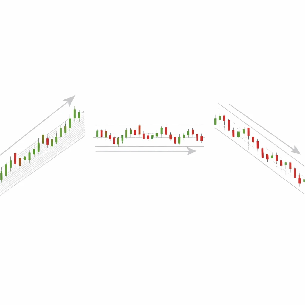
A market trend is a sustained directional bias in price over a specified timeframe. This bias is observed in the sequence of price swings rather than in isolated ticks or one-day moves. Three basic trend states are typically identified:
- Uptrend: price advances in a sequence of higher highs and higher lows.
- Downtrend: price declines in a sequence of lower highs and lower lows.
- Sideways or range: price oscillates without consistent new highs or lows, often between identifiable boundaries.
The definition is inherently contextual. Trends exist only with respect to a timeframe, which acts as the lens through which swings are judged. A persistent intraday rally can coexist with a broader weekly decline. Analysts therefore specify both direction and timeframe when describing a trend.
A trend is not the same as a single impulse. It is a pattern that persists across multiple swings. Minor counter-moves occur in every trend. These counter-moves do not negate the trend unless they shift the sequence of major swing points. For example, in an uptrend the first lower low relative to a prior swing low can mark a potential change in state, though more evidence is often needed to confirm the transition.
How Trends Appear on Charts
Charts make trends visible by displaying the relationship between successive swing highs and swing lows. Price swings are waves within the larger sea of market activity. In an uptrend, the impulsive legs that carry price to new highs tend to be longer or faster than the corrective pullbacks. The inverse holds for downtrends. Sideways conditions show overlapping swings with little net progress.
Several visual elements commonly used to describe trend are worth noting. They are descriptive tools rather than mechanistic rules:
- Trendlines can be drawn under swing lows in an uptrend or above swing highs in a downtrend as a way to highlight slope and rhythm. These lines do not define the trend by themselves, but they summarize structure in a single stroke.
- Channels pair two roughly parallel lines that contain much of the price action. Channels often capture the corridor within which an uptrend or downtrend unfolds.
- Moving averages smooth prices to reveal the underlying drift. When price holds persistently above a rising average, it communicates a bullish bias. When price persists below a falling average, the bias is bearish. The moving average is not the trend, but it offers a compact summary of recent direction and persistence.
These elements are aids to perception. They do not guarantee continuity of behavior. A line can be broken without a genuine structural shift, and an average can flatten temporarily while the broader trend remains intact.
Trend and Market Structure
Market structure refers to the arrangement of swing highs, swing lows, consolidation areas, and breakouts that together form the scaffolding of price action. Trend is the directional expression of that structure. The two ideas are inseparable.
In an uptrend, market structure exhibits a sequence of higher lows that act as candidate support and higher highs that represent progress. When a pullback forms a higher low and price subsequently rises to a higher high, the structure appears healthy. If a pullback breaches a prior swing low with authority, analysts often mark that event as a possible break in structure. It can signal a transition to a range or the early stage of a downtrend.
In a downtrend, the logic is mirrored. Lower highs and lower lows dominate. If a rally exceeds a prior swing high and attracts follow-through, that event can mark a structural change. Once again, context matters. A brief overshoot without continuation can leave the downtrend in place. The structure must be evaluated as a whole, not from a single bar or spike.
Timeframe Dependence and the Fractal Character of Trends
Trends are scale dependent. The same instrument can be rising on the daily chart while declining on the 15-minute chart. This is not a contradiction. Different sampling intervals emphasize different parts of the price path. Shorter intervals highlight microstructure, including noise and liquidity effects. Longer intervals compress smaller swings and reveal broader regimes.
This layered character is sometimes described as fractal, meaning similar patterns appear across multiple scales. The pattern is not strictly self-similar in a mathematical sense, but the principle stands. Analysts often reconcile multiple timeframes by letting a higher timeframe define the primary bias and a lower timeframe describe the path within that bias. The operative point is that any discussion of trend should include the timeframe used to assess it.
Anatomy of Trend: Impulses and Corrections
Every trend alternates between impulsive legs and corrective phases. Impulses travel in the direction of the prevailing trend. Corrections retrace part of that progress. The character of corrections offers useful descriptive information. Shallow, brief pullbacks can signal strong participation in the trend. Deep, overlapping pullbacks suggest a more fragile or mature state.
A helpful way to describe a trend is to note the relative length and time of each leg. For example, in a healthy uptrend, up legs may travel 4 percent in five sessions on average, while pullbacks retrace 2 percent in three sessions. If that relationship begins to invert, with pullbacks that are longer and faster than advances, the structure may be deteriorating even if higher highs have not yet been abandoned.
Why Analysts Pay Attention to Trends
Trends simplify interpretation. A clear directional bias reduces the complexity of price behavior into a manageable description. This conceptual clarity matters for several reasons:
- Context: trend offers a reference frame for evaluating new information. The same news can produce different price responses depending on whether the market is trending or ranging.
- Risk framing: understanding direction and volatility helps analysts assess how far price tends to move before reversing. That can inform risk discussions and scenario planning without implying any specific action.
- Noise filtering: trend recognition reduces the temptation to overreact to minor fluctuations that do not alter market structure.
- Communication: trend language standardizes discussion across teams and reports. Phrases such as higher highs and break of prior swing low are unambiguous when properly defined.
Practical Chart-Based Context
Example 1: A Developing Uptrend
Consider a daily chart where price rises from 100 to 118 over several weeks. The path is not linear. Price advances from 100 to 107, pulls back to 104, then rallies to 112, pulls back to 110, and climbs again to 118. The swing lows at 104 and 110 are higher than the origin, and the swing highs at 107, 112, and 118 step upward in sequence. The trend can be described as up on the daily timeframe.
An analyst might also observe that each pullback was brief and held above a rising 50-day average. The moving average does not cause the trend, but it visually confirms the persistence of upward drift. The angle of ascent is moderate rather than parabolic, which suggests participation is broad and periodic profit-taking is being absorbed without a change in structure.
Example 2: A Weakening Downtrend
On another chart, price declines from 75 to 60 with lower highs and lower lows. Initially, down legs are long and fast, while rallies are short. Later in the sequence, a rally carries price from 61 to 66, exceeding a prior swing high at 65. That event invites a reassessment. It does not automatically reverse the trend, but it marks a break in the prior pattern of lower highs. If price then forms a higher low near 63 and advances again, analysts would describe the downtrend as compromised and possibly transitioning toward a range or an emerging uptrend.
Notice that this description relies on the structure of swings, not on the presence or absence of any particular indicator or pattern. The shift emerges from the price path itself.
Example 3: Sideways Range and Failed Breakouts
Imagine price oscillating between 48 and 52 for several weeks. Attempts to break above 52 are quickly rejected and return to the middle of the range. Dips below 48 produce similar rejections. The sequence of highs and lows is overlapping and does not progress. In this state, trend is best described as neutral. When a genuine breakout does occur, it is typically accompanied by a change in the character of swings. If price breaks above 52 and then finds support on a pullback near that level, the prior ceiling may have become a floor. The label changes from range to uptrend when a series of higher highs and higher lows is established.
Distinguishing Trend from Noise
Financial prices are noisy. Short-term movements reflect changes in liquidity, order flow, and microstructure that do not necessarily carry information about broader direction. Distinguishing trend from noise requires simple but consistent filters.
One approach is to define a minimum swing threshold. A swing high or low is recorded only if price reverses by more than a specified amount, perhaps a fixed percentage or a multiple of recent average true range. This procedure removes minor wiggles and highlights meaningful turns. Another approach is to use a rolling linear regression line and observe its slope. A consistently positive slope with small residual variance indicates a stable uptrend over the window used for regression. A flat slope with large variance suggests a range.
These techniques do not predict what will happen next. They organize what has already occurred into a tractable summary. That summary can then be monitored for change.
Common Misconceptions about Trends
Several misconceptions recur in discussions of trend:
- Trendlines define the trend. In reality, trendlines are descriptive. They can be drawn in different but reasonable ways on the same chart. The sequence of swing highs and lows is the primary evidence.
- Trends must be smooth. Many strong trends include sharp counter-moves. Volatility and trend are not mutually exclusive.
- Every trend change requires a named pattern. Some transitions are abrupt and do not fit classical shapes. A simple violation of a prior swing benchmark can be sufficient to mark a structural change.
- Indicators create trends. Indicators summarize past price action. They are useful for measurement but do not add information beyond the price path and the window over which they are calculated.
- All timeframes must agree. Conflicting trends across timeframes are normal. The appropriate description depends on the horizon being studied.
Measuring and Describing Trend Strength
Analysts often complement visual assessment with measurements that quantify attributes of a trend. Several descriptive measures are commonplace:
- Rate of change: the percentage change over a fixed number of periods. Larger positive values are associated with stronger uptrends, negative values with downtrends.
- Regression slope: the slope of a rolling least squares fit to price or log price, which captures average directional drift over the window.
- Persistence ratio: the fraction of periods that close in the direction of the trend. A high fraction during advances and a low fraction during declines can indicate sustained pressure.
- Swing symmetry: comparison of the size and duration of impulses and corrections. Asymmetry in favor of the prevailing direction suggests robust structure.
- Volatility-adjusted momentum: rate of change scaled by recent volatility to highlight whether movement is large relative to noise.
These measures help document what the chart suggests to the eye. They also provide a basis for consistent descriptions across different instruments and timeframes.
Trend Transitions and Regime Shifts
Trends do not persist indefinitely. Markets rotate through broad regimes often characterized as accumulation, markup, distribution, and markdown. During accumulation, price builds a base, often a range with higher lows appearing gradually. Markup corresponds to an uptrend in which demand overwhelms supply, and prices achieve a series of higher highs. Distribution mirrors accumulation at the top end of a cycle, as supply meets and eventually overtakes demand. Markdown is the associated downtrend.
Transition points can be subtle. Early warnings include loss of momentum, deeper and more overlapping pullbacks, and failure of breakouts to persist. A decisive break of a key swing level is more concrete evidence. Even then, the first break can become a whipsaw if it is not followed by continuation. Good description recognizes both the event and the quality of the follow-up.
Limitations and Sources of Error
Trend analysis is subject to several limitations. The identification of swing points involves judgment, especially in real time. Different analysts may mark different swings, which can lead to different trend labels on the same chart. Hindsight bias is common, because trends look obvious after the fact. In real time, competing interpretations are plausible.
Data frequency can also distort perception. Very short intervals magnify noise and can create illusory micro-trends. Very long intervals can obscure important transitions. The chosen window for any smoothing or regression procedure influences the conclusion. Analysts should be aware that conclusions about trend carry the imprint of the tools used to detect it.
Finally, markets are influenced by discrete events such as policy announcements, earnings shocks, or liquidity breaks. These events can produce gaps and rapid reversals that do not fit prior structure. A description of trend is always provisional and contingent on new information.
Studying Market Trends without Trading Rules
One productive way to internalize the concept of trend is to study historical charts with a consistent annotation method. The objective is to describe, not to signal. A simple process can build discipline and reduce ambiguity:
- Select a timeframe and stick to it for the duration of the exercise, for example daily bars for one instrument across one year.
- Mark swing highs and swing lows according to a predefined threshold, such as a minimum percentage reversal or an average true range multiple.
- Label each segment as impulsive or corrective based on direction relative to the current trend label.
- Record when a prior swing level is broken and note whether continuation follows. Distinguish between decisive breaks and fleeting overshoots.
- Summarize each month with a brief paragraph that states the trend, the evidence, and any changes.
This practice builds a library of examples that clarify how trend and structure interact across different conditions. Over time, the process teaches restraint, because it reveals how often apparent changes fail to persist and how valuable it is to wait for structure to resolve.
Putting It All Together
A market trend is a directional tendency identified through the arrangement of swing highs and lows on a specified timeframe. It appears on charts as a sequence of impulses and corrections that, taken together, achieve progress in one direction or else oscillate within a range. Trend and market structure are tightly linked, because the structure of swings provides the evidence from which the trend is inferred.
Analysts pay attention to trends because they organize complexity into a manageable description, improve communication, and provide context for risk discussions. Trends vary across timeframes and shift through phases. Tools such as trendlines, channels, moving averages, and regression can assist, but none replace the primary evidence of price structure. Recognizing the limits of the concept, and the possibility of error in real time, is part of rigorous analysis.
Key Takeaways
- A market trend is a sustained directional bias in price, defined with respect to a specific timeframe and evidenced by the sequence of swing highs and lows.
- Uptrends show higher highs and higher lows, downtrends show lower highs and lower lows, and ranges show overlapping swings without progress.
- Trend description relies on market structure, including impulses, corrections, and breaks of prior swing levels, not on any single indicator.
- Trends are scale dependent and can differ across timeframes, which makes explicit timeframe labeling essential.
- Trend analysis is descriptive rather than predictive and should be applied with awareness of noise, event risk, and the limits of real-time interpretation.