Overview
Multiple timeframe structure refers to the organized way trend, range, and market structure features align or conflict across different chart horizons. Price draws a nested pattern of swings that repeat at different scales. A rally on a five-minute chart may be a minor countertrend move within a daily pullback that forms part of a weekly uptrend. Reading those layers together is the essence of multiple timeframe structure. The goal is to interpret context rather than to predict a specific path.
Analysts use this concept to situate current price action within a larger backdrop. It can clarify whether the market is trending or consolidating on a higher timeframe, whether a lower timeframe move is impulsive or corrective in that context, and where important swing points reside. It does not require a particular indicator. It is primarily a structured way of mapping swing highs and lows, range boundaries, and transitions between regimes at more than one timeframe.
Core Definition
Multiple timeframe structure is the set of relationships among trends, ranges, and swing points observed simultaneously on at least two chart horizons, commonly organized into higher, intermediate, and lower timeframes. Each timeframe carries its own definition of trend and structure, yet those patterns are linked. The higher timeframe provides the primary directional context and major reference levels. The intermediate timeframe refines that context into actionable detail, such as the internal phases of a pullback or base. The lower timeframe exposes the microstructure by which transitions unfold, including the sequence of minor higher highs and higher lows or their failure.
This definition implies three practical ideas. First, the pattern is fractal, which means similar forms appear at different scales. Second, no single timeframe is complete on its own. Third, structural signals gain or lose significance depending on their position relative to structures on the next higher timeframe.
How Structure Appears on Charts
On any chart, market structure is usually described through swing points and their sequence. A higher high forms when price exceeds the previous swing high. A higher low forms when the next reaction low stays above the prior low. A trend is a persistent sequence of such events. A range is a sustained oscillation between roughly stable highs and lows. Breaks of structure occur when price moves through a prior key swing, often marking a potential phase change.
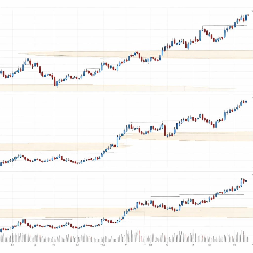
When more than one timeframe is considered, the same features repeat with different granularity. The higher timeframe pattern is slower to change and is built from many lower timeframe swings. The lower timeframe often expresses the higher timeframe move through impulsive legs and corrective pauses. On charts this appears as a staircase effect. A weekly uptrend may look like a series of expanding impulse legs, while the daily chart shows the advance as a sequence of shorter pushes separated by pullbacks. The intraday chart shows those pushes decomposed into smaller waves, micro ranges, and tests of intraday support and resistance.
Important details become visible only when layers are compared side by side. A daily pullback that seems ambiguous can be clarified by noting whether the weekly trend remains intact and where the weekly swing low resides. Likewise, a sharp intraday rally may have less structural meaning if it remains inside a larger daily range.
Why Analysts Pay Attention
Analysts study multiple timeframe structure for several reasons:
- Context: The higher timeframe often sets the dominant regime and key levels that shape expectations for volatility and the likelihood of continuation or transition.
- Signal quality: A structural event that aligns with the higher timeframe, such as a break above an intermediate swing high in a weekly uptrend, is often interpreted differently from the same event occurring against that backdrop.
- Location: Structure highlights where price is relative to prior highs, lows, ranges, and consolidation areas. Location helps frame whether current movement is occurring near inflection areas or in open territory.
- Risk concentration: Major swing points on higher timeframes tend to gather attention. Understanding their placement helps explain why some zones see abrupt acceleration, gap risk, or liquidity vacuums.
- Communication of process: Multiple timeframe mapping creates a common language for documenting analysis. This aids discipline and reduces ambiguity when describing market conditions.
Fractal Relationships and Degree of Trend
Price does not move in a straight line. It forms alternating impulse and corrective phases across scales. This nested structure is sometimes described in terms of degree. A weekly uptrend can contain daily pullbacks and intraday ranges. The key is the relative weight of each layer. Higher timeframes carry more structural weight because they aggregate more information and are slower to change. Lower timeframes provide timing context and reveal the mechanics of how a higher timeframe leg progresses or stalls.
Analysts often observe that structure tends to compress and expand. During compression, ranges contract across several timeframes, and the market shows overlapping bars and failed follow-through. During expansion, directional legs lengthen, and breakouts sustain with less overlap. Recognizing whether compression or expansion dominates across multiple horizons helps interpret whether current action is building pressure or releasing it.
Building a Timeframe Stack
There is no single correct set of timeframes. The choice depends on the instrument and the analytical objective. A common stack uses a higher timeframe for strategic context, an intermediate timeframe for operational context, and a lower timeframe for microstructure. For example:
- Higher timeframe: weekly or monthly chart for primary trend and major levels.
- Intermediate timeframe: daily chart for phases within the higher trend, such as pullbacks, bases, or distribution ranges.
- Lower timeframe: intraday chart, such as 240-minute or 60-minute, for the internal swings that compose the daily phase.
All three are examined together. The higher timeframe identifies the dominant state. The intermediate timeframe shows whether the market is trending, ranging, or transitioning within that state. The lower timeframe reveals detail about tests of support or resistance, minor breaks of structure, and the pace of movement.
Reading Alignment and Conflict
Alignment occurs when the direction of trend and the sequence of swings point the same way across layers. Conflict occurs when they do not. Chart readers look for these conditions to interpret the maturity of a move and the likelihood of erratic behavior.
Alignment example: The weekly chart prints higher highs and higher lows. The daily chart pulls back into prior daily support and then resumes with a higher high. The 60-minute chart shows a clear sequence of minor higher lows leading into the daily resumption. In this case the lower timeframe structure supports the idea that the pullback was corrective within the larger uptrend.
Conflict example: The weekly chart remains in an uptrend, but the daily chart breaks below a well-defined daily swing low and begins to form lower highs. The 60-minute chart shows choppy rallies failing at prior intraday highs. Here the layers disagree. The higher timeframe uptrend still stands, yet the intermediate timeframe reflects a corrective or distributive phase. Such conflict often corresponds to mean-reverting behavior within a broader trend.
Breaks of Structure and Transitional Phases
Break of structure is a common term for price moving through a prior key swing that defined the prevailing sequence. On a daily chart, a break above a prior significant swing high can invalidate a series of lower highs and mark a potential transition from correction to advance. Conversely, a break below a prior swing low in an uptrend can signal that the pullback is developing into a deeper corrective phase.
Transitional phases rarely occur all at once across timeframes. Lower timeframe breaks often occur first and then propagate upward if follow-through persists. A 60-minute break above a minor swing high may precede a daily break above a more important level. Likewise, failed lower timeframe breaks can leave the higher timeframe unchanged. This cascade effect is part of the reason analysts track multiple horizons together.
Support, Resistance, and Value Zones Across Timeframes
Support and resistance are not single-price concepts. They often span zones where multiple swing highs and lows cluster, sometimes reinforced by gaps, consolidation bases, or volumetric features. In multiple timeframe analysis, these zones are ranked by timeframe. A weekly support zone has different significance from a zone drawn from a 15-minute balance area. When zones align across timeframes, they tend to carry more attention. When zones conflict, whipsaws are more common inside the overlap.
In practice, zones are often drawn at the boundaries of prior ranges, at pivot highs and lows, or around areas where momentum changed character. Analysts sometimes add derived references such as moving averages or anchored volume features, but the core remains structural: highs, lows, ranges, and breaks.
Volatility, Range, and Leg Length Across Timeframes
Trend legs and ranges scale with timeframe. Higher timeframes usually exhibit larger absolute moves and longer durations. The lower timeframe often shows alternating bursts of activity and contraction inside those larger moves. Understanding this scaling helps avoid misclassification. A two-day pullback that appears sharp on an intraday chart may be a routine mean reversion on the daily chart. Conversely, a quiet daily candle can hide significant two-sided activity on a lower timeframe that erodes structure.
Volatility regimes also propagate. A period of extreme daily volatility often elevates intraday realized volatility as well. However, propagation is not perfectly linear. Event-driven gaps can change higher timeframe structure rapidly while leaving intraday participants with limited ability to observe the transition as it occurs. This is a reminder that gaps are part of structure too, especially on instruments with defined trading sessions.
Practical Chart-Based Example
Consider a liquid equity index future. The weekly chart shows a sustained uptrend with a clear sequence of higher highs and higher lows over several months. The most recent weekly candle retraced a portion of the prior advance but held above a well-established weekly swing low. The weekly structure, therefore, remains trending upward with no confirmed break of the prior key low.
On the daily chart, the index entered a three-week pullback that retraced roughly one third of the prior daily impulse leg. During this pullback, daily bars overlapped and momentum waned, indicating a corrective phase rather than an abrupt reversal. The daily sequence shifted to a short series of lower highs and lower lows, but the move held above the weekly swing low. This sets a mixed picture: higher timeframe uptrend intact, intermediate timeframe corrective.
On the 60-minute chart, the internal structure of the daily pullback reveals several micro ranges. Early in the pullback, price formed a balance area with a narrow rotation. A minor breakout failed, returning price to the middle of the balance. Later, a more decisive 60-minute higher low formed near the edge of the daily support zone, followed by an intraday push that exceeded a prior 60-minute swing high. The 60-minute structure shifted first, suggesting that the daily corrective phase might be aging. Whether this lower timeframe shift propagates to a daily resumption depends on subsequent follow-through and the daily sequence of swing highs and lows.
This multi-horizon read does not prescribe a trade. It clarifies several points of context. First, the weekly trend provides overarching direction and marks the weekly swing low as a structurally significant level. Second, the daily trend is corrective within that backdrop, which implies a tendency toward two-sided activity and overlapping bars. Third, the 60-minute structure shows early signs of transition, which may or may not mature into a daily change of character. Analysts can track the next daily swing high and low to judge whether the daily correction resolves or deepens.
Common Pitfalls
Several errors recur when using multiple timeframe structure:
- Overweighting the lowest timeframe: Microstructure can be seductive. Without higher timeframe context, it is easy to assign undue meaning to minor fluctuations that reverse quickly.
- Ignoring session boundaries and gaps: Some instruments change structure at the open due to overnight information. A daily gap through a key level is a structural event, even if it leaves fewer intraday footprints.
- Inconsistent swing definitions: If swing highs and lows are identified inconsistently across timeframes, the analysis becomes noisy. Consistent criteria improve clarity.
- Anchoring to outdated levels: Old swing points can become obsolete after a strong expansion phase. Regular review keeps the map current.
- Confirmation hunting: Seeking only alignment and dismissing conflict can bias interpretation. Conflict is informative because it often accompanies transitional phases.
Different Instruments and Structural Nuances
Structure differs by asset class. Equity indices frequently exhibit mean reversion within higher timeframe trends, with volatility clustering around earnings seasons and macro releases. Single stocks can gap frequently, which elevates the importance of daily and weekly levels. Futures on commodities may show extended trends punctuated by sharp reversal days tied to inventory data or seasonality. Foreign exchange often features long multi-month ranges on higher timeframes with strong intraday trends during specific sessions.
These tendencies affect how multiple timeframe structure presents on charts. For example, a currency pair may spend weeks compressing on the daily chart, creating a clear range whose boundaries become dominant references. The lower timeframe then oscillates within that box, repeatedly testing the same areas. In contrast, a high beta stock can break daily structure with a single earnings gap, shifting the entire map overnight. Analysts should take note of the typical gap frequency, session hours, and news cadence for the instrument under study.
Documenting Structure Systematically
A structured workflow helps maintain consistency. One approach is to review from the highest timeframe of interest down to the lowest, updating key elements at each step. The process might look like this:
- Identify the higher timeframe trend state: trending or ranging, with the sequence of higher highs and higher lows or their inverse.
- Mark higher timeframe key swing points and major zones, such as range boundaries or prior reaction highs and lows.
- On the intermediate timeframe, map the internal phase: pullback, base, distribution range, or expansion, and update the active swing sequence.
- On the lower timeframe, note the microstructure, including minor breaks of structure, micro ranges, and whether impulsive legs are lengthening or shortening.
- Record alignment or conflict among the layers and any upcoming areas where structure would change if breached.
The output is a clear, repeatable map that describes where price is located relative to important structural features across timeframes. This document can be maintained as the market evolves, reducing reliance on memory and mitigating recency bias.
Interpreting Momentum and Time
Structure is not only about price levels. The tempo of movement matters. Two charts can have identical highs and lows but differ in how quickly price travels between them. A slow drift into resistance differs from a fast spike into the same area. Analysts sometimes incorporate time-based cues to judge whether a move is impulsive or corrective. For instance, an advance that retraces a prior decline in fewer bars on the same timeframe often indicates stronger momentum. Observing whether lower timeframe impulses are speeding up or slowing down helps contextualize the health of the higher timeframe move.
Compression, Expansion, and Liquidity
Compression appears as overlapping bars, narrow ranges, and repeated failures to extend. On multiple timeframes, compression can stack, with the lower timeframe compressing first inside a larger daily range. Expansion follows when price escapes the compressed area and sustains movement with reduced overlap. Liquidity conditions play a role. Thin liquidity can exaggerate lower timeframe structure, creating false-looking breaks that do not propagate upward. Conversely, deep liquidity can dampen noise and lead to cleaner progressions of swing highs and lows.
Limits of the Approach
Multiple timeframe structure is descriptive, not predictive. It organizes information but does not guarantee outcomes. Several limits are worth noting. First, structural reads can lag during fast markets, especially when gaps bypass levels that would otherwise have been tested. Second, chart scaling choices and swing definitions introduce subjectivity. Third, the approach relies on historical price, which may not capture information that has not yet been revealed publicly. Mindful use acknowledges these limits and avoids overconfidence.
Extended Example: Range to Trend Transition Across Layers
Imagine a commodity future that has spent two months in a daily range between a well-defined ceiling and floor. On the weekly chart, this range appears as a pause within an earlier uptrend. The weekly candles are small with long wicks, indicating indecision but no violation of the prior weekly swing low. The daily chart shows multiple failed pushes at both ends of the range, with lower timeframe rejections near the boundaries.
In week nine, the daily chart closes above the range ceiling for the first time. On the 240-minute chart, the breakout is preceded by a sequence of higher lows that tightened beneath resistance. The 240-minute structure shows that each pullback was shallower than the last, and the time spent near the high increased. This is a classic picture of compression resolving into expansion. Whether the breakout holds will depend on how the next few daily bars relate to the old ceiling, which now functions as a reference zone. A successful retest that maintains a sequence of daily higher lows would strengthen the case that the range has transitioned into a trend leg. A failure that re-enters the range would suggest continuation of the prior equilibrium. Both outcomes are consistent with the map. The structure provides the scaffolding for interpretation.
Integrating Indicators Without Losing Structure
Indicators can be helpful if they serve the structural map rather than replace it. For example, some analysts use moving averages on different timeframes to visualize slope and relative location, or they overlay a higher timeframe average on a lower timeframe chart to gauge whether price is extended. Others employ volume-based tools to see where past trade concentrated. These methods can complement swing analysis by highlighting areas where structure and participation overlap. The key is to defer to the swing map when conflicts arise, since price structure defines the underlying narrative.
From Observation to Communication
A useful final step is to translate the chart observations into a concise, time-stamped note. This note typically records the higher timeframe regime, the intermediate phase, the lower timeframe microstructure, and the specific swing points that would alter the current interpretation if breached. Such discipline helps separate what the market is doing from what one expects it to do. Over time, a catalog of notes improves pattern recognition and reduces the temptation to read more into the chart than the evidence supports.
Key Takeaways
- Multiple timeframe structure links trends, ranges, and swing points across chart horizons, with higher timeframes providing context and lower timeframes revealing microstructure.
- Alignment and conflict among timeframes shape how structural events are interpreted, with breaks often propagating from lower to higher timeframes.
- Support and resistance are zones that can align or conflict across layers, and their timeframe of origin affects their structural weight.
- Compression and expansion cycles appear across scales, influencing volatility, leg length, and the clarity of swing sequences.
- The method is descriptive and contextual. It organizes information about price behavior without implying prediction or prescribing trades.