Technical analysis often begins with a simple question: what is the current structure of price behavior? One of the most widely used answers comes from the sequence of higher highs and higher lows. This sequence describes an uptrend in structural terms, focusing on how price swings evolve through time rather than on any single candle or bar. Understanding this concept helps frame the market’s recent narrative and offers a disciplined way to discuss whether buying pressure or selling pressure has had the upper hand.
The idea is straightforward, but applying it thoughtfully requires clear definitions, attention to timeframe, and consistency about what constitutes a meaningful swing. The sections below define higher highs and higher lows, show how the pattern appears on charts, explain why many market participants monitor it, and provide practical context through examples and annotation conventions.
Defining Higher Highs and Higher Lows
A market is often said to be in an uptrend when price forms a sequence in which each swing high exceeds the prior swing high, and each swing low remains above the prior swing low. These two conditions together create a stair-step pattern that ascends over time. The terms are defined as follows:
- Higher high: a swing high that is above the previous swing high.
- Higher low: a swing low that is above the previous swing low.
The terms swing high and swing low refer to local turning points in price where a move has reached a relative extreme before retracing. In practice, a swing high is often identified when a bar’s high is preceded and followed by lower highs, while a swing low is identified when a bar’s low is preceded and followed by higher lows. Many chartists require two or more bars on each side, which reduces noise but introduces a small delay in recognition.
The concept is inherently fractal. It can be applied to monthly charts or to one-minute charts. A sequence that appears firmly established on a daily chart might be ambiguous on an intraday chart, and vice versa. This fractal quality is a feature, not a flaw, because it allows analysts to describe structure at any horizon. It also means that clarity demands a consistent timeframe: the same symbol can display higher highs and higher lows on the weekly chart while showing a choppy, mixed structure on a five-minute chart.
How the Pattern Appears on Charts
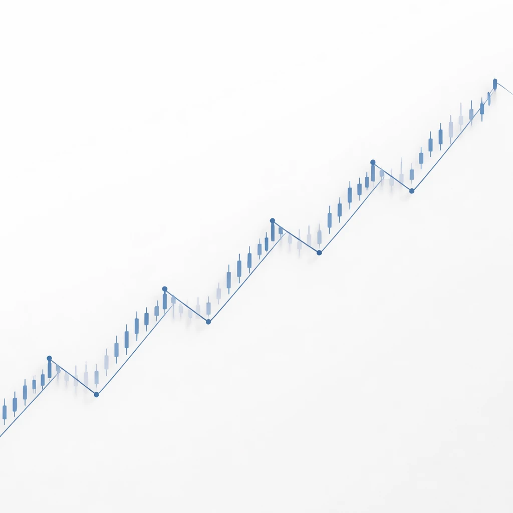
On a bar or candlestick chart, a healthy sequence of higher highs and higher lows looks like ascending steps. Price pushes to a new high, pulls back, finds support above the previous low, and then advances to another new high. This progression repeats. The structure can be sketched as HH for higher high and HL for higher low. A simple annotated path might read: HL1, HH1, HL2, HH2, HL3, HH3.
Visual recognition improves when the analyst marks swing points directly on the chart:
- Use dots or small markers to identify local highs and lows.
- Connect consecutive swing points with simple lines to emphasize the path price has taken.
- Avoid crowding the chart with too many minor pivots. Focus on turns that changed the short-term direction.
Different instruments and timeframes produce different textures. Index futures often travel in relatively smooth steps during quiet sessions. Single stocks can gap due to news, which complicates the pattern because gaps can jump above or below prior swings without trading through intermediate prices. In such cases, many analysts still treat a gap high or low as a legitimate swing point, while others require a confirmation bar to prevent mislabeling.
Why Analysts Pay Attention to Higher Highs and Higher Lows
The sequence communicates information about the balance of pressure between aggressive buyers and aggressive sellers. A higher high indicates that buyers were able to push price to a level not reached in the prior advance. A higher low suggests that sellers were unable to drive price back to prior depths before demand reasserted itself. Together, the pattern implies that demand has been stronger than supply across multiple swings.
This structure also provides a common language. Without it, two analysts looking at the same chart might emphasize different aspects and talk past each other. With a shared definition of swings and a clear record of higher highs and higher lows, the conversation can focus on the current state of the trend, where that state changed in the past, and what would need to occur to change it again. It does not predict future prices. It characterizes the path that prices have taken and frames what would count as a structural continuation or a structural break.
Another reason for its wide use is that it scales well. The same vocabulary can describe the primary trend on a weekly chart and the minor trend within a single session. This multi-horizon consistency helps analysts align views across timeframes or, at minimum, acknowledge when different horizons disagree.
From Pattern to Narrative: What the Sequence Suggests
Although the pattern itself is simple, it can be used to tell a more nuanced story about how the market may be evolving:
- Initiation phase: Early in an uptrend, the first clear higher low after a prolonged decline often stands out. The market shows that it can advance and that pullbacks are finding support above recent extremes.
- Progression: As the sequence continues, price tends to spend more time above prior swing highs and less time retesting prior lows. Advances might broaden across related instruments or sectors, although this varies by market.
- Aging and vulnerability: Trends do not persist forever. In many cases, advances begin to lose momentum. The highs continue to print slightly higher levels, but the distance between highs narrows and pullbacks deepen. These are observations about structure, not forecasts, but they often precede a pause or a change in character.
All of these interpretations come with caveats. The market can present several higher highs and higher lows and then reverse without warning. Likewise, a minor break below a prior higher low may be brief and followed by a fast recovery to new highs. The pattern is a descriptive tool, not a guarantee.
A Practical Chart-Based Example
Consider a simple, hypothetical daily price path for an index. On day 1, the index closes near 100 after a period of sideways trade. By day 6, it pushes to a high of 105, then pulls back to 102 by day 9. It advances again to 108 on day 14, and retraces to 104 on day 17. It then moves up to 112 on day 22 before a pullback to 106 on day 25.
If we mark the swings, the sequence would read as follows. The push to 105 creates a swing high higher than anything seen in the recent range. The pullback to 102 is above the prior swing low at 100, so it is a higher low. The subsequent advance to 108 is a higher high, followed by a higher low at 104. The move to 112 is another higher high, and the retracement to 106 remains above 104, making it another higher low. The structure remains an uptrend through day 25 by these definitions.
Now suppose that on day 28 the index drops intraday to 103 before rebounding to close at 107. Whether this intraday dip counts as a break of structure depends on the rules used to define swing points. If the analysis is based on daily closes, the 103 print might be treated as noise because the close remained well above 104. If intraday extremes define structure, then printing 103 could be considered a violation of the prior higher low at 104. This example illustrates why explicit criteria matter and why different analysts can reach different conclusions using the same chart.
Continuing the example, imagine that after the drop to 103 the index rallies to 110, falls to 105, then rises to 113. Depending on rules, the brief dip below 104 may have been a failed attempt to change structure. Others would call the uptrend intact only after 110 and 113 reasserted higher highs. These alternative readings highlight the interpretive nature of market structure and the value of stating one’s methods clearly.
Identifying Swings: Practical Conventions
Because the definition of higher highs and higher lows relies on swings, it helps to adopt conventions that are systematic and transparent. The following practices are common:
- Pivot confirmation by neighbors: A pivot high is defined when a bar’s high is greater than the highs of the preceding two bars and the following two bars. A pivot low is similarly defined. Two bars on each side is a common choice, but analysts sometimes use one, three, or more to adjust sensitivity.
- Close-based versus wick-based rules: Some treat intraday spikes as noise and rely on closing levels for swing definition. Others insist that the full range matters. Either can be valid if applied consistently.
- Threshold filters: To avoid labeling trivial fluctuations as swings, some require that a new swing exceeds the prior extreme by a minimum amount, such as a fixed percentage or a multiple of average true range. This reduces false signals in choppy conditions.
- Timeboxing: When price meanders without setting new extremes for many bars, a time limit can force a decision to carry forward the last established swing until a decisive move occurs.
These choices influence the number of swings identified and how quickly changes in structure are recognized. Tighter rules will pick up changes earlier but will also capture more noise. Looser rules filter noise but react later to real shifts. There is no universal standard, so clear documentation is part of sound analysis.
Break of Structure and What It Means
Once a sequence of higher highs and higher lows is established, analysts watch for events that would contradict it. The most direct contradiction is a move below the most recent higher low. Many refer to this event as a break of structure. It is a descriptive marker. It tells you that the uptrend sequence, by the chosen rules, has been interrupted. What follows after a break can vary. Sometimes the interruption proves temporary and price quickly reaches new highs, reasserting the sequence. In other cases, the market transitions into a range or begins to form lower highs and lower lows.
Breaks of structure often cluster around well known reference points, such as previous swing lows that many participants can see. Reactions can be exaggerated when stops or hedges are concentrated near those levels, which is one reason that breaks can be swift even if the larger backdrop remains constructive. None of this implies a forecast. It is simply an observation about where tightly defined structural labels sometimes change.
Dow Theory and Structural Lineage
The idea of higher highs and higher lows sits firmly within a long lineage of market analysis. In classical Dow Theory, an uptrend is recognized by successively higher peaks and troughs. That core logic remains influential today. While modern markets and tools have evolved, the descriptive power of this simple sequence persists across asset classes and timeframes. Analysts often combine it with other lenses, including measures of volatility, volume, breadth, or relative performance, to capture a fuller picture of context.
Quantifying the Pattern
Although the pattern is typically presented visually, it can be quantified to make discussion more concrete. Quantification does not imply prediction. It clarifies what has occurred. Common ways to quantify include:
- Count of consecutive swings: Track how many higher highs and higher lows have occurred without interruption. Longer sequences emphasize persistence, while very long runs can suggest a mature trend.
- Advance versus retracement size: Measure the magnitude of each up leg and compare it to the subsequent pullback. Ratios that shrink over time can be read as a sign of waning power.
- Slope and time: Evaluate the angle of ascent by relating price change to time elapsed. A steep slope that flattens can foreshadow a transition into range-bound conditions, but such shifts can also resolve back into trend continuation.
- Volatility-adjusted thresholds: Use average true range or similar measures to ensure that a higher high exceeds the prior high by more than a trivial amount.
These metrics help keep labeling consistent and guard against subjective reinterpretation after the fact. They also make it easier to compare different periods or markets using the same yardstick.
Different Market Conditions and Instruments
The clarity and reliability of higher highs and higher lows vary with conditions:
- Trending phases: In sustained advances, swings are often clean and well separated. Pullbacks are shallow relative to prior advances, which makes higher lows easy to spot.
- Range-bound phases: When price oscillates between defined boundaries, the sequence can alternate between brief higher highs and lower lows without a persistent direction. Recognizing this lack of structure can be as valuable as labeling a trend.
- High-volatility events: News events can produce gaps and long-range bars that overshoot levels and then reverse. In such cases, close-based definitions or volatility filters can reduce mislabeling, although at the cost of slower recognition.
- Instrument differences: Equity indices can display smoother trends due to diversification effects, while individual stocks may gap more frequently. Currencies often trend for long periods but can also be mean-reverting in specific sessions. Commodities may respond to seasonal patterns or inventory data that distort short-term swings.
Understanding the typical behavior of a given instrument helps set expectations for how noisy or clean the sequence is likely to be on a chosen timeframe.
Annotation Tips for Clarity
Clear annotation improves communication and reduces ambiguity. A few practical tips help maintain consistency:
- Label swings with simple markers, and keep the chart free from unnecessary lines.
- Note the timeframe prominently. A higher low on a daily chart may be a cluster of minor lower lows on a five-minute chart.
- Record the rules used for swing identification alongside the chart, such as the number of neighboring bars and whether intraday extremes or closes are used.
- Retain a version of the chart at each evaluation date to avoid retroactively redefining swings as new information arrives.
These habits create an audit trail. They also help separate structural observations from interpretation that might creep in after subsequent bars have unfolded.
Common Pitfalls and Misinterpretations
Even a concept as simple as higher highs and higher lows can be misapplied. Several issues recur:
- Over-labeling: Counting every minor fluctuation as a swing produces clutter and frequent false breaks. A threshold for minimum move or a fixed lookback helps.
- Ignoring timeframe context: A visible uptrend on the hourly chart can be a small countertrend move within a larger weekly downtrend. Awareness of the hierarchy prevents contradictory conclusions.
- Late or ambiguous recognition: Because most definitions require confirmation by subsequent bars, the analyst recognizes a swing only after it has already occurred. This lag is inherent and should be accepted rather than patched with ad hoc exceptions.
- Miscalculating gaps: Treating gaps inconsistently leads to confusion. Decide whether a gap high or low can set a swing and apply the decision uniformly.
- Retrospective fitting: Redefining past swings to fit the latest narrative undermines the usefulness of structure. Precommit to rules and keep records to resist hindsight bias.
Higher Highs and Higher Lows as Context
The primary contribution of the sequence is context. It tells an analyst where the market has been leaning and what would need to happen for that lean to change. It can serve as a scaffold for integrating other information without asserting a predictive edge on its own. For example, institutions may reference the sequence when discussing whether recent price action should be described as accumulation, distribution, markup, or consolidation. Short-term participants might observe how intraday higher lows interact with daily swing levels. These uses share a common purpose: to ground discussion in observable structure.
Context also helps manage expectations about variability. No market trends all the time. Understanding that higher highs and higher lows will occasionally be interrupted by corrections or by noise keeps analysis proportional and avoids overreaction to single bars.
Case Study: Multiple Timeframe Perspective
Suppose a stock has formed higher highs and higher lows on the weekly chart for six months. On the daily chart, the latest advance pauses and price prints a lower high followed by a test of the most recent daily higher low. A daily break of structure occurs, but the weekly sequence remains intact. An analyst who documents both horizons can now describe the situation precisely. The primary trend continues to show higher highs and higher lows, while the daily time horizon has weakened and may be transitioning to a range. If the weekly chart later produces a higher high, the earlier daily wobble appears as a minor interruption. If instead the weekly chart prints a lower low, that would confirm a broader structural change.
This example highlights the importance of stating both the timeframe and the level of analysis when discussing structure. It also shows how different horizons can deliver different messages without contradiction.
Limits of the Concept
Higher highs and higher lows are descriptive, not prescriptive. They say what has been happening, not what must happen next. The sequence can persist for long stretches and then fail abruptly. External catalysts, such as macroeconomic releases, earnings announcements, or policy decisions, can overshadow the pattern for a time. Structural labels can also be distorted in highly illiquid markets where single prints can produce outlier highs or lows that do not reflect sustained trading interest.
Moreover, different definitions of swings yield different labels for the same price path. This does not render the concept useless. It simply means that results depend on the chosen rules. Precision about those rules is a hallmark of careful work.
Putting It All Together
To interpret market price behavior with higher highs and higher lows, begin with consistent swing definitions and a clear timeframe. Annotate charts to make the sequence visible and verifiable. Observe how the distance and rhythm of swings evolve. When an interruption occurs, describe it in structural terms and note what would constitute a reassertion of the prior sequence. Throughout, keep the focus on description and context. The value lies in the clarity of the map, not in a promise about the road ahead.
Key Takeaways
- Higher highs and higher lows define an uptrend by confirming that advances exceed prior peaks and pullbacks hold above prior troughs.
- The concept is fractal and timeframe dependent, so analysts should specify rules for swing identification and the horizon under review.
- Structural labels are descriptive tools that help communicate context and identify when the character of price action has changed.
- Quantifying swings with thresholds, counts, and ratios improves consistency and reduces subjective relabeling.
- Breaks of structure can be brief or durable, which is why the sequence should be monitored alongside broader market conditions and instrument behavior.