Overview
Support and resistance are foundational concepts in technical analysis. They describe price zones where buying or selling pressure has historically been strong enough to slow, pause, or reverse movement. In trending markets, these zones do not merely mark isolated turning points. They act as a structural framework that helps interpret whether a trend is progressing smoothly, accelerating, or losing coherence. Understanding support and resistance in trends allows an observer to read price action with greater context, without assuming predictive certainty.
This article defines support and resistance as they appear in trending conditions, explains how they present on charts, explores why market participants pay attention to them, and offers practical chart-based context. The focus is interpretive rather than prescriptive, with no trade setups or recommendations.
Definitions in the Context of Trends
Support is a price zone where demand has been sufficiently active to prevent price from falling further on prior occasions. It often forms around prior swing lows or consolidation floors. In an uptrend, support is commonly found at higher lows and near prior breakout levels.
Resistance is a price zone where supply has been sufficiently active to prevent price from rising further on prior occasions. It frequently forms around prior swing highs or consolidation ceilings. In a downtrend, resistance is commonly found at lower highs and near prior breakdown levels.
These are not single-price points. They are typically zones, sometimes a range of a few ticks or several percentage points, depending on the asset and its volatility. Treating them as zones rather than razor-thin lines aligns better with how markets trade, especially in fast conditions where overshoots and intraday probes are common.
How Support and Resistance Appear on Charts
On a basic candlestick chart, support and resistance in trends can be recognized through recurring features:
- Swing points: Repeated higher lows in an uptrend cluster into a support region. Repeated lower highs in a downtrend cluster into a resistance region.
- Prior consolidation boundaries: Trading ranges before a breakout often become later reference zones. The top of an old range can act as support in an uptrend after price advances above it. The bottom of an old range can act as resistance in a downtrend after price breaks below it.
- Trendlines and channels: A sequence of rising lows connected with a line can define dynamic support. A parallel line across rising highs can define channel resistance. The mirror holds for downtrends.
- Gaps and round numbers: Gaps sometimes leave behind zones that later act as support or resistance. Round numbers can concentrate order flow and produce visible reactions that form reference areas.
On candle anatomy, both wicks and bodies matter. Long lower shadows that cluster around similar prices can reveal buying interest near support. Long upper shadows that cluster around similar prices can reveal selling interest near resistance. Closes carry weight because they reflect where the auction ended during that bar. Clusters of closes near a band can indicate a region of balance before continuation or reversal.
Support and Resistance Within Trend Structure
Trend structure is a sequence of swing highs and lows. In an uptrend, the working definition is a pattern of higher highs and higher lows. In a downtrend, the pattern is lower lows and lower highs. Support and resistance in trends are the footprint of that structure.
In an uptrend, price often advances to a new high, pulls back to a higher low, then makes another high. Each higher low forms a support zone. The distance of pullbacks and the frequency of tests provide information about the trend’s health. If pullbacks become shallow and brief, it indicates sustained demand at higher prices. If pullbacks deepen and test older levels, it indicates a more fragile advance. Conversely, in a downtrend, each lower high forms a resistance zone. Shallow rallies that fail near recent lower highs indicate persistent supply. Deeper rallies toward older resistance may indicate a weakening downtrend, though not necessarily a reversal.
Channels are a useful way to visualize this. If an uptrend forms a rising channel, price interactions with the lower boundary often align with support tests. Interactions with the upper boundary align with resistance. Respecting the channel suggests orderly progression. Frequent breaches or failure to reach one side can signal changing momentum. In a downtrend, similar insights apply in reverse.
Static Versus Dynamic Support and Resistance
It is helpful to distinguish between static and dynamic references:
- Static levels: Horizontal zones derived from prior highs, lows, and consolidations. These remain at the same price value regardless of time.
- Dynamic levels: Sloped references, such as trendlines and channels, that move with time. Some participants also watch moving averages as dynamic references because they summarize recent prices into a single evolving value. The moving average itself is not a price barrier; it is a statistical summary that may coincide with areas where buying or selling reappeared in the past.
Both types can coexist. For example, a pullback in an uptrend may approach a horizontal zone defined by a prior range top while also touching a rising trendline. This produces a confluence of references that many observers will notice. Confluence does not guarantee any particular outcome. It simply highlights that multiple definitions of value overlap in the same region.
The Principle of Polarity
Polarity refers to the tendency for broken resistance to act later as support, and for broken support to act later as resistance. The logic is rooted in market memory and position pressure. Consider a prior ceiling that price struggled to overcome. After a successful breakout, some participants who missed the move may look for an opportunity to transact near that old ceiling. Meanwhile, those who sold at the ceiling and see price above it may be uncomfortable and willing to buy back if price retests the level. The combination can create demand on a pullback toward the old resistance band, which can function as support. The reverse applies when support breaks in a downtrend.
Polarity does not apply mechanically. The age of the level, how decisively it broke, and what happened in between matter. If price spent months far above an old breakout level and then returns during a period of high volatility, the old level may not carry the same weight as it did shortly after the breakout.
Timeframes and the Nesting of Levels
Support and resistance are fractal. A level visible on a weekly chart can influence behavior on daily or intraday charts. Likewise, intraday levels can matter for short-term participants but may barely register on a weekly chart. When multiple timeframes align, a zone can gain prominence because a broader audience observes it. When levels conflict across timeframes, price can be choppy as different groups act on different reference points.
To interpret behavior, it helps to know which timeframe defines the dominant trend. For example, an asset could be in a weekly uptrend while correcting on the daily chart. In such a case, daily resistance encountered during the correction might give way once the weekly trend reasserts itself. Alternatively, a weekly downtrend can overpower daily support that looks strong on a shorter chart. Understanding this nesting resolves apparent contradictions and frames expectations about which levels are likely to command attention.
Volatility, Momentum, and How Levels Behave
Volatility conditions affect how thoroughly levels are tested. In low-volatility uptrends, pullbacks often stop near recent higher lows with modest overshoot. In high-volatility regimes, price can pierce support zones intraday and still recover by the close. The same pattern appears in downtrends near resistance.
Momentum also shapes interactions. Strong upside momentum can produce shallow pullbacks and brief contact with support, followed by swift continuation. Fading momentum can produce multiple tests of the same support zone with diminishing bounces. In a downtrend, strong downside momentum often shows as sharp rejections from resistance, while fading momentum may show as repeated tests and more time spent near the level.
Gaps, Round Numbers, and Clustering
Gaps, especially those associated with significant news, often leave behind reference points. The top of a gap can act as resistance during a rally. The bottom of a gap can act as support during a pullback. This effect can be strong shortly after the gap and tends to fade as the market digests new information.
Round numbers and psychologically notable prices can concentrate orders. Levels like 100, 1,000, or 10,000 often attract attention. When these coincide with prior swing points or trendlines, the clustering can create an area that many participants monitor.
Clustering is not only about price. Time matters too. A level revisited frequently within a short period can become less effective as the market absorbs orders resting there. A level revisited occasionally after long intervals may retain its influence if it represents a boundary with untested liquidity.
Reliability Considerations and Evidence of Strength
No level is reliable by itself. Market observers often judge the relative importance of a support or resistance zone by considering the following descriptive elements:
- Number of touches: Multiple interactions with a zone can indicate that participants repeatedly transacted there. However, repeated tests can also consume the resting orders that created the level in the first place.
- Rejection speed: Swift movement away from a level suggests a decisive imbalance of orders near that price band. Slow drifts away suggest less urgency.
- Interaction type: Whether price respected the level on intraday wicks but closed back inside, or whether it closed decisively through it, informs how strong the level appears.
- Time spent: Short contact with quick reversal can indicate a firm boundary. Extended basing at the level can indicate absorption and potential for later traversal.
- Contextual volume: While volume is not a guarantee, heavier trading near a level can signal that many positions changed hands there. Light volume may indicate tentative interest. The interpretation is contextual and depends on the asset’s typical activity.
These elements do not produce a binary label of strong or weak. They help build a qualitative assessment of how price has interacted with a level so far, which can inform interpretation of subsequent tests.
False Breaks, Overshoots, and Liquidity
Levels are often exceeded briefly before price returns. These events can reflect the microstructure of stops and resting orders. Many participants cluster their protective orders around obvious reference points. When price approaches a well-known level, it may probe beyond it, triggering orders and accessing liquidity. If there is insufficient follow-through after the probe, price can revert back into the prior range.
In an uptrend, a false break below a support zone might be followed by a quick recovery, indicating that sellers lacked commitment at lower prices. In a downtrend, a brief push above resistance followed by a rejection can indicate a lack of committed buyers. These behaviors are common and do not by themselves signal a future direction. They simply highlight that markets often test boundaries before deciding where to spend time.
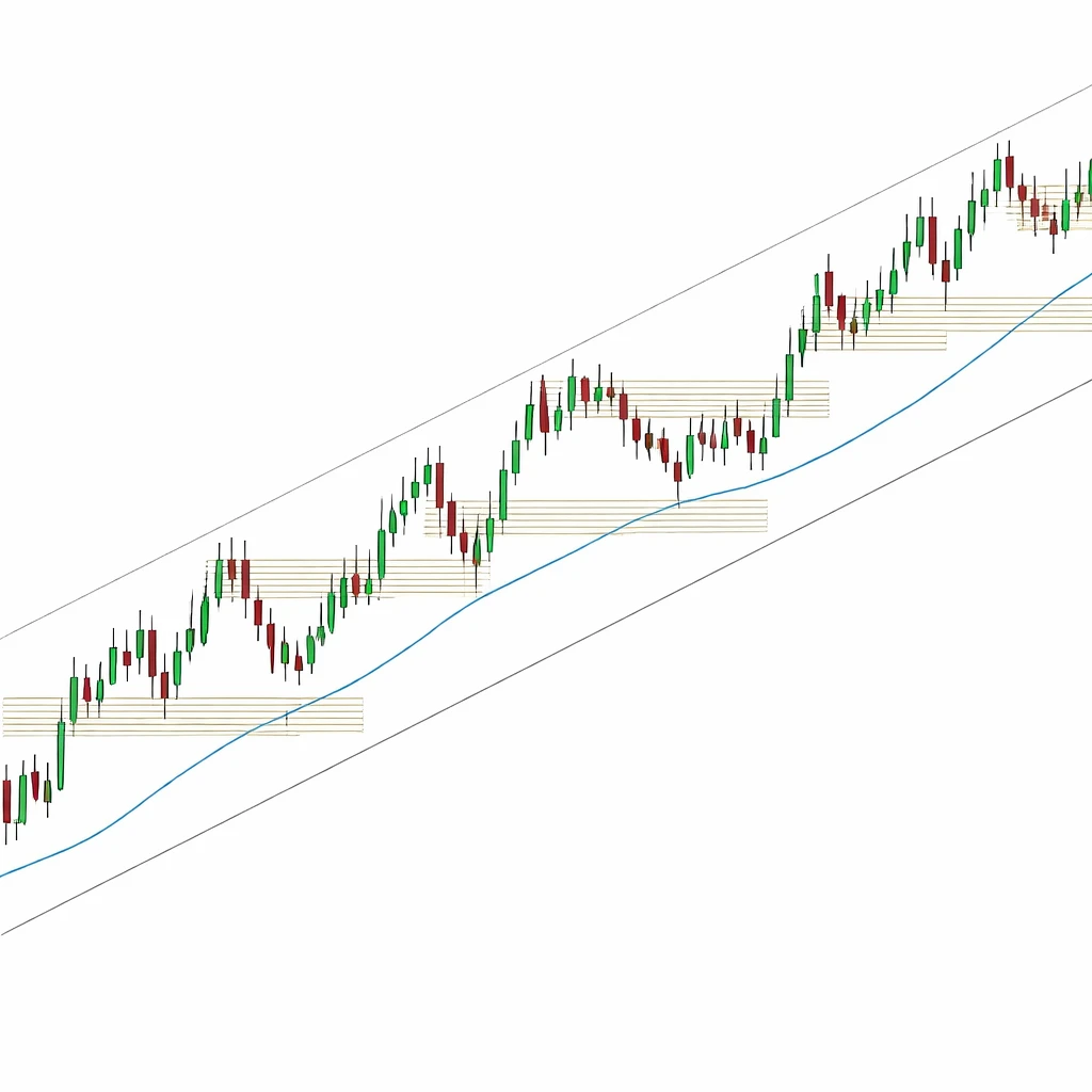
Practical Chart-Based Context: A Hypothetical Uptrend
Consider a hypothetical equity that begins a sustained advance from 50. After a quick rally to 60, it consolidates between 58 and 60 for several sessions. The 58 to 60 band is initial resistance. When price finally closes above 60 with increased range, the top of the old band transitions, through polarity, into a support zone.
Price then runs to 68 and pulls back toward 62 to 64, which is near the old range top as well as the rising swing lows formed during the breakout. The pullback halts at 63 intraday, with several candles showing lower shadows into the 62 to 64 region and closes back above 64. The clustering of wicks indicates responsive buying. The market then pushes to a new high at 72.
At 72 to 73, upper shadows appear, and the advance stalls. This band becomes near-term resistance. A brief dip back to 66 to 67 finds interest, and price grinds higher. Notice that the support is not a single tick. Rather, it is a zone that corresponds to the midpoint of the prior acceleration and a minor swing low. As price makes a higher high toward 76, the rising trendline drawn under the sequence of higher lows intersects near 67 to 68. The confluence of the trendline and the horizontal cluster of prior trading near 66 to 68 marks a region that many observers would consider important.
Later, the equity accelerates to 80, then retraces to test 72 to 73, the prior resistance area. This is a polarity test. The market spends two sessions hovering around 73, then closes back above 75, suggesting that supply at the prior ceiling was absorbed by demand. The uptrend continues, but pullbacks now become a bit deeper and time-consuming, a sign that momentum is normalizing. Support remains visible, but the market is no longer advancing in a single surge. Each retreat provides new information about where demand reappears.
Several days later, an earnings gap carries price from 78 to an open at 83. The gap leaves a visible discontinuity. On the next pullback, buyers appear near 83 to 84, where the top of the gap aligns with the rising channel’s lower boundary. The reaction there suggests that participants referenced both the gap and the channel.
In this hypothetical sequence, support and resistance organized the narrative. Old resistance around 60 and 72 later acted as support, trendlines provided dynamic references during pullbacks, and the degree of overshoot around each level conveyed information about volatility and momentum. None of these elements predicted the future. They provided a way to describe what the market valued at each stage and how the balance of orders changed through time.
Practical Chart-Based Context: A Hypothetical Downtrend
Consider a currency pair that declines from 1.2000 to 1.1650 and rebounds to 1.1800. The rally stalls near 1.1800 where several earlier candles had failed. That band acts as resistance. Price then slides to 1.1600 and rebounds again, failing at a slightly lower high near 1.1780. The series of lower highs defines a downtrend. The growing number of upper shadows near 1.1780 to 1.1800 indicates persistent supply. The prior floor around 1.1650 becomes a resistance band after a decisive break, illustrating polarity in the downward context. Minor overshoots above 1.1700 followed by quick rejections show that probes can occur without changing the underlying structure. Observers now have a map of resistance zones that frame subsequent attempts to rally.
Using Support and Resistance to Interpret Market Behavior
In practice, support and resistance help observers categorize events rather than forecast them. Several interpretive uses are common:
- Assessing trend health: Are pullbacks in an uptrend finding interest at progressively higher levels, or are they slipping back into older ranges. Are rallies in a downtrend stalling at progressively lower levels.
- Reading changes in character: Is price respecting the channel boundaries, or has it begun to traverse them more freely. Are there more false breaks and extended basing near levels, suggesting absorption.
- Locating price memory: Which prior ranges, gaps, or round numbers continue to attract participation. Which ones no longer elicit a reaction, suggesting that the market has moved on.
- Understanding confluence: Do multiple references cluster in the same area, such as a prior high aligning with a trendline. Clustering alerts the observer to zones where many definitions of value overlap.
- Timeframe alignment: Are the daily and weekly levels broadly consistent, or are they at odds. Alignment can reduce noise. Conflict can increase noise and produce range-bound conditions.
These uses inform an understanding of how the market is auctioning price. They do not prescribe a course of action. The same map of levels can lead different participants to different conclusions based on their objectives and time horizons.
When Levels Lose Relevance
Support and resistance are not permanent. They lose relevance when underlying conditions change or when price has traded through them repeatedly. Several scenarios commonly reduce a level’s importance:
- Multiple deep penetrations: A zone that is crossed back and forth many times has likely had its resting orders absorbed. It becomes less informative.
- Regime shifts: Significant changes in volatility, macro data, or company fundamentals can reprioritize what the market values. Levels that mattered previously can fade as participants update their views.
- Aging levels: The passage of time without retests can erode a level’s influence, especially on shorter timeframes where memory fades faster.
- Structural breaks: A decisive break after lengthy consolidation often resets the market’s focus onto new areas formed by the breakout or breakdown.
Recognizing when a level has lost meaning is as important as identifying it in the first place. The goal is to pay attention to reference points that still organize trading activity.
Common Pitfalls and Sources of Bias
Human perception seeks patterns. Several pitfalls can impair the interpretation of support and resistance in trends:
- Hindsight bias: It is easy to draw perfect levels after the fact. Real time is messier, with incomplete information and conflicting signals.
- Anchoring on precise prices: Levels are zones. Treating them as single-price lines invites frustration when normal overshoots occur.
- Confirmation bias: Seeing only the levels that align with a preexisting view can lead to skewed interpretation. A disciplined approach considers both supporting and contradictory evidence.
- Overfitting: Drawing too many lines and zones can create an illusion of precision. Simplicity often yields clearer insight.
- Ignoring timeframe context: A strong level on a weekly chart can dominate numerous minor intraday levels. Without recognizing the hierarchy, short-term fluctuations can be misread.
A Note on Indicators and Derived Levels
Some market participants use derived references like moving averages, pivot points, or volume profile features to complement visually identified support and resistance. These tools can highlight where trading has concentrated, where price has spent time, or where the trend’s central tendency lies. The important point is that no single tool confers certainty. The interpretive value arises when multiple pieces of evidence align with the observed structure of highs, lows, and consolidations.
Integrating Support and Resistance Into a Broader Analytical Framework
Support and resistance should not be isolated from other analytical inputs. Corporate events, macroeconomic releases, and liquidity conditions can all change how levels behave. A level that held firmly in a quiet period may behave differently during an earnings announcement or a central bank decision. Analysts often note the calendar and prevailing narrative alongside the chart. This does not turn technical observations into predictions. It situates them within the broader market context.
Why Market Participants Pay Attention
Support and resistance concentrate attention because they summarize collective behavior. They reflect where many transactions occurred, where participants hesitated, and where the auction stalled or accelerated. Since many observers watch similar references, reactions can become self-reinforcing. That visibility is a feature rather than a flaw. It gives analysts a common language to describe market behavior.
In addition, levels help organize uncertainty. Markets are continuous auctions, and price discovery is noisy. Reference zones let observers assess whether the market is behaving as it has during prior legs of the trend or whether it is deviating in ways that deserve attention. The result is not a prediction but a clearer map of where important debates between buyers and sellers have taken place.
Putting It All Together
Support and resistance in trends offer a coherent way to read charts. Horizontal zones mark prior battles between supply and demand. Trendlines and channels define the slope and rhythm of the move. Polarity explains how former ceilings and floors can change roles as trends progress. Overshoots and false breaks acknowledge that levels are tested and probed as order flow shifts through time. Timeframe analysis clarifies which set of levels is likely to matter most to the current move.
By focusing on the interaction between price and these references, an observer can evaluate whether a trend appears orderly or strained, whether momentum is stable or fading, and whether recent levels retain influence or have been absorbed. Such interpretation enhances understanding without requiring forecasts or prescriptive actions.
Key Takeaways
- Support and resistance are price zones, not single points, that mark where buying or selling pressure has previously influenced the auction.
- In trends, these zones frame structure through higher lows in uptrends and lower highs in downtrends, often reinforced by trendlines and channels.
- Polarity describes how broken resistance can act later as support and how broken support can act later as resistance, though context determines relevance.
- Volatility, momentum, and timeframe alignment shape how levels behave, including the frequency of overshoots, retests, and false breaks.
- Observing how price interacts with identified levels helps interpret market behavior, organize uncertainty, and detect changes in character without implying specific trades.