Support and resistance sit near the center of technical analysis. They are simple to draw yet easy to misuse. Many charts tell a convincing story after the fact, which invites errors in how levels are drawn, labeled, and interpreted in real time. Understanding common support and resistance mistakes helps clarify what price behavior may be communicating and reduces the risk of reading too much into a line on a chart.
What Counts as a Support or Resistance Mistake
Support is a price area where buying pressure has historically been sufficient to absorb selling, often visible where declines slow or reverse. Resistance is the opposite, where selling pressure has limited advances. A mistake occurs when a chartist defines or interprets these areas in a way that is inconsistent with the evidence in price data, the relevant timeframe, or the market’s volatility and structure. The result is overconfidence in a level that is not well supported by the chart itself.
Common mistakes cluster around a few themes. Some are drawing mistakes, such as marking razor-thin lines where zones would be more accurate. Others are interpretive, such as reading every small breach as a decisive breakout or dismissing every loss of a level as a false move. Still others come from context errors, such as ignoring the primary trend or the volatility regime that determines how wide a level should be.
Why These Mistakes Matter
Markets devote attention to price areas where transactions have stalled or reversed in the past. Those areas often become reference points for pending orders, optionality hedges, and risk management thresholds. If a chartist misidentifies a level, the map used to interpret price behavior is distorted. The analyst may overstate the significance of a move through a thin line that did not reflect the true breadth of trading interest, or may expect a retest that never arrives because other participants saw a different reference area. Avoiding these mistakes does not predict outcomes, but it improves the quality of inference drawn from price behavior around important areas.
How Support and Resistance Appear on Charts
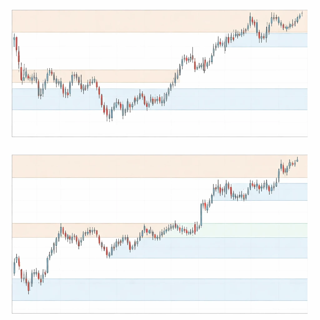
On a candlestick chart, support and resistance usually show up as clusters of swing lows or swing highs, congestion areas where candles overlap, or tight ranges that reappear at similar prices over time. These areas are rarely single ticks or exact prices. Instead, they form bands where orders accumulate. On intraday charts, these bands can be narrow. On weekly charts, they can span several percent or more. Wicks indicate tests and rejections, while bodies reflect where markets accepted price during the period. Volume can sometimes concentrate near these areas, but even without volume, repeated hesitation or reversal often signals where the market paid attention.
Frequent Drawing and Interpretation Errors
Mistake 1: Treating levels as single-price lines rather than zones
Price rarely pivots at the same exact tick. A line at 100.00 may look precise, but most reactions occur inside a neighborhood such as 99.20 to 100.60. Using a single line invites frequent apparent violations that do not carry information, since minor breaches are common in normal trading noise. Zones better represent the range in which orders cluster and where other participants are likely to react. A zone acknowledges that liquidity is distributed across prices, not pinned to a point.
Chart appearance: a single horizontal line is repeatedly pierced by thin wicks, giving the impression of constant breakouts and failures. Converting that line into a shaded band that covers the actual cluster of swing highs or lows shows that price often stayed within the area rather than breaking it.
Mistake 2: Ignoring timeframe alignment
Levels that matter on a daily chart often dwarf intraday pivots. Drawing support and resistance only on a five-minute chart can create an illusion of tight levels that repeatedly fail when the daily trend or weekly level dominates actual flows. The opposite can also happen. Copying only weekly levels and ignoring intraday structure can cause an analyst to miss shorter-term congestion that shapes day-to-day movement.
Example context: a stock hovering near a weekly resistance band between 62 and 63 can display several intraday pullbacks that appear strong on a five-minute chart. Without the weekly context, the intraday analyst may overstate the significance of each minor bounce. With the weekly band noted, those short-term movements are easier to interpret as reactions inside a larger area of supply.
Mistake 3: Overweighting extremes or ignoring closes
There is no single correct rule about whether to anchor levels to wicks or candle bodies. The mistake is to ignore one side entirely. Wicks show rejection, while bodies show acceptance. In quiet markets with low intraday noise, bodies often provide a cleaner representation of where transactions concentrated. In volatile conditions, long wicks can better reflect the true limits of buying or selling interest.
Chart appearance: if a band is drawn only on bodies, repeated wick tests may look like breakouts that immediately fail. If the band is drawn only on wicks, closes may look distant from the threshold and the level may seem irrelevant. A balanced method is to observe where both bodies and wicks cluster and to let that evidence determine the zone’s width.
Mistake 4: Cluttering the chart and overfitting
It is easy to cover a chart with a dozen lines and then retroactively point to the one that happened to matter. The problem is not the number of lines, but the lack of a consistent rationale for each one. A chart that is tuned to explain yesterday will not necessarily be useful tomorrow. Forward-looking interpretation benefits from a limited set of levels selected by clear criteria, such as repeated tests with visible slowdowns in momentum or prior consolidation bands that attracted significant trading activity.
Practical note: after a level is identified, the question is how the market behaves around it. If price repeatedly slices through a line with little hesitation or volume change, the level may not be meaningful. The mistake is to keep it on the chart only because it looked tidy in hindsight.
Mistake 5: Assuming static levels in a dynamic market
Many focus exclusively on horizontal levels and ignore dynamic support and resistance that change as time passes. Trendlines, channels, and moving average bands can represent areas where price has repeatedly met supply or demand that is not horizontal. While horizontal zones are often the clearest, some markets express structure better through sloping areas. Dismissing dynamic areas can lead to confusion when price repeatedly reacts along a rising or falling boundary that is not captured by flat lines.
Example context: a commodity market that oscillates along a rising channel may produce higher swing lows. A horizontal line at the old low underestimates where buyers repeatedly engage. A dynamic band aligned with the channel may capture the more relevant reactions.
Mistake 6: Misreading breaks, retests, and role reversal
Role reversal describes the tendency for broken support to act as resistance later, and vice versa. The mistake is to treat this as an iron rule or as immediate. Some breaks are marginal and fade quickly. Others show clear acceptance where price consolidates on the far side of the zone. A retest is common enough to deserve attention, but it is not guaranteed. Expecting a textbook retest at the exact level often leads to missed context or overconfident narratives.
Chart appearance: a strong close beyond a wide resistance band followed by several sessions that hold above it shows acceptance. A narrow intraday poke through the band with an immediate reversal and close back inside the prior range is less informative. The error is to label both as equivalent breakouts or to call both false breaks without considering follow-through and time spent on the far side of the zone.
Mistake 7: Neglecting volatility when sizing zones
Zone width should reflect current volatility. In quiet regimes, a band spanning a fraction of a percent may be sufficient. In fast markets, that same width produces constant noise breaches that look like signals but carry little information. Using an average true range or a similar measure to sense the market’s typical excursion can help set expectations for how much penetration is noise versus genuine displacement.
Example context: if a currency pair is moving 1.2 percent per day on average, a support band that is only 0.2 percent wide will likely be pierced regularly. Widening the zone to match the environment reduces the false impression of repeated breakouts and failures.
Mistake 8: Ignoring the primary trend and market structure
Support and resistance are not independent of trend. In a persistent downtrend with lower highs and lower lows, so-called support often fails more easily. In a persistent uptrend, overhead supply is more likely to be absorbed. Treating every horizontal level as equally potent regardless of trend can produce unrealistic expectations. Market structure, such as a series of higher lows into a flat ceiling, conveys different information than isolated tests with no developing structure.
Practical implication: chartists pay attention to whether tests occur in the direction of the prevailing structure or against it. The more a level is tested from one side while the market builds energy, the more informative its eventual resolution tends to be. The mistake is to ignore that buildup entirely and treat every touch as independent.
Mistake 9: Overreliance on round numbers or arbitrary anchors
Round numbers attract attention because many orders cluster there. That attention can matter, but it is not sufficient to define a level on its own. Some markets respect round numbers; others respect prior swing structures more. Anchoring a level because it looks tidy at a round price while nearby price action shows a more accurate cluster a little higher or lower can distort interpretation.
Example context: if a stock shows repeated hesitation and tails at 198.40 to 199.30, drawing resistance at 200.00 alone leaves the analyst treating every approach to 199 as noise. The chart evidence suggests the band sits below the round number, not at it.
Mistake 10: Treating gaps, session boundaries, and liquidity as irrelevant
In equities, premarket and after-hours trading can leave gaps that alter how levels function during the regular session. In futures or crypto that trade nearly around the clock, liquidity varies by hour and by venue. Assuming that an overnight breach of a level carries the same weight as a high-volume breach during the most active hours can be misleading. Session boundaries, opening auctions, and major scheduled events often shape how levels are tested and respected.
Chart appearance: an overnight gap below support that immediately trades back into the prior range at the open reflects a different character than a high-volume drive during peak participation that holds below the band for several hours.
Mistake 11: Anchoring to stale levels and ignoring regime change
Markets change character after major fundamental events, shifts in liquidity, or transitions between volatility regimes. A level that mattered during a slow, range-bound period may lose relevance in a fast-trending phase. Keeping every historical line on the chart because it once worked creates clutter and invites narrative bias. Levels deserve to be retired when price stops reacting to them in any observable way.
Practical note: a review process helps. If a band has not influenced price behavior across several tests or has not been approached for a long period in a changed environment, it may no longer belong on a working chart.
Mistake 12: Ignoring arithmetic versus logarithmic scale on long-term charts
On long-term charts, equal percentage moves become visually compressed on an arithmetic scale when price is high. A support band drawn using a long-term trendline can appear broken on an arithmetic chart but intact on a log chart. The mistake is not to prefer one scale in all cases, but to fail to check whether the choice of scale is altering the interpretation of where levels reside.
Mistake 13: Confusing precision for accuracy
Precision is drawing a line to the cent. Accuracy is capturing the area where other participants have repeatedly acted. A highly precise line can be inaccurate if it ignores several nearby tests. An accurate zone may look less tidy on the chart, yet it better reflects how trading actually occurred.
How These Errors Show Up on Real Charts
Consider a hypothetical daily chart of an index ETF that rallied from 48 to 62, paused, then oscillated between 59 and 63 for several weeks before breaking higher to 66. A closer look reveals how common mistakes change the reading of the same price action.
During the 59 to 63 range, candles repeatedly show small bodies and overlapping highs and lows. Wicks extend slightly below 59 on two days and just above 63 on three days. Volume is typical during the range and expands on the break to 66. A narrow line at 63 makes it look as if the market faked out three times. A shaded band from 62.6 to 63.2 instead shows that price spent more time inside resistance than beyond it, suggesting those pokes were modest excursions rather than decisive breaks. On the downside, a line at 59 would make the two wicks look like dramatic failures. A support band from 58.6 to 59.2 better describes where buyers repeatedly showed up.
Timeframe adds another layer. On the same chart, a four-hour view shows a series of higher lows into the 63 band. The daily still reads as range-bound, but the intraday structure hints that buyers were more aggressive with each test. An analyst who ignores the four-hour structure might describe the breakout as random. An analyst who ignores the daily might overstate the meaning of each intraday push into the band. Considering both clarifies that the daily ceiling was tested within a developing pattern of higher lows.
Volatility matters as well. Suppose the average true range expanded from 0.8 to 1.4 during the final week before the break. If the resistance zone remained only 0.3 wide, those minor excursions would look like repeated signals. Widening the band to match the environment reduces the apparent noise and frames the break to 66 as the first clear move that closed and held outside the expanded zone.
Practical Context: A Step-by-Step Annotation Process
The goal is not to prescribe a strategy, but to outline a disciplined way to reduce the mistakes discussed above. A consistent annotation process helps keep the chart focused on the evidence.
First, select a primary timeframe that matches the analysis horizon. Identify the most obvious clusters of swing highs and lows on that timeframe. Rather than drawing a thin line through the exact extreme, bracket the area that captures most of the touches and the zones of hesitation. Use a width that is coherent with recent volatility so that minor penetrations do not produce constant false impressions.
Second, check one higher timeframe and one lower timeframe to see whether those zones remain relevant. If the higher timeframe has a broader band that overlaps the primary zone, give it priority. If the lower timeframe displays additional detail inside the band, note it without allowing the microstructure to overwhelm the larger context.
Third, observe how price behaves when it enters each zone. Not all tests are equal. Some arrive with momentum and show immediate rejection. Others grind into the area and then consolidate, which can indicate acceptance. Importantly, keep a record of how many times a zone has been approached and whether the market spends time on the far side. This does not imply prediction. It simply avoids treating every touch as fresh and independent when the market has a clear recent memory of the area.
Fourth, retire zones that lose their influence and update those that migrate due to changing structure. After a decisive move followed by weeks of trading far from a prior band, the old level may no longer be the most relevant reference. The annotation should reflect current evidence rather than a museum of past reactions.
Finally, document the rationale for each zone. A short note recorded outside the chart can help avoid hindsight bias. For example, note whether the zone is based on clustered highs, a consolidation shelf, or a gap boundary. When price later reacts differently, the note helps determine whether the original definition was reasonable or whether it relied on overly precise or arbitrary anchors.
Recognizing Market Behavior Around Levels
Support and resistance are useful because they are focal points for crowd behavior. A quick probe into a resistance zone with immediate rejection suggests limited acceptance at higher prices during that attempt. A slow pullback into support that then stabilizes suggests demand still operates within the area. Time spent inside or outside of a zone often says more than a single test.
Incorporating these observations reduces the temptation to label every excursion as a breakout or failure. The key is to ask whether the market is accepting price beyond the level or merely exploring. Acceptance appears as closes and consolidation beyond a zone, not just as a single tick or wick. Exploration appears as thin intraday breaches with little follow-through. This distinction helps interpret behavior without implying that any specific outcome must follow.
Special Cases to Watch
Thin liquidity hours and venues
Some instruments trade with significantly different liquidity during off hours or on certain venues. A level that appears broken overnight may not carry the same interpretive weight as one that is broken during the most active session. Chartists who do not distinguish session periods can overreact to movements that occur when participation is limited.
Event-driven displacement
Earnings reports, economic data releases, and policy announcements can produce gaps and rapid repricing that jump across multiple levels. Applying ordinary rules of zone width or expecting textbook retests in these moments often proves unrealistic. During event-driven markets, even well-defined zones can briefly lose relevance as the market searches for a new area of acceptance.
Venue and data differences
Different data providers can report slightly different highs and lows because of varying trade filters. Anchoring a level to a one-tick extreme from a single feed is fragile. When precision is required, it helps to confirm that the level is not an artifact of a single data source.
Why Traders Pay Attention to These Mistakes
Market participants care about support and resistance because these areas capture shared attention. Many place conditional orders near such zones. Options hedging often intensifies around them. Even those who do not trade on charts are affected by the behavior of those who do. Recognizing common mistakes keeps the focus on which levels have broad recognition and which exist mostly on a single overfitted chart. Avoiding the errors outlined above fosters clearer interpretation of price behavior and keeps expectations aligned with observable evidence rather than tidy narratives.
Chart-Based Example: From Range to Break and Back
Consider a hypothetical technology stock that trades between 118 and 124 for a month after a prior advance from 102. The range shows overlapping candles, with two intraday excursions to 124.6 and one spike to 117.7. An analyst who draws thin lines at 118 and 124 will see four apparent breakout and breakdown events. By contrast, a band from 117.8 to 118.4 and another from 124.2 to 124.8 reduce those events to one modest breach on each side that reversed quickly.
Two weeks into the range, the stock records higher intraday lows at 118.9, 119.2, and 119.6. The four-hour chart reveals a rising local structure pressing into the upper band. When the eventual move occurs, price closes at 125.2 and then spends two sessions consolidating between 124.9 and 125.5. This indicates acceptance beyond the prior ceiling. Labeling this move as just another poke would miss the character change, while assuming all breaks are decisive would have been an earlier mistake during the range.
A week later, the stock declines back to 125 and briefly trades to 124.7. Interpreting this as a failure requires context. The pullback retested the acceptance area that formed after the break. A narrow focus on the old ceiling at 124 to 125 without noting the new consolidation band would miss the evolving structure. This example illustrates how levels migrate and why stale lines must sometimes be retired in favor of zones that reflect where the market has recently accepted price.
Building Consistency Without Overconfidence
No annotation method removes uncertainty. The aim is to reduce avoidable errors. Consistency comes from using the same logic to define zones, checking multiple timeframes without letting the smallest one dominate, sizing zones with respect to volatility, and updating or retiring levels as behavior changes. Overconfidence often stems from tidy lines that appear perfect in hindsight. Real markets are messier. Price behavior around zones is probabilistic, not deterministic.
Seen this way, support and resistance are not predictions but hypotheses about where the crowd may respond. They help organize observation. When a level is approached, the market either accepts or rejects that area for the moment. Recording which occurs provides an evidence base for interpretation, free of the assumption that any single test must deliver a particular outcome.
Key Takeaways
- Support and resistance are best viewed as zones that reflect clusters of trading interest, not as single-price lines.
- Timeframe context, volatility regime, and primary trend shape how meaningful any level is and how wide a zone should be.
- Misreading breakouts, retests, and role reversal often comes from ignoring acceptance versus rejection and the time spent beyond a zone.
- Cluttered, hindsight-driven charts and stale levels create narratives that look convincing but add little to forward-looking interpretation.
- A disciplined annotation process helps avoid these mistakes and yields clearer, evidence-based readings of price behavior around important areas.