Price charts can illuminate market behavior or obscure it. When a chart is crowded with indicators, overlapping drawings, competing color schemes, and multiple time references, the eye struggles to identify what matters. A simple chart removes nonessential elements so that the fundamental story of price is visible. Simplicity does not mean naivety or lack of rigor. It means intentionally limiting what is shown to improve clarity, reduce cognitive load, and strengthen the analyst’s ability to interpret price action.
Defining Simplicity in Charts
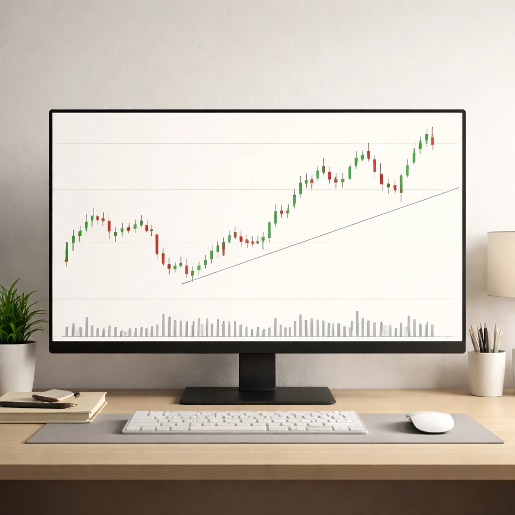
Chart simplicity is the intentional choice to display only the elements that directly serve the analytical question at hand. In price action work, this typically includes price bars or candles, the time and price axes, and a small number of reference features such as key swing levels or a single trendline. Volume may be displayed when it adds informational value. Everything else is optional.
Simplicity differs from minimalism for its own sake. A chart can be sparse yet uninformative if crucial context is missing. The core idea is not to use as little as possible, but to show enough to read the market’s behavior without distraction. What constitutes “enough” depends on the instrument, timeframe, and the specific behavior under study. The discipline lies in making that selection explicit and consistent.
Why Simplicity Improves Interpretation
Human perception is selective. A cluttered visual field increases cognitive load and raises the chance of misreading patterns. When the chart is simple, the visual hierarchy becomes clearer. Highs and lows, expansions and contractions, and the rhythm of swings are easier to see. Three practical mechanisms explain this effect:
- Noise reduction. Removing overlapping indicators reduces conflicting signals that can mask the underlying path of price.
- Sharper structure. With fewer lines and colors, the eye naturally tracks swing points, ranges, and breakouts with fewer false anchors.
- Consistent framing. A stable visual template builds pattern recognition over time, improving the reliability of qualitative judgments.
In empirical terms, simplicity tends to improve signal to noise. While indicators can be useful for measurement, layering many of them often restates similar information in different forms. This redundancy can create an illusion of confirmation without adding genuine insight.
What “Simple” Looks Like on the Chart
A simple price action chart has a restrained set of features:
- Price bars or candles with a neutral color scheme that highlights up and down movement without excessive contrast.
- One timeframe shown at a time, scaled appropriately so that recent structure is visible without compressing detail.
- A few horizontal levels drawn from clear swing highs and lows or notable gaps. Lines are thin and unobtrusive.
- A single diagonal guide such as a trendline if the market exhibits directional structure. If direction is not clear, the line is omitted.
- Volume only if it directly informs interpretation, placed in a small pane with subdued colors.
The result is a chart where your eye can trace the path of price and observe how it interacts with defined reference points. The focus remains on behavior: expansion, contraction, hesitation, and continuation of movement.
Price Action as Primary Data
Price action analysis treats the open, high, low, and close as the fundamental observations. Candlestick shapes, bar ranges, and the sequence of swings express the market’s balance of buying and selling pressure. Indicators often derive from this same data using transformations or smoothing. When the underlying action is clear to the eye, the added layer of transformation is not always necessary to understand context.
Simplicity centers the analyst’s attention on how price moves through space and time. Typical questions include: Where are recent extremes that participants may reference? How quickly does price travel between these points? Does the market accelerate or stall near prior structure? Such questions are easier to answer when the chart emphasizes the raw path of price, not the byproducts of various calculations.
Visual Hierarchy and Chart Hygiene
To sustain simplicity, control the visual hierarchy. Small design choices compound:
- Color and contrast. Use a restrained palette. Avoid bright overlays that compete with price bars.
- Line weight. Trendlines and levels should be thin and consistent so they do not overpower the candles.
- Grid and axes. Light gridlines or none at all. Clear axis labels in a readable font.
- Scale choice. Linear or logarithmic scaling should match the analytical purpose. Log scaling often clarifies percentage changes over long horizons, while linear scaling can be appropriate for short-term absolute moves.
These choices are not aesthetic preferences alone. They affect how quickly and reliably one can detect structure and change. Good chart hygiene removes incidental friction from the reading process.
Reading Structure with Fewer Elements
A central task in price action work is recognizing structure. With a simple chart, several elements stand out more readily:
- Swings. A sequence of higher highs and higher lows or the opposite. The clarity of these sequences is greatest when they are not obscured by overlapping drawings.
- Ranges. Consolidation areas where price repeatedly tests boundaries. A few horizontal lines are often sufficient to mark the region.
- Impulse and correction. Faster expansions in one direction followed by slower counter-moves. The contrast between bar size and spacing becomes apparent without additional overlays.
- Gaps. Openings away from prior close. These stand out on clean charts and often attract attention as reference points.
Clarity in these elements helps analysts describe what the market has done and how it has done it, which is the foundation for forming hypotheses about behavior.
Timeframe Discipline
Complexity often enters when multiple timeframes are blended without a clear rationale. A simple approach separates them. Analyze one timeframe at a time. When context from a higher or lower timeframe is relevant, switch views rather than stacking everything on a single screen. This preserves clarity and prevents the eye from toggling among contradictory signals drawn from different sampling intervals.
Timeframe discipline also reduces inconsistency in interpretation. For example, a pullback on a daily chart can appear as a full intraday downtrend. Mixing these within one frame can induce interpretive whiplash. By isolating them, the analyst sees each behavior on its own terms.
Practical Chart-Based Examples
Example 1: A Clean Uptrend With a Pause
Imagine a daily chart of a liquid equity index over three months. The chart shows only candlesticks, two horizontal levels, and a single rising trendline fitted to the most evident higher lows. Volume is displayed in a small lower pane.
Price advances in a series of higher highs and higher lows. During weeks five and six, bars compress in size and overlap more, forming a narrow consolidation just below a prior high. Because the chart is uncluttered, the contraction in range and the repeated tests of the same area stand out. Volume declines during the pause. The simplicity helps the analyst describe behavior precisely: trend present, momentum cooling, consolidation near a known reference point.
Example 2: Range Identification and Break
Consider a four-hour chart of a major currency pair. For two weeks, price oscillates between well-defined boundaries. The analyst draws a single rectangle to represent the range, and adds two horizontal lines at the extreme wicks where rejection previously occurred. No additional indicators are used.
On the twelfth day, price accelerates out of the rectangle with larger candles. Even without a volatility overlay, the increased bar size, reduced overlap, and distance traveled per bar make the change apparent. The simple chart foregrounds the structural transition from containment to expansion.
Example 3: Contextual Role of Volume
Take a futures contract on a commodity. The daily chart shows candles and a basic volume histogram below. Over ten sessions, price drifts higher but with small bars and erratic closes. Volume is relatively muted. On the eleventh session, price tests a level that capped advances three times earlier. The chart’s simplicity allows the analyst to compare the current test to past tests with minimal distraction. Whether volume confirms or diverges can be observed without introducing additional complex overlays.
Common Sources of Unhelpful Complexity
Complexity is not always harmful, but several patterns regularly degrade interpretability:
- Indicator stacks. Multiple oscillators, moving averages of different lengths, and derivative overlays often encode overlapping information. The chart becomes saturated with visual cues that point in different directions.
- Dual axes and mixed scales. Price on one axis, indicator on another, and a second price axis can confuse relative magnitudes and trends.
- Persistent drawings. Old lines that no longer relate to current price action remain on the chart, crowding current structure.
- Inconsistent color mapping. Colors assigned to similar elements change across charts, forcing the eye to relearn the legend each time.
Each of these adds friction without necessarily adding insight. Removing or consolidating them often restores a coherent view.
Simplicity and Cognitive Bias
Simplicity supports better reasoning by reducing opportunities for bias to enter through selective interpretation. When dozens of signals are present, confirmation bias finds what it expects. A clean chart narrows the interpretive range to observable behavior: how price moved, where it paused, and how it responded at known reference points. This limitation does not eliminate bias, but it constrains it.
Moreover, a simple chart improves repeatability. Two analysts with the same clean view are more likely to describe the same events in similar terms, which increases inter-rater reliability. Complex charts encourage idiosyncratic readings that are harder to compare and evaluate.
Minimal Annotation Techniques
Annotations can help or hinder. A simple framework keeps them subordinate to price:
- Label swings sparingly. Mark the most recent sequence of higher highs and higher lows or the opposing sequence. Avoid labeling every minor fluctuation.
- Use zones rather than precise ticks when appropriate. Many reactions occur in areas, not at single prices. A light rectangle often communicates this better than five separate lines.
- Record only salient notes. One or two short comments near major turns or tests are usually enough. The goal is to capture behavior, not to narrate every bar.
Clarity improves when annotations are purposeful and restrained.
When Additional Tools Add Clarity
Simplicity does not prohibit all tools. The criterion is whether a tool clarifies price behavior. Two examples illustrate this idea:
- Smoothing for orientation. A single moving average can help summarize direction when bars are noisy. If used, it should be visually quiet and clearly secondary to price.
- Volatility context. A basic band or range envelope can illustrate typical excursion size. Its purpose is to contextualize bar ranges, not to dictate actions.
These tools should be removed when they stop clarifying. The chart is a workspace, not a scrapbook. Every element must earn its place.
Risks of Oversimplification
There is a difference between simplicity and the neglect of relevant context. Two pitfalls stand out:
- Ignoring regime shifts. A market can transition from low volatility to high volatility, or from mean-reverting to trending conditions. If the chart hides relevant history or compresses scale, the shift may be missed.
- Discarding essential data. Some instruments are sensitive to events or session boundaries. Removing all session markers or volume context may erase useful information.
The solution is not to add everything back, but to add only what is necessary to preserve awareness of changing conditions. Simplicity should be adaptive, not rigid.
Building a Simple Charting Workflow
A disciplined workflow helps maintain simplicity across instruments and days. A practical sequence is:
- State the question. For example, “Is price compressing or expanding relative to recent behavior” or “Where are the most recent swing references that participants might use”.
- Select the timeframe. Choose the interval that matches the question. Do not mix timeframes on one screen. Switch views for context.
- Display price and volume if relevant. Begin with candles or bars. Add volume only if it informs the question.
- Mark key structure. Draw horizontal levels at recent swing extremes or important gaps. Add a single trendline if structure warrants it.
- Annotate sparingly. Add brief notes or a zone only when they clarify what the market did and where.
- Review and remove. Delete outdated lines and notes. End with a clean chart that reflects current behavior.
This workflow is not a strategy. It is an organizational method that keeps the focus on observable behavior and preserves interpretability.
Evaluating Whether a Chart Is Simple Enough
Several practical tests help gauge whether simplicity has been achieved:
- Time to description. If it takes more than a few seconds to articulate the market’s current structure, the chart likely contains distractions.
- Element audit. Count overlays and drawings. If multiple items serve the same purpose, remove all but one.
- Clarity check. Step away and return. If the eye immediately finds the most important levels and swing points, the visual hierarchy is working.
These tests rely on behavior, not opinion. They assess whether the chart supports fast and accurate description.
Simplicity Across Market Conditions
Simplicity is especially helpful during volatile or news-driven periods. When movement accelerates, a crowded chart becomes unmanageable. A clean view allows the analyst to monitor how price travels between known references and whether new structure is forming. During quiet periods, simplicity prevents the impulse to over-interpret small fluctuations as meaningful shifts.
Across instruments, the same principle applies. Futures with frequent session gaps, spot currency pairs that trade nearly around the clock, and single-name equities with idiosyncratic events each benefit from a clean display that foregrounds the basic path of price. Adjustments to scaling, session markers, or volume can be made case by case without abandoning the core commitment to clarity.
Documentation and Learning With Simple Charts
One advantage of simple charts is that they are easier to document and review. A brief screenshot with a few notes communicates the essential structure. Over time, a library of such charts builds a personal reference of recurring behaviors. Because each image contains only the necessary elements, future you will not need a legend to decipher what you once thought was important. This improves learning and reduces hindsight bias in later evaluations.
How Simplicity Helps Explain Market Behavior
Markets reflect a continuous process of discovery and repricing. The visual language of price action encodes that process in swings, pauses, and accelerations. Simple charts make this language legible. For instance, a series of higher lows approaching a well-traveled level communicates persistence. A quick rejection at a prior swing, visible as a long wick and immediate push away, communicates sensitivity at that reference. An expansion in range followed by orderly consolidation communicates digestion after effort. None of these require elaborate overlays. They require clean space and disciplined attention.
From Restraint to Consistency
Perhaps the most practical benefit of simplicity is consistency. When charts share a common template, with the same color scheme, line weights, and annotation style, interpretation becomes more uniform. This uniformity supports more reliable comparisons across instruments and across time. Consistency also reduces fatigue. Analysts spend less energy deciphering the chart and more energy understanding the market.
Putting It All Together
Simplicity in charts is a methodological choice grounded in how humans perceive and reason under uncertainty. By reducing noise and emphasizing core structure, a simple chart helps the analyst see price behavior more directly. It does not remove uncertainty or provide answers by itself. It improves the quality of observation, which is the starting point for any further analysis one might undertake.
Key Takeaways
- A simple chart displays only the elements that directly clarify price behavior, typically price bars, a few levels, and minimal annotations.
- Reducing visual noise sharpens the perception of swings, ranges, and changes in volatility, which improves interpretability.
- Timeframe discipline preserves clarity by avoiding mixed signals that arise when multiple intervals are overlaid.
- Simplicity supports consistency, reduces opportunities for bias, and makes documentation and review more effective.
- Minimalism should be adaptive. Add only what is necessary to preserve context while keeping the focus on price action.