Candlestick charts are a compact visual encoding of price action. Each candle aggregates a defined period of trading into four essential data points: the opening price, the highest traded price, the lowest traded price, and the closing price. The rectangular body and thin lines, often called shadows or wicks, convey how price moved within that period. Despite their simplicity, candlesticks offer a rich view of intraperiod dynamics and help analysts interpret pressure, uncertainty, and momentum without requiring complex indicators.
This article clarifies how candlesticks are constructed, how they appear on charts, what information they communicate about market behavior, and why many market participants pay attention to their shapes and relationships. The discussion remains descriptive and explanatory. It avoids trading strategies, prescriptive setups, and recommendations.
What a Candlestick Represents
A single candlestick summarizes a period of trading activity, such as one minute, one hour, one day, or one week. The open is the first transaction price of the period, the close is the last, and the high and low capture the extremes reached in between. The body of the candle spans the distance between open and close. The wicks extend from the body to the high and to the low. Many charting platforms color bodies to indicate whether the close was above the open (often green or white) or below the open (often red or black).
For example, consider a daily candle with open 100, high 105, low 97, and close 103. The body runs from 100 to 103, suggesting that price closed higher than it opened. The upper wick shows that price reached 105 but did not hold there by the close. The lower wick shows that buyers defended levels below 100 during the session. This single candle does not tell a complete story, yet it conveys who had the upper hand by the close, how far price explored above and below, and how contested the session may have been.
How Candlesticks Appear on Charts
On a typical candlestick chart each period is drawn as one candle. A series of candles placed side by side forms a time series of intraperiod summaries. The vertical dimension measures price, the horizontal dimension orders time. Colors and body sizes immediately highlight sequences of upward closes, downward closes, narrow consolidations, and expanded ranges.
A few visual notes help avoid common misreadings:
- Candle color is based on the open relative to the close of the same period, not relative to the prior period. A red daily candle can still close above yesterday’s close if today’s open was even higher.
- A long body indicates that the close ended far from the open. A long wick indicates that price explored far from the open-close region but was pushed back before the close.
- A very small body with long wicks signals intraperiod two-sided probing and indecision. A very small range signals quiet trading regardless of color.
Construction Details and Data Nuances
Candlestick interpretation depends on how the data are constructed. A few structural points matter:
- Timeframe choice. A five-minute candle compresses a very short sequence of trades. A daily candle compresses an entire trading session. Some assets trade nearly around the clock, others have discrete sessions with auctions at the open and close.
- Session boundaries. Daily candles for futures or crypto may use continuous sessions across time zones, while equities typically use an exchange’s primary session. Pre-market or after-hours prints may or may not be included depending on the data source and settings.
- Gaps. A gap occurs when the new period’s open is above or below the prior period’s range. On a candlestick chart a gap is visible as empty vertical space between bodies or wicks. Gaps often reflect new information arriving between sessions.
- Data quality. Thinly traded instruments can show erratic wicks from isolated prints. Consolidated feeds may differ in highs and lows from single-venue feeds. Small data differences can change the appearance of individual candles.
Why Traders Pay Attention to Candlesticks
Candlesticks compress order flow into a descriptive shape. A candle with a large body and little to no wick often indicates that one side dominated the period with relatively persistent pressure. A candle with long wicks and a small body suggests a tug-of-war where neither side could secure control by the close. Over a sequence of candles, the clustering of large bodies, the alternation of colors, and the appearance of progressively higher or lower extremes provide a narrative about how participants are negotiating value.
The appeal is partly practical. Candlesticks provide immediate visual cues that our pattern-recognition systems process quickly. They are also flexible across timeframes. The same open-high-low-close structure applies from seconds to months, which makes it easy to compare intraday behavior with longer-horizon context. Finally, candlesticks do not presume a model of equilibrium or efficiency. They simply record what traded, which is why they remain a staple for price-focused analysis.
Anatomy and Terminology
Several named candle types recur in financial literature. The labels are less important than the underlying dynamics they imply. Below are common forms and what they describe about the period.
Marubozu
A marubozu has a long body with little or no wicks. A bullish marubozu opens near the low and closes near the high. This shape indicates sustained directional pressure through the period with minimal rejection at the extremes. The lack of shadows suggests that attempts to push against the prevailing side were limited or ineffective.
Spinning Top
A spinning top has a small body and relatively balanced upper and lower wicks. The period saw movement in both directions but finished near its open. This reflects uncertainty or balance, not necessarily a forthcoming reversal. In quiet markets many consecutive spinning tops can form a recognizable consolidation.
Doji
A doji forms when open and close are very close or equal, leaving a nearly flat body. The wicks may be short or long. A long-legged doji with extended shadows shows vigorous two-sided participation during the period, but no resolution by the close. A doji emphasizes hesitation more strongly than a spinning top because the body is even smaller relative to the range.
Hammer and Inverted Hammer
A hammer has a small body near the top of the range and a long lower wick. During the period price traded meaningfully lower, then recovered into the close. An inverted hammer has a small body near the bottom of the range and a long upper wick. Price tried higher but later slipped back. The name suggests a possible shift in control, yet the candle by itself only documents rejection of one extreme within that period.
Shooting Star
A shooting star is similar to an inverted hammer but is often discussed when it appears after prior upward movement. The long upper wick highlights that higher prices were offered and rejected before the close. The concept is identical in construction to the inverted hammer; only the prior context differs.
Two- and Three-Candle Relationships
Because each candle is a summary, relationships between consecutive periods carry additional information about continuity or change.
Engulfing and Outside Bars
An outside bar is a candle whose high is above the prior candle’s high and whose low is below the prior candle’s low. It completely contains the previous range. If the close flips the prior color, many label it an engulfing candle. The outside structure indicates an expansion in range and often reflects increased participation or volatility. The color informs which side won the close, but the critical piece is that price explored both directions more than in the prior period.
Inside Bars
An inside bar is a candle whose high is below the prior high and whose low is above the prior low. It sits within the previous range and reflects contraction. Long sequences of inside bars are rare on liquid timeframes and often mark quiet intervals between more active moves.
Gap Sequences
Gaps add another relational element. A gap up followed by a candle with a long upper wick conveys that buyers opened aggressively but met supply intra-session. A gap down followed by a long lower wick shows early selling that later met demand. The details again are descriptive. They do not specify what must happen next.
Interpreting Body, Wick, and Range Quantitatively
Visual reading benefits from a few simple quantitative measures. These are not trading rules. They are descriptors that reduce ambiguity in language such as “long” or “small.”
- Body-to-range ratio. Compute |close − open| divided by (high − low). Values near 1 indicate dominance of the close over the open. Values near 0 indicate balance. Comparing the current ratio to a recent average clarifies whether a given candle is unusually decisive.
- Wick asymmetry. Compare upper wick length to lower wick length. If only the upper wick is large, the period probed higher and was rejected. If only the lower wick is large, the period probed lower and was rejected. If both are large, there was two-sided exploration.
- Range normalization. Divide a candle’s range by a rolling measure such as Average True Range or a simple moving average of ranges. A normalized value significantly above 1 identifies an expansionary period.
- Gap size. Measure the difference between the current open and prior close or prior range. Large gaps reframe expectations because a significant portion of the period’s movement may have occurred between sessions.
Context, Not Just Candles
The same candlestick shape can carry different implications depending on where it appears in the broader sequence. Several elements of context affect interpretation:
- Trend and structure. Are successive highs and lows rising, falling, or compressing into a tight range
- Location. Does the candle form near a recent swing high or swing low, or inside a congestion zone where many candles overlap
- Volatility regime. Is the candle part of a calm phase with small ranges, or does it land in a period of frequent outside bars and gaps
- Volume and liquidity. If available, did participation expand or contract on this candle relative to recent history
Context frames the narrative. A hammer within a choppy sideways market often signals a brief probe and rejection that may repeat in both directions. The same hammer after a sharp expansion in range could reflect exhaustion or simply a pause before further discovery. The candle does not dictate an outcome. It records the interaction between buyers and sellers during a single period.
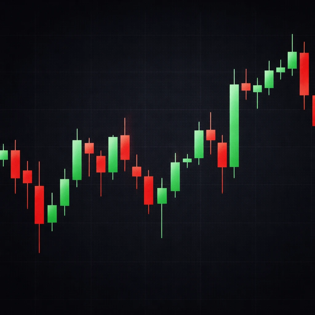
Practical Chart-Based Example
Consider a liquid large-cap equity on a daily chart over eight sessions. The stock has been generally rising for several weeks, forming a sequence of higher highs and higher lows with mostly moderate ranges.
Day 1. A small green spinning top appears. The body is narrow, and wicks are balanced. Price closed slightly above the open, but intraday movement was limited. This aligns with routine consolidation after recent progress.
Day 2. Another small body appears, this time red, again with symmetric wicks. The two-day pair looks like a pause where neither side is pressing. The ranges are both smaller than the 20-day average. Market participation appears steady but unhurried.
Day 3. The candle expands. It is a bullish marubozu with a range 1.6 times the 20-day average and only a thin upper wick. Price opened near the low and closed near the high. The session recorded persistent buying interest with minimal rejection at the top.
Day 4. The next day opens with a gap up. During the session price explores higher, but the day leaves a noticeable upper wick. The body is still green, yet the upper shadow is longer than the body. The gap and shadow together show that enthusiasm at the open met supply later on, tempering the advance without fully reversing it.
Day 5. An inside day forms. The high and low sit within Day 4’s range. The market pauses and compresses. There is little new information in price, and intraday excursions do not exceed the prior extremes.
Day 6. Another inside day forms. Two consecutive inside days are relatively uncommon in active names and characterize a quiet pocket between larger sessions.
Day 7. An outside day appears. Price trades below Day 6’s low, then above Day 6’s high, and closes green. Range expands again after two quiet sessions. The close near the upper portion of the range shows that buyers managed to regain control into the finish.
Day 8. A doji forms with fairly long wicks both directions. After the expansion, two-sided participation is evident. The session closes near its open, signaling hesitancy to extend either side without additional information.
This eight-day sequence illustrates how candlesticks narrate alternating phases: compression, directional pressure, enthusiasm met by supply, quiet consolidation, and renewed exploration. No single candle prescribed what followed. The pattern of ranges, wicks, and closes mapped out how participants negotiated value over time.
Comparisons With Other Price Plots
Other chart types encode similar data with different emphasis. Traditional open-high-low-close bars show the same four points with a vertical line and tick marks for open and close, emphasizing precision over area. Hollow candles show up or down relative to the prior close rather than solely the current open. Heikin-Ashi averages smooth the series to highlight trends but no longer represent exact transaction OHLC values for each period. Renko and point-and-figure represent price changes independent of time. Each visualization has strengths. The appeal of standard candlesticks is that they retain exact OHLC per period while providing immediate visual weight to the close relative to the open.
Limitations and Common Pitfalls
It is easy to overstate what candlesticks can do. Several limitations are worth keeping in mind.
- Sample size and selection bias. Many named candlestick formations have been collected from memorable episodes. When tested systematically, their standalone predictive power often depends on market regime, timeframe, asset class, and definitions.
- Context dependency. The same form can carry different meanings in different phases. Without considering trend, volatility, and location within the recent structure, the message of a candle is incomplete.
- Data artifacts. Thin liquidity, crossing quotes, and outlier prints can create misleading wicks. Cleaning rules and data vendor choices influence highs and lows.
- Color confusion. Green and red encode the close relative to the open within the same period. They do not guarantee that a green candle advanced relative to the prior close or that a red candle declined relative to it. Misreading this point can invert conclusions about strength and weakness.
- Hindsight bias. After a large move, it is tempting to retrofit meaning into earlier candles. Consistent interpretation requires a disciplined, forward-looking reading that does not rely on knowing what came later.
Reading Candles in Market Structure
Candlesticks become most informative when linked to simple structural questions that price alone can answer:
- Are ranges expanding or contracting relative to a rolling baseline
- Are closes clustering near highs, near lows, or near midpoints
- Are upper wicks or lower wicks dominating over a sequence
- Are gaps appearing more frequently than usual
These questions do not suggest actions. They frame how the market is currently behaving and how that behavior differs from its recent pattern. For instance, a transition from many small inside candles to several large outside candles with closes near the extremes indicates a shift from balance to discovery. Whether that shift persists is an empirical matter that depends on additional information.
Incorporating Volume and Time-of-Day Effects
Where volume data are available, combining candlesticks with volume histograms adds context. High volume paired with a long body suggests broad participation in the directional move during that period. High volume paired with a long wick can signal aggressive rejection and responsive activity at the extremes. Time-of-day effects also matter. In many equity markets the open and close concentrate liquidity and news processing, so first and last candles of the session often behave differently from midday candles. Overnight sessions can be thinner, which makes their wicks more susceptible to transitory prints.
Granularity and Multi-Timeframe Views
The same instrument can display conflicting information at different timeframes without contradiction. A weekly candle might be a small spinning top inside a month-long consolidation, while the daily chart shows alternating marubozu sessions that net to little change by the weekly close. In such cases a multi-timeframe view clarifies that short-horizon activity is active inside a broader equilibrium. Candlesticks allow this nesting because the same OHLC logic applies at each scale.
Notes on Measurement and Notation
Analysts who formalize candlestick reading often establish consistent notation. One can define:
- Body size B = |close − open|
- Total range R = high − low
- Upper wick U = high − max(open, close)
- Lower wick L = min(open, close) − low
- Body fraction f = B / R with f in [0,1] when R > 0
With this notation, many descriptive statements become testable. For example, classify a hammer when L is much larger than U and f is small while the body sits near the top of the range. The thresholds for “much larger” and “small” should be specified quantitatively, such as multiples of recent medians, if one wants to study frequencies and outcomes empirically across assets and regimes.
Clean Charting Practices for Candles
Several practical choices improve clarity when analyzing candlesticks:
- Use consistent color conventions and document them. Whether green or white signifies up periods, consistency aids interpretation.
- Note whether the chart includes pre-market or after-hours trading for equities. Mixed sessions can change the apparent location of gaps and shadows.
- Prefer log scaling for long spans with large percentage moves. Linear scaling can visually understate or overstate older candles.
- Annotate key highs and lows when context is important. A few lines often convey more than many indicators.
What Candlesticks Do Not Provide
Candlesticks convey a period’s open, high, low, and close. They do not show how price traversed those levels within the period. The path could have been a single directional march or a volatile back-and-forth ending near the same close. They also do not encode the distribution of trades at different prices unless combined with volume-at-price tools. Finally, candlesticks do not establish causality. News, order flow constraints, and microstructure all influence their shapes, but the chart itself does not identify the drivers.
Putting It All Together
Candlestick charts remain widely used because they present essential price information in a compact and interpretable form. The body, the shadows, the range, and their relationships over sequences of periods capture how buyers and sellers negotiate value. Reading them well involves attention to construction details, awareness of context, and a preference for descriptive metrics over labels alone. Used in this way they contribute a disciplined perspective on price action that is compatible with a variety of analytical frameworks.
Key Takeaways
- Each candlestick records the open, high, low, and close for a defined period, with the body and wicks summarizing how price moved within that interval.
- Interpretation improves when candles are read in context, including recent trend, volatility, gaps, and location within the ongoing structure.
- Simple quantitative descriptors such as body-to-range ratio, wick asymmetry, and normalized range help turn visual impressions into consistent language.
- Named forms like doji, hammer, and engulfing are useful shortcuts, but their implications depend on market regime and are not prescriptive on their own.
- Candlesticks are precise about OHLC but silent about intraperiod path and causality, which limits what can be inferred without additional information.