Technical indicators are quantitative calculations derived from market data such as price, volume, and in some cases open interest. They appear on charts as lines, bands, histograms, or oscillating panels beneath price. Their purpose is to make aspects of price behavior more measurable, such as the direction and strength of a trend, the speed of recent moves, the variability of returns, or the presence of participation through volume. Indicators do not predict the future on their own. They translate raw market inputs into standardized forms that are easier to compare across time and instruments.
Understanding what indicators are and how they appear on charts helps organize chart reading. Once you can identify whether a study is an overlay on price, a separate oscillator, or a volatility envelope, you can interpret its readings as a measurement rather than as a directive. That framing reduces the temptation to treat a single indicator as a decision rule and clarifies its role in describing market conditions.
Defining Technical Indicators
A technical indicator is a function of one or more data series, most commonly price and volume, designed to quantify a specific property of market behavior. The function may smooth noise, measure rate of change, normalize values to a bounded scale, or produce a ratio that compares two quantities. At a high level, indicators fall into several descriptive groups.
Trend measures. Examples include simple and exponential moving averages, moving average convergence divergence, and price channels. These tools smooth price to reveal direction and persistence of movement.
Momentum oscillators. Examples include the Relative Strength Index, stochastic oscillator, and rate of change. These convert price changes into a scale that highlights acceleration, deceleration, and overextended conditions within a chosen window.
Volatility indicators. Average True Range, standard deviation bands such as Bollinger Bands, and historical volatility estimates quantify the magnitude of price fluctuations.
Volume and breadth measures. On Balance Volume, volume moving averages, and advance-decline lines use participation data to contextualize price moves.
Each group answers a different question. Trend tools ask whether prices are moving in a consistent direction. Momentum oscillators ask how quickly they are moving relative to recent history. Volatility indicators ask how variable the path has been. Volume and breadth indicators ask who is participating and how widespread the movement is across a market.
How Indicators Appear on Charts
Indicators appear in two main locations: on top of the price chart or in a separate panel below it. The placement usually reflects what the indicator measures.
Overlays on price. Moving averages and Bollinger Bands are drawn directly on the price series. A moving average appears as a smooth line that follows price at a distance determined by the lookback length. Bollinger Bands appear as two lines that envelope price at a set number of standard deviations above and below a moving average. These overlays help visualize trend direction, typical range, and how far price is from a central tendency.
Subchart oscillators. RSI, stochastic, MACD histogram, and similar tools are plotted in their own panels with vertical scales. Oscillators usually have reference lines, such as 30 and 70 for RSI, or a zero line for MACD. The independent panel allows the indicator to be scaled appropriately without distorting the price axis.
Volume-based displays. Volume commonly appears as bars at the bottom of the chart, often color coded by price change. Indicators like On Balance Volume are then plotted as a cumulative line in a subpanel, which helps relate volume flow to price direction.
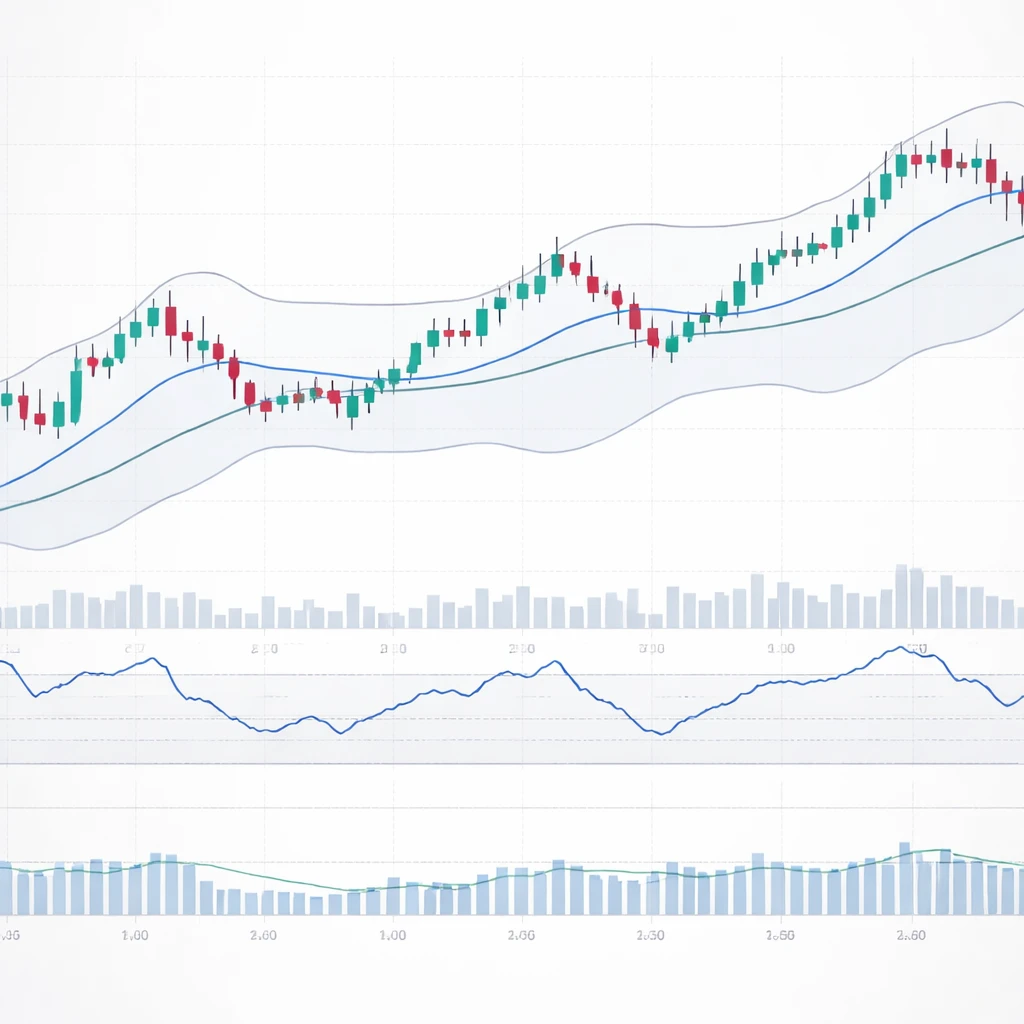
On a typical chart you might see candlesticks, a 50-period moving average, a 200-period moving average, and Bollinger Bands on the main panel, with RSI and volume in panels below. This layout separates what is measured while keeping relationships visible at a glance.
What Indicators Measure
Trend indicators
A simple moving average (SMA) is the arithmetic mean of price over the last N periods. It smooths short-term noise to reveal direction. An exponential moving average (EMA) weights recent data more heavily, so it responds faster to new information. The moving average convergence divergence (MACD) compares two EMAs and can be shown as a line or a histogram relative to a signal line. All three are designed to capture directional bias and its stability.
Trend indicators are useful for describing whether the market is in a rising, falling, or sideways phase. A price series holding above an upward-sloping 200-day SMA reflects longer-term strength. A flattening average suggests a less directional environment. Such descriptions do not prescribe action. They offer a consistent vocabulary for the prevailing state of the market.
Momentum oscillators
Momentum indicators quantify how quickly price is changing. The Relative Strength Index transforms average gains and losses over a lookback period into a 0 to 100 scale, which allows comparisons across instruments and timeframes. The stochastic oscillator evaluates where the latest close sits within the recent high-low range. Rate of change measures the percentage change over N periods. These tools are sensitive to accelerations and decelerations that a simple trend line may hide.
Because momentum oscillators are bounded or centered, they also help identify when recent moves are statistically or historically strong relative to the selected window. For instance, an RSI value near 70 indicates that average gains have dominated average losses in that window. In trending markets, oscillators may spend extended time near the extremes without implying an imminent reversal. In range-bound markets, oscillations around a midline can be more frequent.
Volatility indicators
Volatility describes the dispersion of returns. Average True Range estimates the average absolute range, incorporating gaps through the true range definition that uses the maximum of daily range and gap distances. Bollinger Bands use a moving standard deviation around a moving average to create dynamic envelopes. When bands contract, recent variability has declined. When bands widen, variability has increased. Prices interacting with bands do not guarantee outcomes. The bands serve as a visual context that relates price position to recent variance.
Volume and breadth
Volume confirms or contradicts the intensity of price moves. A volume moving average smooths daily fluctuations to show whether current activity is above or below typical levels. On Balance Volume adds or subtracts volume based on whether price closes up or down, creating a cumulative line that attempts to reflect whether buying or selling pressure has dominated. Breadth indicators, such as the advance-decline line across an index, report how many constituents participate in a move. These measures address participation rather than price movement alone.
Construction Basics: Inputs, Transformations, and Parameters
Most indicators follow a chain of simple steps. They select an input, apply a mathematical transformation, and sometimes normalize the output for interpretability. Understanding each step clarifies what a reading can and cannot convey.
Inputs
Common inputs include closing price, high, low, and volume. Some calculations use a composite price such as the typical price, which is the average of high, low, and close. The choice of input matters. Indicators calculated from closing prices are less sensitive to intraday swings than those using highs and lows. Volume-based indicators depend on accurate volume reporting, which can vary by market and instrument.
Smoothing and lag
Smoothing reduces noise but introduces delay. An SMA of length N waits for N observations before fully reflecting a change. An EMA reduces this delay by weighting the most recent observation more heavily, but it still lags. The balance between smoothness and responsiveness is a design choice. A shorter lookback responds quickly but can fluctuate with noise. A longer lookback reduces noise but reacts more slowly to change. Recognizing this trade-off helps interpret why a fast average hugs price while a slow average stands back.
Normalization and scaling
Indicators often normalize data to facilitate interpretation. RSI bounds values between 0 and 100. Percentage rate of change scales absolute differences by prior price. Z-score style indicators subtract a rolling mean and divide by rolling standard deviation, which interprets deviations in standard deviation units. Normalization allows comparisons across assets with different price levels and volatility profiles. It also helps define reference lines, such as a zero line or fixed thresholds.
Parameter sensitivity
Every indicator requires parameter choices, such as lookback length, smoothing constants, or the number of standard deviations. These choices affect responsiveness and stability. There is no universally optimal setting because markets differ by asset class, timeframe, and regime. The same RSI setting that behaves steadily on a weekly equity chart may jitter excessively on a one-minute futures chart. Awareness of parameter sensitivity encourages caution when interpreting a reading in isolation.
Why Traders Pay Attention to Indicators
Market data is dense. Indicators reduce complexity by summarizing key features of price behavior without using qualitative judgment alone. Several reasons explain their widespread use.
Information reduction and clarity. A moving average transforms hundreds of price bars into a single smooth representation of direction. An oscillator condenses recent swings into a bounded number. These summaries make conditions easier to evaluate.
Consistency and objectivity. Formulas apply the same rules to each bar. This consistency can help reduce the influence of emotion during rapid market changes. Even when judgement ultimately decides, indicators provide a standardized baseline.
Comparability across markets and timeframes. Normalized indicators allow apples-to-apples comparisons. An RSI of 60 means the same thing in range terms whether the instrument trades at 20 or at 2,000. A 20-day ATR of 5 points means the average daily range has been 5 points regardless of price level.
Context for risk and regime. Volatility indicators report whether the environment is quiet or turbulent. Trend indicators report whether price persistence is present. This contextual information informs how uncertain or variable conditions have been, which is relevant for interpreting subsequent moves.
Communication. Indicators serve as a common language. When one analyst notes that price is above a rising 200-day average while ATR has increased, others can understand the description without seeing the chart.
Practical Chart Context and Examples
Example 1: Moving averages with RSI on a daily equity chart
Consider a daily chart of a liquid stock. The price series shows candlesticks. The main panel includes a 50-day SMA and a 200-day SMA. Below the price panel, an RSI with a 14-day lookback oscillates between 0 and 100 with reference lines at 30 and 70.
If the 50-day SMA is sloping upward and price closes consistently above it, the trend description is positive over that intermediate window. If the 200-day SMA is also rising, the longer-term backdrop is aligned with that direction. When price pulls back toward the 50-day SMA after an extended advance, the distance between price and the average narrows, which reduces the degree of short-term extension. In the lower panel, if RSI climbs from 40 toward 60 at the same time, momentum is improving relative to recent losses. None of these observations propose an action. They summarize that the intermediate trend has been rising, that price has reverted toward its mean, and that the speed of gains has increased relative to the prior pullback.
Alternatively, imagine the same chart during a range. The 50-day SMA flattens and weaves through price. The 200-day SMA shows minimal slope. RSI fluctuates more frequently around its midline near 50. This combination indicates a lower degree of directional persistence. A flat moving average and frequent oscillator crossings are characteristics of a consolidating market.
Example 2: Bollinger Bands and ATR around a volatility shift
On a currency pair chart, place 20-period Bollinger Bands at two standard deviations and plot a 14-period ATR below. During a quiet period, the bands narrow and ATR falls toward a local minimum. Candlesticks appear compressed. Later, a series of larger candles expands the bands and ATR rises. The chart now shows a quantitative transition from low to higher variability. If price hugs the upper band during the expansion, that indicates strong directional pressure within an expanded volatility regime. If it oscillates around the moving average inside the bands, that suggests uneven direction despite higher variability. The measurements of band width and ATR provide context about the magnitude of recent movements.
This context is especially useful when comparing across instruments. A one-point ATR on one asset may represent a large percentage move, while the same absolute ATR on another asset might be negligible. Normalizing ATR by price level or considering percentage moves can refine this comparison, but the chart still communicates the shift in variability regardless of the chosen scale.
Example 3: Price with volume and a cumulative flow line
On an exchange-traded fund that tracks a broad equity index, the main panel shows price candles. Underneath, the volume bars highlight daily trading activity with a 20-day volume average. Add On Balance Volume in a separate subpanel. Suppose price grinds upward over several weeks. If OBV rises with price, volume flow has broadly supported the move. If OBV flattens while price rises, price appreciation has occurred without strong cumulative volume support. This contrast does not infer causality or a forecast. It simply states whether the flow of volume has been aligned with or indifferent to recent price direction.
Interpreting Indicator Readings Across Conditions
Indicators behave differently in trending versus ranging markets. In a steady trend, momentum oscillators can remain near extreme zones for extended periods. Traders sometimes misinterpret this as an automatic sign of reversal pressure. In a range, the same oscillators fluctuate around midlines more frequently, and trend measures are less informative because they flatten. Recognizing the backdrop helps prevent misinterpretation of isolated readings.
Timeframe also matters. A 14-period RSI on a five-minute chart reflects intraday swings that can reverse quickly, while the same setting on a weekly chart reflects multi-month momentum. Neither is inherently superior. They serve different descriptive goals. Aligning the timeframe of the indicator with the question you want to answer is part of sound interpretation. If the goal is to describe long-term trend persistence, a slow moving average on a weekly chart will be more meaningful than a fast average on a one-minute chart.
Asset class characteristics further condition interpretation. Foreign exchange often displays mean-reverting behavior over short horizons relative to commodities that can trend through supply shocks. Single stocks may gap more frequently around earnings, which affects true range and standard deviation calculations. Crypto assets can exhibit high volatility with 24-hour trading, which alters the scale of indicators and compresses or extends cycles relative to traditional markets. The same indicator values can carry different practical implications across these contexts because underlying microstructure differs.
Common Pitfalls and Limitations
Indicators are simplifications. Several limitations are worth keeping in mind.
Lag and whipsaw. Smoothing creates lag. A moving average will recognize a reversal only after it has occurred. In choppy markets, many indicators alternate direction quickly, producing whipsaws. Interpreting a measure outside of its intended regime can lead to misleading inferences.
Parameter mining and overfitting. Optimizing lookback lengths or thresholds on historical data can produce apparently strong results that do not generalize. Indicators can be tuned to past noise. Split sample testing, out-of-sample evaluation, and robustness checks help detect this problem.
Indicator stacking. Adding many indicators rarely improves understanding if they measure the same thing. Multiple momentum oscillators with similar lookbacks will often reach similar conclusions. Redundancy can create false confidence without adding information.
Repainting and look-ahead bias. Some visual tools, such as zigzag lines that mark past turning points, use future data to anchor past signals. These are helpful for illustration but cannot be read in real time the way a non-repainting indicator can. Distinguishing between illustrative and real-time calculations is critical when learning from historical charts.
Data quality and scaling. Bad ticks, split adjustments, and inconsistent volume reporting can distort indicator values. Scaling mismatches can also mislead. For example, plotting an unbounded oscillator on the same axis as price compresses its variation. Separate panels with appropriate scales avoid this issue.
Practical Workflow for Reading a Chart with Indicators
A structured approach helps keep interpretation disciplined. One practical sequence is to read from general to specific. Begin with the price structure and a slow trend measure. Note whether the longer-term average is rising, falling, or flat. Then examine a faster trend or mean estimate to describe the intermediate condition. After that, read a momentum oscillator to gauge whether recent short-horizon momentum aligns or conflicts with the broader trend description. Next, look at volatility measures to understand whether the environment is quiet or turbulent. Finally, review volume or breadth to assess participation.
This progression avoids anchoring on a single reading. It also ensures that you consider direction, speed, dispersion, and participation in a consistent manner. The objective is to assemble a coherent description of the market state rather than to identify a specific trade outcome.
Notes on Backtesting and Validation
Although indicators are descriptive, they are often components of systematic approaches. Any attempt to evaluate their historical usefulness benefits from careful testing practices. When assessing an indicator in a rules-based context, researchers typically split data into training and testing periods, avoid using future information in calculations, and account for transaction costs where relevant. They also examine performance across multiple regimes, instruments, and parameter settings. A pattern that appears only within a narrow window or on a single instrument is less likely to be robust.
Even without formal backtesting, you can validate an indicator’s descriptive power by scanning historical charts across different market conditions. Seek consistency rather than perfection. Expect exceptions and false readings. Any measurement grounded in noisy data will contain errors. The goal is to understand what an indicator generally captures and when its interpretation tends to be most clear.
Selecting and Configuring Indicators
Selection starts with identifying what property of price behavior you want to measure. If the aim is to describe direction, a moving average or a moving regression line will be relevant. If the aim is to describe the speed of change, an oscillator such as RSI may be appropriate. If the aim is to quantify variability, ATR or standard deviation based measures are suited to the task. Volume and breadth indicators add color about participation and diffusion.
Configuration follows from the sampling interval and the typical holding horizon that you want to study or monitor. Short lookbacks emphasize responsiveness at the cost of noise. Long lookbacks emphasize stability at the cost of delay. Many charting platforms provide commonly used defaults, such as RSI(14) or Bollinger Bands with a 20-period basis and two standard deviations. These defaults are starting points rather than standards. Adjustments should reflect the characteristics of the instrument and timeframe under review. Documentation of parameter choices helps keep future interpretations consistent.
Reading Indicator Interactions Without Inferring Strategy
Often, insight arises from how different categories of indicators relate to each other. If a slow moving average is rising while volatility is contracting, the chart shows a steady trend with relatively contained dispersion. If momentum weakens while trend remains up, the market may be transitioning to a slower advance or a range. If volatility expands sharply and trend remains unclear, conditions are turbulent and directional readings may be less reliable. These are descriptive statements about the alignment or tension among measurements.
Avoid converting these observations into automatic rules. The same configuration can precede varied outcomes because markets reflect complex information flows. Treat indicator interactions as a way to build a coherent narrative of the current state rather than as a template for decisions.
A Note on Mathematical Detail
The mathematics behind common indicators is straightforward. SMA is the arithmetic mean. EMA applies exponential weighting with a smoothing factor that can be expressed in terms of lookback length. RSI uses the ratio of average gains to average losses transformed onto a bounded scale. ATR averages true ranges, which incorporate gaps between periods. Bollinger Bands place a multiple of rolling standard deviation around a moving average. These are simple operations that are reproducible and transparent. Their simplicity is a feature because it keeps the mapping from data to indicator clear.
Summary of Indicator Roles
Technical indicators turn raw market inputs into interpretable forms. Trend measures reduce noise to highlight direction. Momentum oscillators standardize the speed of recent changes. Volatility indicators quantify dispersion, which clarifies the level of uncertainty observed in price movement. Volume and breadth measures relate participation to price. When read together in an orderly way, they form a descriptive framework for market behavior. The framework does not guarantee outcomes. It supports a structured reading of what prices have been doing and how strongly they have been doing it.
Key Takeaways
- Technical indicators are quantitative transformations of price and volume that measure trend, momentum, volatility, and participation.
- Indicators appear either as overlays on price or as separate oscillators with their own scales, each suited to what is being measured.
- Parameter choices shape responsiveness and stability, so interpretation should account for timeframe, asset characteristics, and market regime.
- Indicators are descriptive rather than predictive. Their role is to organize and standardize chart reading, not to prescribe trades.
- Combining different categories of indicators provides a coherent description of market conditions, but overuse, overfitting, and misinterpretation remain common risks.