Technical indicators translate raw price and volume into structured measurements. They compress recent market behavior into numbers that highlight trend, momentum, and volatility. Within this toolkit, the distinction between leading and lagging indicators is a foundational concept. It shapes how chart readers interpret signals and how they balance responsiveness against reliability.
Defining Leading and Lagging Indicators
Leading indicators attempt to anticipate changes in price behavior. They often react quickly to new information and may show potential turning points before price has clearly reversed. Oscillators that emphasize rate of change or relative position within a recent range are common examples. Relative Strength Index, Stochastic Oscillator, Williams %R, and Commodity Channel Index are frequently discussed in this category.
Lagging indicators emphasize confirmation. They smooth price data to extract the dominant direction or persistent momentum. Because smoothing reduces noise, it also delays signals. Moving averages, moving average envelopes, and indicators derived from moving averages, such as the Moving Average Convergence Divergence, are typical lagging tools.
These labels are tendencies rather than guarantees. A so-called leading indicator can be late or wrong in some contexts. A lagging indicator can appear timely in a strongly trending market. The classification describes a general trade-off between responsiveness and stability, not a promise of early or late success.
How Indicators Transform Price Data
Most indicators apply a mathematical filter to price. The filter can be as simple as an average or as involved as a weighted rate-of-change with bounded scaling. Several principles help explain why indicators differ in timing:
Smoothing and lag. A simple or exponential moving average removes high-frequency fluctuations by averaging. The act of averaging introduces lag. The longer the look-back window, the greater the lag.
Normalization and bounds. Oscillators like RSI map recent gains and losses to a bounded scale. Normalization does not remove lag entirely, but it emphasizes relative intensity, which can change faster than price direction. That quality makes many oscillators feel more responsive.
Rate of change and momentum. Indicators that measure first or second differences can move rapidly when momentum shifts. These tools often change course before price has produced a clear reversal pattern.
Signal-to-noise trade-offs. Increasing responsiveness tends to increase noise. Increasing stability tends to reduce noise at the cost of later reactions. Leading versus lagging is largely a choice about where to sit on this continuum.
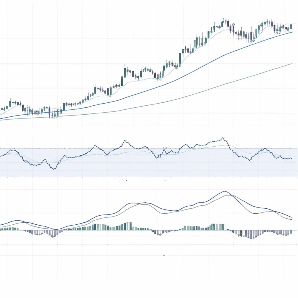
How the Concept Appears on Charts
On a typical chart you will see two visual styles:
Overlays on price. Moving averages and envelopes sit on top of candles or bars. They smooth the jagged path of price and show the dominant direction. Crossovers and slope changes are common features, but they occur after price has already moved.
Separate panels for oscillators. Oscillators such as RSI, Stochastics, or MACD histogram often appear in panels below the price chart. They oscillate around a midline or within a defined range. When momentum fades, the oscillator may turn even while price still edges higher or lower. That early bending is what observers call a leading characteristic.
In a rising trend, a leading oscillator may form lower highs while price forms higher highs. This visual disagreement is known as bearish divergence. In a falling trend, the oscillator may form higher lows while price makes lower lows, a potential bullish divergence. By contrast, a lagging moving average might continue to slope upward until price has fallen enough to pull the average down, making the change visible only after the turn is well underway.
Why Market Participants Pay Attention
The distinction matters because it influences how one interprets risk and uncertainty on a chart.
Responsiveness to change. Leading tools can highlight subtle shifts in momentum or breadth. That can be informative when a trend is tiring or when a range is compressing before a break.
Confirmation and persistence. Lagging tools help filter out noise and emphasize moves that have gained traction. When the goal is to understand whether a recent move has persistence, lagging tools provide a clearer picture.
Context sensitivity. In strongly trending markets, lagging measures often align cleanly with price and provide fewer contradictory signals. In range-bound markets, leading measures can be more informative because oscillations within a range are more frequent and smoother averages offer less insight.
Understanding these contrasts does not imply that one category is superior. It frames how one reads a chart in different regimes and how one weighs early clues versus later confirmation.
Examples of Leading Indicators on the Chart
Relative Strength Index. RSI oscillates between 0 and 100 based on the ratio of average gains to average losses over a look-back period. It can turn down from elevated levels while price still climbs. That shift highlights a loss of upward momentum. Conversely, it can turn up from depressed levels while price still falls.
Stochastic Oscillator. Stochastics compares the closing price to the recent high-low range. It is highly responsive to where price finishes within each bar. Turning points often appear early during consolidations and near the edges of ranges.
Commodity Channel Index. CCI measures deviation from a moving average in standardized terms. Large positive or negative readings capture momentum extremes. Shifts back toward zero can occur before price has obviously reversed.
These indicators are called leading because they often react to the internal dynamics of price before the aggregate path of price has shifted direction enough to be obvious on the main chart.
Examples of Lagging Indicators on the Chart
Moving Averages. Simple, exponential, or weighted moving averages plot the smoothed trajectory of price. Crossovers, such as a short average moving above a long average, occur after a trend has already formed. Slope changes and the position of price relative to a long average provide a delayed but cleaner view of direction.
Moving Average Convergence Divergence. MACD is built from the difference between two exponential moving averages and a smoothed signal line. Rising MACD values or a positive histogram reflect momentum that has already developed. Crosses of the signal line confirm a shift only after several bars of change.
Average Directional Index. ADX measures the strength of a trend irrespective of direction. It rises as a trend becomes more established. The information is most useful once a move is no longer tentative, which is why it is commonly classified as lagging.
Practical Chart Contexts
Abstract definitions become clearer when grounded in realistic situations. The following contexts illustrate how the leading versus lagging distinction appears in practice without suggesting any specific course of action.
Context 1. A sustained uptrend with shallow pullbacks. Suppose a daily chart shows a series of higher highs and higher lows with a 50-day simple moving average rising steadily under price. The moving average is lagging, which is evident when price dips briefly but the average continues upward. During the late stage of the move, RSI begins to form lower highs while price makes slightly higher highs. The oscillator signals a loss of momentum before the moving average flattens. If the uptrend slows and price compresses into a tight range, the 50-day average eventually flattens and may turn down. The order of events on the chart reflects the leading-lagging sequence: oscillator change first, average slope change later.
Context 2. A sideways range with frequent reversals. Assume price oscillates between a clear support and resistance band for several weeks. A short moving average that works well in trends now whipsaws as it chases each minor swing. Meanwhile, a bounded oscillator turns at the edges of the range, often before price leaves the boundary zone. The oscillator looks early because it responds to the distance from the recent high-low window. The moving average looks late because smoothing masks small swings until they are already maturing.
Context 3. A sharp gap after news. News can create discontinuous moves. With a large gap, oscillators may leap to extremes, but their prior turning points are no longer informative. A longer moving average will lag heavily, and MACD may require multiple bars to show a clear momentum shift. In this case, the classification is less about which tool is better and more about understanding why the readings look odd. Indicators reflect their construction, and unusual price paths can produce unusual indicator behavior.
Context 4. A transition from contraction to expansion in volatility. When volatility is low, smoothing produces very steady lines and oscillators may cluster around midpoints. As volatility expands, oscillators often register the change first, since momentum accelerates within each bar. Lagging measures then follow as sustained movement recalibrates the averages. The sequence tells a story about market state rather than a prediction about what comes next.
Parameter Choices and the Illusion of Leadership
Whether an indicator behaves as leading or lagging depends on its settings and the timeframe of the chart.
Look-back length. Shorter look-backs increase responsiveness. A 10-period moving average will hug price more tightly than a 50-period average. The shorter line will appear to lead simply because it is less smoothed, but it will also produce more frequent and smaller wiggles that may not be meaningful.
Smoothing choices. Exponential averages respond faster than simple averages with the same period because they weight recent data more heavily. Removing smoothing entirely can make an indicator so volatile that it becomes difficult to interpret. Adding more smoothing reduces false turns while adding delay.
Thresholds and scaling. Oscillators with overbought and oversold regions can be tuned with different thresholds. Lowering a threshold can increase the count of early warnings, but it may also increase the count of signals that never develop into meaningful moves. Raising thresholds tends to reduce noise at the cost of timeliness.
The label leading can therefore be a function of parameterization rather than a fundamental property. Settings that look excellent in hindsight may owe their apparent quality to the specific sample used to test them. That risk is known as overfitting, and it is especially acute when tuning thresholds to capture a small number of memorable market episodes.
Divergence, Confirmation, and Validity Windows
Divergence is a classic example of a leading concept. Price pushes to a new extreme while an oscillator fails to confirm. The divergence may be a genuine early warning or a byproduct of consolidation within an ongoing move. Since oscillators are bounded or mean-reverting by construction, they cannot climb indefinitely with price. Some divergences are therefore inevitable and not all have interpretive value.
Analysts often think in terms of confirmation and validity windows. A divergence is noted at time t. If price confirms within a reasonable window, the early warning looks informative. If confirmation does not occur, the divergence may be ignored as background noise. The size of that window is contextual. It depends on timeframe, volatility, and the look-back parameters of the indicator. This disciplined approach reduces the temptation to treat every early hint as meaningful.
Data Quality, Calculation Conventions, and Bar Closes
Indicator readings depend on the data used and the moment at which they are evaluated.
Closed bars versus intrabar updates. Many indicators are defined using closing prices. During the active formation of a bar, oscillators and averages can change rapidly. A signal observed mid-bar can vanish by the close. Evaluating indicators only on closed bars reduces this effect at the cost of reacting later.
Recalculation and the perception of repainting. Classic indicators do not typically rewrite completed historical values when new data arrives. However, readings for the current, not-yet-closed bar can change. Traders sometimes refer to this as repainting even though it is simply the natural update of a still-forming data point. Understanding this behavior prevents confusion when reviewing signals after the fact.
Alternative price constructions. Some chart types transform price, such as Heikin-Ashi or Renko. Indicators calculated on transformed price can behave differently from those calculated on raw closes. What appears leading on one representation may look less so on another because the underlying input has changed.
Misconceptions and Limits
Several misconceptions recur in discussions of leading and lagging tools.
Leading does not mean predictive. An early signal can be wrong as often as it is right. It is simply early. Treating a leading indicator as a predictor turns a descriptive tool into a forecasting device without statistical justification.
Lagging does not mean useless. Confirmation is valuable when the goal is to understand whether a move has durability. Late signals can still be informative about the quality and persistence of a trend.
All indicators are derived from price and volume. They cannot add information that is not present in the inputs. They reveal structure and emphasize features, but they do not create new information about the future.
Regime dependency is real. An indicator that behaves well in one environment may struggle in another. A tool can look superior for long stretches and then fall out of sync. Recognizing the regime a market is in, rather than attaching universal labels, improves interpretation.
Combining Leading and Lagging Readings Without Prescribing Trades
Analysts often examine a chart with both types of information on display. One indicator can mark potential turning zones while another clarifies whether a broader trend is still intact. For example, a long moving average may show the prevailing direction and a momentum oscillator may highlight when the current swing is stretched within that direction. The purpose is not to generate a signal to act on, but to achieve a layered reading of market structure.
Multi-timeframe comparisons can add context. A lagging indicator on a higher timeframe can provide a slow backdrop, while a faster, more leading tool on a lower timeframe can show short-term fluctuations around that backdrop. This arrangement helps distinguish noise from structural movement without implying any particular decision.
Reading Specific Indicators Through the Leading-Lagging Lens
Moving Averages and Crossovers. The distance between price and a long average illustrates the trade-off clearly. When price accelerates, the average lags. When price mean-reverts, the average can be crossed quickly. A crossover of a short average below a long average is a typical lagging event because it requires a sustained change before it appears.
MACD Components. The MACD line tracks the difference between two exponential averages. The signal line is an additional average of that difference. Each step adds smoothing and delay. The histogram is the difference between MACD and its signal line, which visualizes changes in momentum. Rapid changes in the histogram can look more leading than the cross of MACD with its signal line.
RSI and Thresholds. RSI readings near extremes receive attention, but the most informative element can be the direction of travel as momentum shifts. An RSI that curls down from a high region during an uptrend can be an early sign of slowing impulse. Whether that change is meaningful depends on subsequent price action and context.
Stochastics in Ranges. Because Stochastics compare closing price to a recent range, the oscillator often turns near range boundaries. That property makes it naturally sensitive to context where price oscillates within horizontal support and resistance.
Volatility and Timeframe Effects
Volatility and timeframe influence how early or late an indicator appears.
Short timeframes. On intraday charts, even lagging tools can appear brisk because price evolves quickly. However, the noise level is high and small movements can dominate indicator behavior. A short moving average may cross repeatedly with little informational value.
Long timeframes. On weekly or monthly charts, smoothing dominates. Signals are fewer and later, but they represent larger structural changes. Leading oscillators on long timeframes can still turn early, although the absolute time between the turn and any subsequent price confirmation can be significant.
Volatility clusters. Markets often shift between periods of low and high volatility. During low volatility, leading tools may appear sluggish because there is little momentum to measure. During high volatility, lagging tools may flip states more quickly because large moves push averages faster than usual.
Interpreting Conflicting Signals
Conflicts are common. An oscillator may show fading momentum while a long moving average continues to rise. This is not a contradiction. The indicators are summarizing different aspects of the same data. Fading momentum describes the rate of change within a still-positive trend. The question is not which indicator is right, but what each is saying about the structure and stage of the move.
Analysts address conflicts by assigning roles. A lagging tool can define background conditions such as direction and strength. A leading tool can flag areas where the probability of change is rising. The combination is descriptive, not prescriptive, and it reduces the risk of overreacting to a single reading taken out of context.
Common Pitfalls When Interpreting Early and Late Signals
Hindsight bias. After a turning point, an early oscillator blip looks obvious. Before the fact, many similar blips were not followed by a change. Chart readers should remember the denominator of missed signals, not only the numerator of memorable ones.
Over-optimization. Tweaking settings to maximize apparent timeliness on a specific dataset often produces fragile rules that do not generalize. The urge to eliminate lag can lead to indicators that are too noisy to interpret consistently.
Ignoring the close. Evaluating signals before the bar closes can create a misleading picture of timeliness. What looked early at noon may disappear by the close of the session.
Mislabeling tools. Some indicators have both leading and lagging elements. MACD is often called lagging, yet its histogram can react quickly to momentum shifts. RSI is often considered leading, yet trendline breaks or midline crossovers on RSI can lag price changes in certain contexts. Labels are helpful, but behavior is contextual.
Using the Distinction to Improve Interpretation
The leading versus lagging framework helps organize information on a chart. It guides the eye to read momentum changes, trend persistence, and volatility shifts as parts of the same story. Rather than seeking a perfect early signal, a disciplined reader weighs multiple perspectives. Early warnings are treated as hypotheses. Confirmations are treated as supporting evidence. Both are time stamped, and both are understood as conditional on evolving market structure.
Key Takeaways
- Leading indicators are more responsive and often highlight momentum shifts before price has clearly turned, while lagging indicators emphasize confirmation and trend persistence.
- The distinction arises from mathematics: smoothing and longer look-backs add delay, while normalization and rate-of-change calculations respond faster but can add noise.
- On charts, oscillators in separate panels often show early turns or divergences, whereas moving averages and MACD-based tools provide cleaner but later confirmation.
- Context matters. In strong trends, lagging tools often align best. In ranges, leading tools can provide more timely information about swings within boundaries.
- No indicator predicts the future. The leading-lagging framework is a way to organize evidence, balance early clues against later confirmation, and read market structure without implying a specific trade.