Technical indicators and oscillators translate price and volume data into derived series that can be inspected visually or measured quantitatively. Their outputs depend on parameter choices that are rarely neutral. Indicator settings, such as lookback length, smoothing method, source price, and threshold levels, influence timing, amplitude, and frequency of signals. Understanding these settings and their pitfalls helps interpret market behavior more accurately and reduces the chance of drawing conclusions from artifacts of the calculation rather than from the underlying price process.
What Are Indicator Settings
Indicator settings are the configurable parameters that control how an indicator processes input data. Although every indicator has its own specification, most settings fall into a few categories.
- Lookback length: The number of bars used in a rolling calculation, for example a 14 period RSI or a 20 period moving average.
- Smoothing method: The weighting scheme or filter, such as simple, exponential, weighted, Wilder, or double exponential smoothing.
- Data source: The input field. Common choices include close, open, high, low, typical price, or median price.
- Thresholds and bands: Fixed levels that help classify readings, for example 70 and 30 for RSI or two standard deviations for Bollinger Bands.
- Normalization: Transformations that map raw values to a bounded or scaled range, for example oscillator values from 0 to 100.
- Timeframe and session treatment: The bar interval and whether calculations span full 24 hour sessions, exchange sessions, or custom trading hours.
These choices change not only the numeric output but also the way the indicator appears on a chart. A short lookback shows more variation and turns more quickly. A long lookback appears smoother and slower. A tighter threshold produces more frequent classification events, while a wider threshold produces fewer events.
How Settings Appear on Charts
Indicators appear either as overlays on price or as separate panels. Settings shape the lines and shapes you see.
- Overlays: Moving averages, Bollinger Bands, Donchian channels, and price channels are drawn directly over the price series. Shorter lengths hug price more closely. Longer lengths lag and filter more noise.
- Oscillators: RSI, Stochastic, MACD histogram, and Commodity Channel Index are plotted in a subpanel. Shorter lengths result in faster flips around the midpoint. Longer lengths compress oscillations and reduce whipsaws at the cost of delay.
On a daily chart, a 10 period moving average turns quickly with new information. A 100 period moving average bends slowly and remains largely unchanged by short bursts of volatility. In an oscillator panel, a 7 period RSI frequently reaches extremes while a 21 period RSI spends more time near the middle of the range.
Why Parameter Choices Matter
Parameter choices influence what you learn from the chart. They affect timing, sensitivity, comparability, and the risk of misinterpretation.
- Timing: Smoother indicators react later. Settings determine how late and by how much.
- Sensitivity to noise: Short lengths treat small moves as meaningful. Longer lengths require broader and more persistent moves.
- Interpretation of extremes: Overbought and oversold labels depend on thresholds. Some assets or regimes naturally live near those bounds for extended periods.
- Cross indicator comparability: Defaults are not universal. Two platforms may compute the same named indicator differently. Comparing settings without confirming definitions can mislead.
Common Settings by Indicator and Their Visual Effects
Moving Averages
A moving average summarizes price over a lookback window. The type of average shapes its lag and smoothness.
- Length: Short lengths track price closely and change direction quickly. Long lengths are smoother and slower.
- Type: Simple averages weight all bars equally. Exponential averages weight recent bars more heavily. Weighted schemes respond faster but can display more jagged behavior.
- Source: Using close versus typical price can change the average slightly, especially for wide intraday ranges.
On a chart, a 20 period simple average reacts less to a one day price gap than a 20 period exponential average. Side by side, the EMA will turn sooner and sit closer to recent price.
Relative Strength Index
RSI measures the ratio of average gains to average losses over a lookback window and then normalizes the result between 0 and 100.
- Length: Shorter than 14 increases responsiveness and the frequency of visits to extreme zones. Longer than 14 reduces swings and delays reversals in the line.
- Thresholds: The conventional 70 and 30 are not sacrosanct. Tighter thresholds will label more conditions as extreme.
- Smoothing method: Some platforms use Wilder smoothing, others use simple averages. The choice affects the curvature and timing.
On a trending chart, RSI can remain near 70 or 80 for prolonged periods. That visual persistence is a function of both market conditions and the chosen length. Reducing length to 7 often produces more frequent excursions above 70 that do not align with notable changes in price structure.
MACD
MACD uses the difference between two exponential averages and often includes a signal line as a smoothed version of that difference. The histogram plots the gap between MACD and its signal line.
- Fast and slow lengths: Reducing the fast length or increasing the slow length increases sensitivity to recent moves. The histogram flips direction more often.
- Signal length: A shorter signal smoothing tracks the MACD line more tightly and reduces the size of histogram bars.
On a chart with defaults similar to 12, 26, 9 the histogram changes color or sign less frequently than with a configuration like 6, 19, 3. The visual effect is a busier panel with the shorter set, which can be mistaken for added information rather than added noise.
Bollinger Bands
Bollinger Bands use a moving average with upper and lower bands at a chosen number of standard deviations.
- Length: Short lengths adapt quickly to changing volatility. Long lengths react slowly and can remain wide or narrow for extended periods.
- Deviation multiplier: Increasing the multiplier widens the bands and reduces the frequency with which price touches the band.
- Standard deviation definition: Some implementations use population standard deviation. Others use sample standard deviation. This small difference affects width.
In a sideways market, 20 period bands at two standard deviations will appear to envelope most price action. Switching to 50 periods narrows the frequency of band touches and smooths the bandwidth, which can change the perceived volatility regime on the chart.
Stochastic Oscillator
Stochastic compares the close to the recent high low range. It commonly includes smoothing steps for the %K and %D lines.
- Lookback for %K: A shorter lookback changes quickly with each new bar. A longer lookback anchors to a larger range and moves more slowly.
- Smoothing: A 3 period smoothing on %K and %D removes jitter. Removing smoothing creates a choppier oscillator that touches the extremes frequently.
In a visually choppy market, a 5, 3 setting creates fast swings that saturate at 0 or 100. A 14, 3 setting dampens the effect, showing fewer full range traversals.
Average True Range
ATR measures average range, including gaps, over a lookback window.
- Length: Shorter ATR lengths adapt quickly to recent volatility bursts and drop quickly when volatility subsides. Longer lengths keep elevated readings long after price settles.
- Smoothing method: The Wilder smoothing used in many ATR definitions changes the rate of decay compared with simple averaging.
The chart effect is an ATR line that either spikes and decays quickly or rises and remains high for many bars after a shock.
Volume and Money Flow Indicators
On Balance Volume accumulates signed volume. Chaikin Money Flow averages a money flow multiplier over a lookback window. Settings affect how much intraday positioning within the high low range influences the calculated value.
- Length: CMF values based on shorter windows can swing from positive to negative frequently, especially when volume is noisy.
- Session handling: Indicators that compare intraday range position across sessions can distort around session gaps or thinly traded periods.
Ichimoku Components
Ichimoku defaults such as 9, 26, 52 come from historical Japanese trading conventions. Applying these to different markets and sessions changes the relationship between price and the cloud, especially if the asset trades nearly around the clock.
Typical Pitfalls When Working With Settings
Overfitting to the Past
Optimizing settings to maximize a chosen historical metric often captures noise that will not persist. Sharp peaks in performance or fit around a very specific setting are a warning sign. Small changes in the parameter that produce large changes in outcomes indicate instability and low robustness.
Regime Dependence
Markets cycle through trending, mean reverting, and volatile phases. A parameter that provides a balanced view during one regime can mislead in another. An oscillator length that keeps values near the middle during a range may remain pinned near an extreme during a trend, which can appear to contradict the oscillator’s label but is a normal response to persistent directional movement.
Assuming Thresholds Are Universal
Overbought and oversold lines are conventions. Assets with persistent drift or strong momentum regimes can spend a long time above a conventional upper line without reversing. Interpreting every touch as a significant event is a common misreading of what the indicator is designed to show.
Repainting and Lookahead Effects
Some indicators require future bars to confirm a point. Fractals, pivot points that need a certain number of bars on each side, and ZigZag style swings update after the fact. On historical charts, it can look as if a marker appeared perfectly at the true turning point. In real time, that marker only becomes final several bars later. Multi timeframe indicators may also recalculate a lower timeframe output when the higher timeframe bar closes, which changes the historical path.
There is a difference between legitimate recalculation that stabilizes once sufficient data arrives and improper use of future data that was not available at the time. When reviewing charts, verify whether a plotted signal would have existed at bar close without knowledge of the future.
Boundary and Warm Up Effects
Rolling calculations need a minimum number of bars. During the initial bars the indicator either has no value or an unstable value. Some platforms seed initial values in ways that can bias early readings. Interpretation near the start of a dataset should acknowledge that the indicator has not fully warmed up.
Platform and Formula Differences
Indicators with the same name can differ in implementation.
- RSI: Wilder smoothing versus simple average of up and down closes produces different curvature.
- Bollinger Bands: Sample versus population standard deviation changes bandwidth.
- ATR: The definition of true range and the smoothing algorithm vary by platform.
- Stochastic: Whether the current close equals the high or low includes the endpoint in the range can vary.
These differences matter when comparing charts across platforms or when combining results from different sources. A printed value of 70 on one chart may correspond to a slightly different calculation on another.
Data Issues
Corporate actions, missing data, and thin liquidity can alter indicator behavior.
- Splits and dividends: If a price series is not adjusted, many indicators will display discontinuities around corporate actions.
- Gaps and session changes: ATR and standard deviation based measures jump on gaps that reflect overnight news or session boundaries, not necessarily intraday volatility.
- Illiquidity: Sparse prints can create stair step effects in oscillators that depend on high low ranges.
Multiple Comparison and Redundancy
Many indicators are transformations of the same underlying information. A moving average and MACD share exponential averaging. RSI and Stochastic both summarize relative position over a window. Looking for agreement among highly correlated indicators can exaggerate confidence without adding new information.
Timeframe Sensitivity
The same setting behaves differently across timeframes. A 14 period oscillator on a 5 minute chart digests less information than a 14 period oscillator on a daily chart. Intrabar noise, microstructure effects, and session gaps cause different behaviors and may alter how often extremes occur.
Intrabar Versus Close
Some indicators can cross a threshold during a bar and then return before the bar closes. If the platform updates the plot intrabar, the chart can show temporary crossings that disappear at close. Reviewing how an indicator is confirmed helps avoid interpreting transient changes as final readings.
Visual Bias and Hindsight
It is easy to tweak settings until the past chart looks clean. Visual neatness is not evidence that the setting captures a stable feature of the price process. Clean historical examples may depend on cherry picked windows or luck.
Practical Chart Based Context
Example 1: RSI Length and Thresholds
Consider daily data for a stock that trends upward over several months with periodic pullbacks. An RSI with length 14 spends long stretches between 50 and 80 during the trend, with brief dips below 40 during pullbacks. Switching to length 7, the oscillator spends more time near 80 and 20 and crosses the midpoint more frequently. The shorter length creates the impression of a more turbulent market, yet price structure is unchanged. Thresholds such as 70 and 30 are crossed more often with length 7. On a chart, the number of overbought tags increases, but the underlying price behavior has not become more extreme, only the measurement window has.
Example 2: MACD Sensitivity
On the same instrument, compare a MACD configured with fast 12, slow 26, signal 9 to one with 6, 19, 3. The histogram with shorter settings changes sign frequently as it reacts to small rotations in the two EMAs. The default like configuration has longer spans between flips and a smoother histogram. Visually, the busier histogram can be mistaken for more timely information, but it primarily reflects higher sensitivity to short term fluctuations.
Example 3: Bollinger Band Length
In a consolidating period followed by a breakout, 20 period two standard deviation bands will begin to widen as soon as volatility rises on the breakout. With 50 periods, the bands remain narrow for longer then widen as the longer window accumulates more high variance bars. In the immediate aftermath, the chart with 50 periods may show price running outside the band more often because the bands have not yet adapted. The different settings produce different visual narratives for the same price path.
Example 4: ATR and Volatility Shocks
When a market experiences a large gap, a 14 period ATR typically jumps immediately, then begins to decay unless volatility remains high. A 50 period ATR rises more slowly and stays elevated longer. If the chart is used to understand current volatility conditions, the choice of length can lead to different qualitative interpretations about whether recent volatility is atypical.
Example 5: Moving Average Type
On a gap and go day, a 20 period EMA will track the move more closely than a 20 period SMA. The EMA pulls toward recent prices and shows a sharper slope change. The SMA flattens the move and lags. On the chart, the EMA may appear to validate the new price level sooner, while the SMA takes longer to catch up.
Example 6: Session Handling
For futures that trade nearly around the clock, computing indicators across the full 24 hour session captures overnight price activity. Restricting calculations to an exchange session compresses the data window and can produce different values at the open. On the chart, Bollinger Bands computed on full session data may appear wider than those computed on regular trading hours only.
Interpreting Indicator Behavior Without Overreach
Charts convert large data sets into shapes and rhythms that can be recognized quickly. Indicator settings decide which rhythms dominate the display. The choice of settings should match the analytical question. For instance, a longer lookback average answers whether price has deviated from its broader base, while a shorter lookback answers whether price has deviated from the last few bars. Both are valid questions, but they are not interchangeable.
Oscillators with strict bounds can create the impression of symmetry. In practice, markets can lean against one bound for long periods. The bounds are a useful map of relative position within the recent window, not a claim about imminent reversion. That statement holds irrespective of the asset, and it is especially visible when settings are shortened.
Diagnosing Sensitivity and Robustness
Several diagnostic habits improve understanding of how a setting changes interpretation without prescribing any strategy.
- Side by side panels: Plot the same indicator with two or three adjacent settings. Observe whether qualitative conclusions change, for example whether major swings appear in all panels or only in the most sensitive one.
- Parameter sweeps: Scan a range of lengths to see whether the indicator’s characterization of periods, such as high volatility or persistent momentum, is stable across neighboring settings. Stability across a plateau suggests the observation depends less on a single arbitrary value.
- Regime segmentation: Visually segment the chart into trending and ranging periods. Check whether the indicator preserves its descriptive power in both. Settings that rely on a single regime often fail when the regime shifts.
- Platform documentation: Confirm definitions and smoothing details. Small formula choices produce visible differences that matter at boundaries and extremes.
Special Topics and Less Obvious Pitfalls
Normalization Across Assets
An oscillator value of 80 on a quiet asset can reflect a very different set of conditions than an 80 on a volatile asset. Normalized scales assist comparison within the same asset over time. Comparisons across assets with different volatility and drift can be misleading unless the context is matched.
Logarithmic Versus Linear Charts
Chart scaling does not usually change indicator values, since indicators draw from numerical price data independent of the chart projection. It does change how the human eye interprets the relation between price and overlays. On a log chart, equal percentage moves are equal visual distances. On a linear chart, equal absolute moves are equal distances. When using moving averages, the perception of distance from price can change even though the computed average is identical.
Multi Timeframe Inputs
Indicators that reference a higher timeframe while plotted on a lower timeframe can look different once the higher bar closes. During formation, the higher timeframe value is provisional. After close, it finalizes, and the lower timeframe history can appear to have contained a more stable value than was actually available at the time.
Divergence and Window Choice
Divergence between price and an oscillator depends on the pivot points chosen in both series. Changing the lookback alters which highs and lows qualify. On a chart, a divergence visible with a short lookback can disappear when length increases, not because the market changed, but because the chosen window now groups bars differently.
Indicator Clustering
Stacking many indicators that measure similar properties creates the illusion of confirmation. A cluster of momentum measures agreeing is not independent evidence if they are transformations of the same input. On a chart, this often appears as several panels turning at the same time. The common cause may be the underlying price change and weighted averaging, not multiple distinct signals.
How Traders Use This Concept
Practitioners pay attention to settings because settings determine whether an indicator highlights structural moves or temporary fluctuations. They examine how a conclusion changes across a reasonable range of parameters and across timeframes. When a descriptive conclusion holds across multiple sensible settings, confidence in the interpretation increases. When a conclusion flips with a small tweak, caution is warranted because the observation may rely on a narrow lens.
They also confirm that the platform’s definitions match their expectations. Small implementation differences are easy to overlook when copying a chart from a reference source. Reconciling definitions prevents errors that stem from assuming equivalence across tools.
Constructive Habits for Chart Work
- Document indicator definitions and parameters explicitly on saved chart layouts to avoid silent changes over time.
- Check for warm up bias at the start of datasets and for recalculation behavior in multi timeframe plots.
- Note corporate actions and session changes that can produce atypical values in volatility and range based indicators.
- Review whether a visual conclusion survives small variations in length or smoothing.
Putting It Together on the Screen
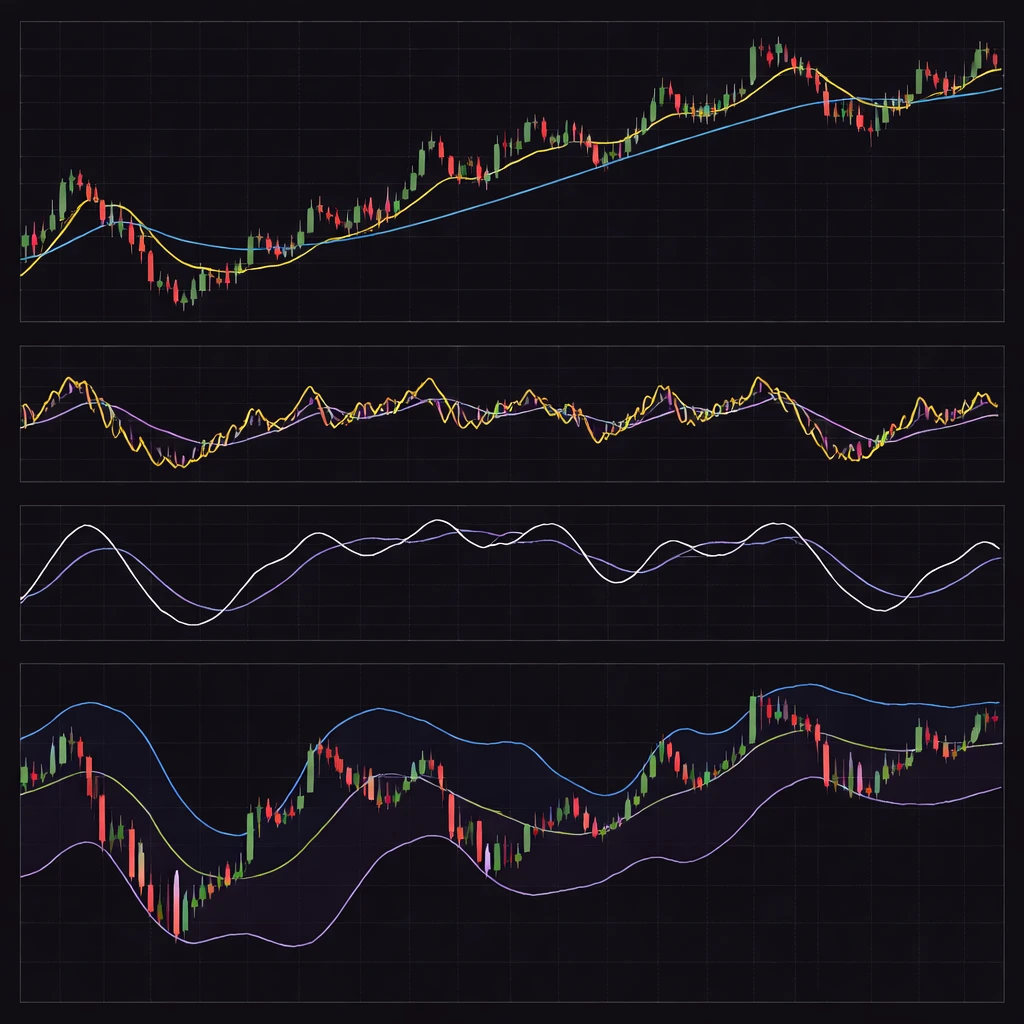
A practical way to build intuition is to display two or three versions of the same indicator for a single instrument and timeframe. For instance, plot a 20 and a 50 period moving average on price, an RSI with lengths 7 and 14 in one panel, and a Bollinger Band set with 20, 2 in another. Scan a month with strong movement, then a quiet month. Observe which conclusions remain stable across both months and across the two settings in each panel. This visual exercise highlights which aspects of the indicator are robust properties of price behavior and which are artifacts of the parameterization.
Finally, be mindful that indicators summarize history. They do not see the future. Their value lies in consistent translation of past data into a form that the human eye and mind can process. Settings are the rules of that translation. Thoughtful selection and honest awareness of pitfalls allow the chart to represent the market more faithfully.
Key Takeaways
- Indicator settings control sensitivity, timing, and amplitude, which directly change how price behavior appears on a chart.
- Defaults are conventions, not universal standards. Platform formulas and session handling can materially alter values.
- Shorter windows increase responsiveness and noise. Longer windows reduce noise and add lag. Neither is inherently better without context.
- Common pitfalls include overfitting, regime dependence, repainting or lookahead effects, and boundary or warm up distortions.
- Robust interpretations hold across reasonable parameter ranges and survive changes in timeframe, while fragile ones flip with minor tweaks.